Hello Webkinz Newz readers, Ella McWoof here with a special report! Earlier this month you voted for the Webkinz Sweet 16 theme to be the next theme released in the W-Shop. Our artists here at Webkinz headquarters have been hard at work and I am pleased to show you the first set of concept drawings! The 3D artists will use these drawings as a guide when actually creating the final items that will be available in the W-Shop on July 10th.
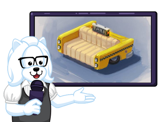
Here’s a first look at a couch that will be part of this theme. If you have a name suggestion for any of these items, please feel free to leave them in the comments section below this article:
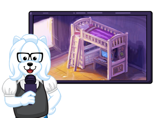
What a beautiful bed! I love the color choices and the workstation is a great touch:
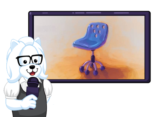
Looks like this desk chair will tuck in nicely beneath that bed:
You may remember this next one. It was one of the 5 concept drawings players could vote for: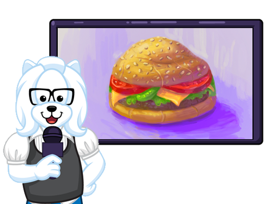
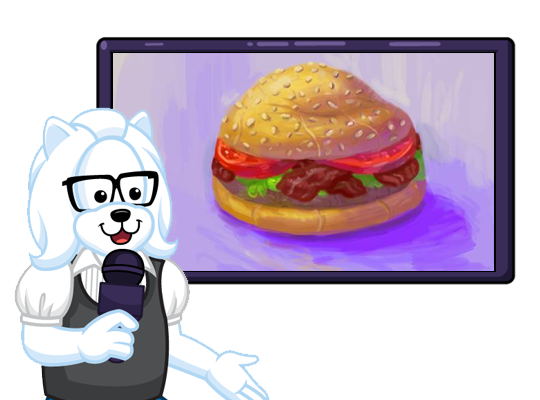
Here’s a matching chair to go with the cheeseburger beanbag chair. They both look very cozy:
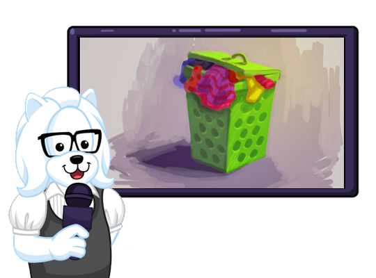
This is one of the most colorful laundry hampers I have ever seen:
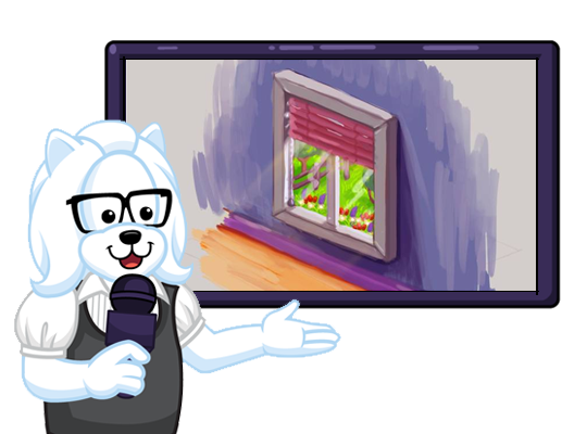
This window looks like it will brighten up any room:
Finally, this couch looks like the perfect place to read your favorite book: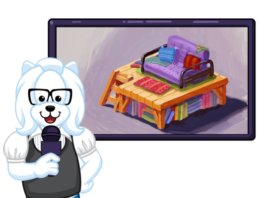
I for one can’t wait to pick up this theme in the W-Shop on July 10th! In the meantime, please feel free to leave your feedback and name suggestions in the comments section below and stay tuned for the second set of concept drawings coming soon!
This has been Ella McWoof reporting for Webkinz Newz…






I think the couch and the bed are my favorite out of all of them :)
Love this theme! For the Taxi, I would call it pick me up couch. For the bed, maybe technical bunk bed, because it has the computer under it.
Hmmm, just not really feeling these. I liked the hotel theme so much better. I guess the taxi cab couch and the bed are kinda cool. The two burger chairs are kinda redundant and the other items just look messy to me…oh well, can’t please everyone, I guess.
I also wish that the hotel room was chosen because I think it might have been better. I liked the modern and classy look of the hotel theme. I’m not a big fan of the messy style of these items. Also I wish there was one colour scheme instead of just all the colours. I guess its okay, maybe they will also do the hotel theme because a lot of people liked that one.
They are kind of supposed to look messy. Older teenagers (sweet 16) are usually known to be messy and lazy. =P I thought the Hotel theme was pretty boring. Just like everything else. I’m happy this won..
I thought the same thing but lets just give it a shot:D
I think it is all horrid; not a single item, so far, that I will be getting. I dislike the dark primary colours and the overall chunkiness of these items. I think this looks more like a very young child’s room than a room for a 16 yr. old. By that age, I wanted antiques and fine textiles. Maybe the very young players will like this, but surely not older teenagers?
I like the bed with the workstation. I could use that in a room but most of the rest I will pass.
I agree.
The bed is pretty cool! It could be the “Lovely Lavender Loft Bed,” and that chair looks like it should be really shiny–I think I would name it the “Rock and Rollin’ Task Chair.” I’m still working on ideas for the other pieces, but I like them! Nice!
Maybe relaxin reading recliner for the 2nd couch?
So far, I am pleasantly surprised. I was really upset when this theme won. I didn’t care for it at all. These concept drawings certainly show promise. My only advice would be to try to keep this theme unisex, (for both boys & girls). If you decide to do this, you may need to change the colors up for the bed and maybe the window. That way those 2 items won’t look quite so girly. There are so many themes that are very girly and not very many that are boyish. Making this theme work for both may make a big difference in how it is received. IMHO.
Totally with you I have more boy pets than girl pets…They should make two beds so it could be like twins a boy and a girl:)
But only girls have “Sweet 16s”
Mhmm. Racoon6000 is pretty right. I have WAY more girl pets than boy pets, but I think it would be awesome if you could make there be beds where 2 pets could sleep in one bed. It makes a whole lot more sense.. sure they are supposed to be like kids, but kids have sleep overs, right?
But, Racoon6000, maybe boys can have AWESOME 16s!
I really like it so far. It’ll be interesting to see the whole thing come together
Love it!!! The bunk bed is the best! And there’s items for both genders, so that’s awesome. Great work, Ganz!
I also love how Ganz made this theme for both genders! That way both genders can have fun with this theme and then it’s not too girly or too boyish! Love it!
Book Nook how awesome is this! Loving the Sweet 16 Theme and looking forward to July 16th. Thanks to those voting for this theme.
yes I love the book nook and the bed the best!
oh and I love the name for the book nook! it’s perfect!
I love the realism in these drawings! I’m very excited for the workstation!!! That window is fantastic and I’m sure it will have many exciting applications in other room designs! Fantastic job, Ganz Team! I think the couch in the beginning should be called the “Cruisin’ Cab Couch”.
I’m excited too! I like this theme better than the toadstool theme, the one that won last year. I think that the bed should be called “Laptop Loft Bed”
I agree and love the workstation bed as well! But honestly that couch is really not that cool… I’m still looking forward to this (mostly) awesome theme! And I love the name idea Cruisin Cab Couch! :-)
I love the raised bed with the workstation! I am still not too sure about the beanbag chairs (although I am partial to the one with bacon!), however I like the idea of the 2 sofas. They are not only very creative but they offer plenty of seating/sleeping room for study groups and sleepovers. I think the theme is growing on me a bit. I find that I am starting to think of room layouts.
i really hope it isn’t for estore points!
I think it would be awesome if they made the window interactive and the blinds would go up and down. I would name it the Daydream Privacy Window.
This theme is actually turning out better than I thought it would be! But I am hoping that none of the items are deluxe…….but Í’m probably getting my hopes up too high/ These concept drawings are really good though!
You know what Ganz should do? There should be a time, when every new theme comes out, all of the items should be non-deluxe for at least a few days and then Ganz can make them Deluxe after that. That way all members can have an equal chance.
Too bad, I did NOT vote for this.
very cute :) wish it came out last year for my sweet 16! i havent been on webkinz in like 3 months and seeing all this new stuff is awesome :) i wish i had more time to go on istead of occasionally
3 months? Aww! You missed out on the anniversary! They gave away a Decade Dragon for free. There was so much cool stuff for the anniversary. =[ That’s too bad..
I feel like I shouldn’t get it cause I’m not 16 yet…………
i especially like the window and i hope it’ll be nice and big! good work, Ganz!
i haven’t been 16 for a vvvvvery long time, but i’m looking forward to celebrating it again! and, if ur not old enough to have had a sweet 16 before, u can think of it as a preview! (my actual sweet 16 was a total loss anyway.)
I probably will not get the Sweet 16 theme (I would really like to use the Toadstool theme for my next room), but I still might get the window because I also really like it.
Happy late Sweet 16 MidnightFireflies15!
Mmm….. Actually I like the couch , it can be name Lazy Day Traveller Couch.
The last couch should be called the Lazy Lounge.
I don’t know what you will call it, Ganz, but I named my window “alarm clock” :(
16 loft couch
I had to laugh. When I showed the designs to my 18 year old daughter, her opinion of the raised bed is that it looks like a ‘princess bed for a 5 year old’! She was not impressed by the burger beanbag chairs either. :)
It’s only for deluxe members though. :(
I meant to say that after 202ganz’s comment.
Me too! so sad!
I didn’t vote for this :( Its okay I guess, maybe a bit cute not very nice-looking…– of course, just my opinion :P
I didn’t vote for this theme either but it still is kinda cute. I wish the hotel theme would have won though :-)
The hotel theme was what I voted for…but this one is cute too :-)
Why is it called Sweet Sixteen anyways?
NAME SUGGESTIONS:
1. Cushioned Cab Couch
2. Lofty Dreams Loft Bed
3. Swiveling Study Seat
4. Cheeseburger Beaner Chair
5. Beacon Burger Beanbag Chair
6. Happy Lime Hamper
7. Bright Sight Window
8. Industrious Reader Sofa
Here is another name suggestion for the hamper: Hampered Lime Hamper
I like Happy Lime Hamper better paperclip00
Wow! Those are all really good names! I say just go with the list Ganz!
I love those name suggestions you had there paperclip00!
I think that those are great names! I agree with them paperclip00!
same names!
Great ideas paperclip00! My idea for the loft bed is: Hangin’ Out Loft Bed! I hope you like my idea :) and thank you sooooooooo much for using my bed idea :D it made me really happy when I saw it! Thank you very very very very very very very very very very very very very very very very much! :D :D :D :D :D :D :D ~Horsegirl~
Ahcdogcrazy, its called sweet 16 because when people turn sixteen they call it ”Sweet 16″.
i like the taxi couch and the desk bed and the rolly-polly chair and the bacon burger beanbag yummm….love it all glad i voted 4 this
Thanks megamom12 and NMKID4527 !