Hey guys… I am back with some more Christmas Cabin room theme concept drawings. If you missed my last post, you can see it HERE. Big thanks to everyone who left some feedback… it looks like a lot of players are eagerly awaiting the release of this theme.
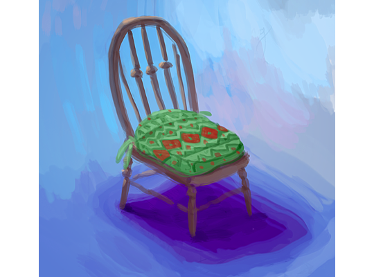
Let’s get right to it… Here’s a look at the dining chair that will be included in the theme. Once again, that wonderful classic Christmas pattern is featured on the pillow of the chair. This will definitely match the dining table perfectly:
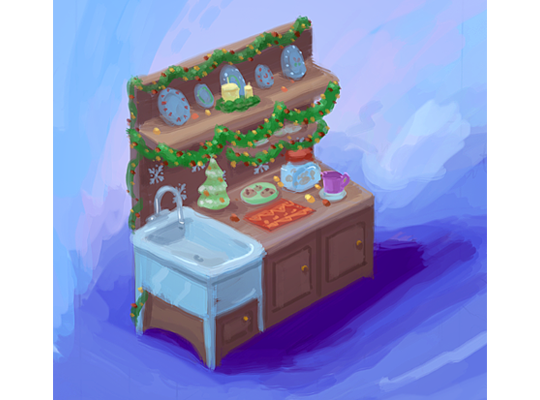
Here’s a look at the Christmas Cabin counter. We don’t really have anything like it in the W-Shop. That sink will come in handy when cleaning up after a cozy Christmas dinner:
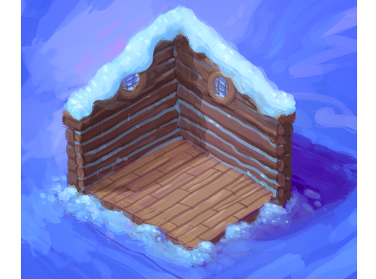
Finally, here is the Christmas Cabin wallpaper and flooring. Love the snow that’s featured on the roof of the cabin. Those circular windows are also a nice touch. The windows will be located above each door if you choose to add another room to your Christmas Cabin:
What do you think of the second half of this theme? Do you have feedback for our artists before we start modeling the final items in 3D? Please feel free to leave your comments and feedback in the section below, and stay tuned for a first look at the final 3D items that will be released in the W-Shop December 1st…






Oh my gosh I absolutely love that sink!!! Only thing is that i would like the sink legs to be taken off so the sink merges into the cabinet below. i also adore the wallpaper!! This theme is looking amazing. So glad it won. :D
Haha, right??
I love the sink/prep station!!!! There are many of these old relics still around. We had one where the cabinet had a built-in bin for flour. It was meant to be a place to make breads, etc. When it was all closed up it just looked like a hutch. Our sink had only 2 legs. You can still find 2 legged sinks today. Some people had a “curtain” around the bottom of the sink, (a great hiding place for youngsters). This has to be my favorite piece. Please don’t change it. For those who doubt, you can search for photos of these wonderful old “Hoosier” kitchen work stations. Yes, they had a name. It was a space saver to have the attached sink.
I would of rather had the Santakinz Theme instead of this one. I already have stuff like this in my house. It would of been better to have the Santakinz one.
Wonderful stuff here! I can’t wait! I’ve always wanted to live in a log home and I would have it decorated rustic style year round, so I just love the flooring and walls! That mug of perhaps cocoa, and cookies just make me want to take it over to the dining table, warm up with the fire going, and read a book, or play a board game, or do a puzzle with family. I could imagine this type of cabin being in the mountains and that means I might have a sleigh. I would like it if there were sleigh bells (jingle bells) to hang on the wall, that really jingled. I love that sound! Thank you all so much for working so diligently on this concept and for creating it just for us. It’s going to be awesome!
This looks very cozy! I agree with the others about the sink though. And I hope there’s gonna be a nice big fireplace…
Yes take the legs off the sink and just make it a cabinet.
I think the sink should just be in the middle of the top without white legs
I really like the idea of windows above the doors! There should be more wallpapers like that! as for the kitchen i think it would look better if the sink didn’t have legs- it doesn’t seem to work logically for a sink to have legs whilst being part of the cabinet. I would also like to see it have two rotations with the Christmas decorations and two without.
You’re right, I agree with you and alexandraandrew above, the sink shouldn’t have legs. We’ll see if they like our input!
i honestly have no idea how this theme won and not the santakinz one. this just looks like the whatever you call it cabin-like theme we already have but with slight adjustments to make it look slightly wintery. meh
Yeaahh.. I kinda agree.. This theme is a bit ‘meh’ for me too. I mean, it’s a nice theme, but it’s just very similar to stuff we already have.
eh I disagree. anything with snow on it can be Christmas-y, so a snowy cabin filled with stuff with Christmas patterns on it makes sense to me. when you say cabin theme, do you mean the campkinz one or the countryside cabin one? either way, I don’t really see many similarities between them and the proposed Christmas cabin ones. also, I personally didn’t like the santakinz cottage theme, probably because I didn’t really like the santakinz workshop theme when it came out and the description said it was going to be like that.
Majority rules is usually how a voting process works. To me, the Santakinz looked like the Christmas themes we’ve gotten over the last several years. One thing that’s neat about this theme is that you can substitute pieces that will make it a year round summer cabin or a winter retreat. :) You could even leave the Christmasy parts up all year long, we have people that still have their Christmas lights up from last winter! :) ha ha!
I love them!