Last week I showed off the first half of the Christmas Cabin room theme and today, I am excited to reveal the final 4 items that will be included in this theme.
I am very happy with the way these items turned out. Our artists did an amazing job designing them, as usual.
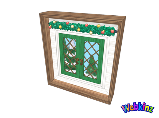
Take a look at the Christmas Cabin window. The scene outside will change based on where you position it on the wall. We have done this with a few windows in the past and it has really added a special touch to room designs:
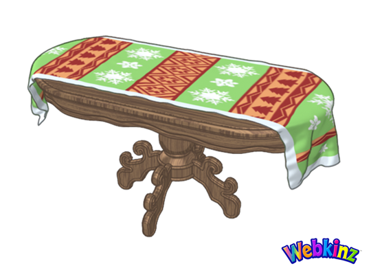
I love the detail that’s featured on the tablecloth that is draped over this dining table. The beautiful wood grain is also a nice touch:
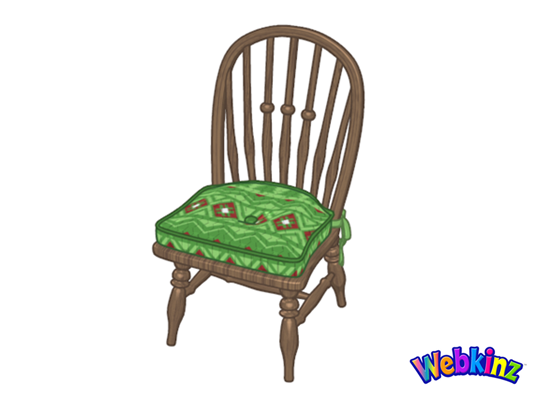
Here’s a look at the dining chair that is made to match the dining table. I think that this chair will look great in a variety of room designs:
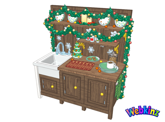
Finally, here’s a look at the kitchen counter that has been decorated for Christmas. When you click on this item, the sink will fill with water. Clicking it a second time will empty the sink. It’s a fun little touch to a beautifully designed item:
The Christmas Cabin room theme will be released in the W-Shop, for KinzCash, on December 1st. Do you have a favorite item that’s included in the theme? Let us know by leaving a comment in the section below…






Very nice theme, when will we be able to buy it?
I will have loads of fun with the interaction with the sink!
Looks amazing! I hope a lot of it doesn’t end up deluxe-only so I can get it all! I’ll be saving up my Kinzcash! lol
I really like these! The old time frig in the Wshop will look great with that kitchen counter!
I really am looking forward to the theme, it turned out beautifully. I wish the designers hard left both legs on the sink, though. It no longer looks like the real thing. Sorry, I just don’t see how removing one of the legs made it better.
It’s not removed, just painted. Although I do see your point.
Hi guys! I closely compared the concept drawing with the finished one. Actually if you follow the woodgrain beneath the sink, the right leg is definitely missing. Actually the whole bottom line was changed, making it look clunkier. It’s just my opinion here: I think the sink would have looked better with the area below it left open, all 4 white legs visible to some degree, and with a little basket of pinecones (or something rustic) sitting beneath it. Or reposition the towel rack from the right side of the counter to the current cabinet below the sink to diguise the awkwardness of the leg situation. Oh well, ahem, enough “armchair [designing]“, lol.
Can’t wait for these to go on sale. I love decorating for Christmas.
This theme is so beautiful. Can’t wait to go shopping!
I like the final version of the table even better than the earlier concept drawing. Looking forward to this theme.
Every piece is beautiful, and I love all the details, like the sink filling and the windows changing. Ganz designers, you are awesome, thank you!
These turned out so well! Can’t wait to decorate!