Hey guys, I’m back with some new Garden Oasis concept drawings! If you missed my first post, you can see it HERE.
The Garden Oasis room theme will be released in the W-Shop this July. Stay tuned to Webkinz Newz as we show off concepts drawings and the actual items as they are being created, allowing you to provide feedback to help us make this the best theme possible.
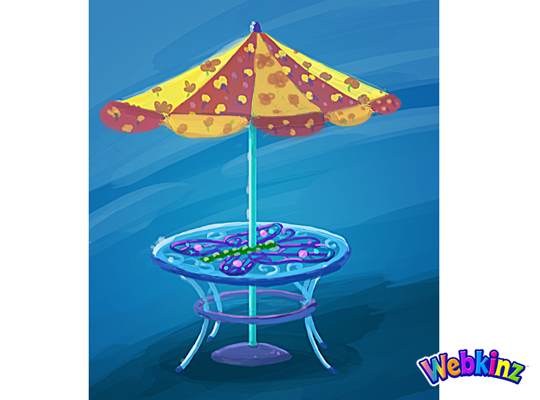
Here’s a look at the concept for the table that will be included in the theme. This will add a burst of color to any outdoor yard:
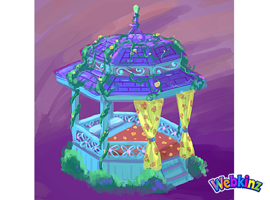
This Gazebo matches the table and looks like the perfect place to have a nap:
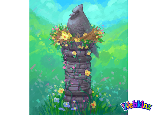
The stone bird featured at the top of this column looks like it’s sitting in a bird’s nest made of flowers:
Here’s a couple of color variations for a waterfall. Which one do you prefer, or do you think the stones should match the color of the column?:
This stove is meant to match the look and feel of the Iron Wood Watering Can and Side Table that we released during Spring Celebration:
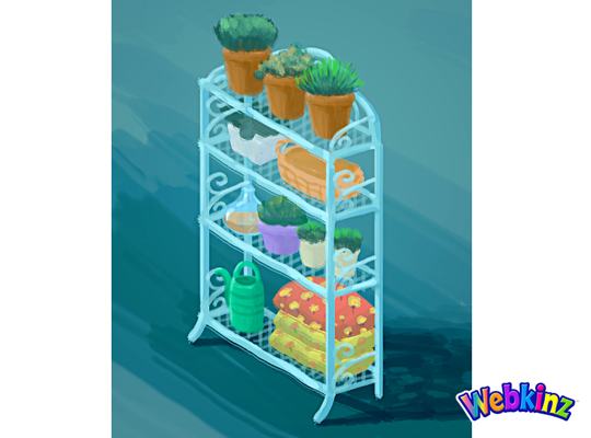
Finally, here’s a look at the shelf that will be included in this theme. It looks like this would also work well as a room divider:
The 3D artist will use these concept drawings as inspiration when designing the final items that will be included in this theme. So, please feel free to leave your feedback in the comments section below.
Remember, the Garden Oasis room theme will be released in the W-Shop, for KinzCash, on July 4th. Stay tuned to Webkinz Newz for more concept drawings soon!

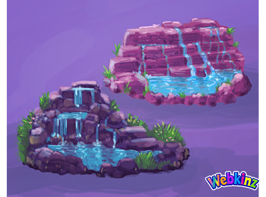





Well, neither waterfall matches that column…but I adore both. I think I slightly prefer the color/design of the darker one, though.
I like the darker one too
Definitely the darker waterfall.
I prefer the darker colored waterfall, but I’d love if turning the waterfall gave you the option to have more then one look to it
I love where this theme is going…thank you, design team! My favorites are the plant shelf/room divider, the stove, and that the gazebo doubles as a bed. Brilliant! Like many others, I prefer the lower left waterfall and would like to see it the same color as the column, which is perfect just as it is IMO.
Really like these items! I think the waterfall stones should match the column. If not, I like the darker one better.
I LOVE the darker waterfall – color and deign. I think the stone column would be so much prettier in this dark purple color. And the redish background on the gazebo coverlet and the table umbrella should be more of a lavender or purple color. Thanks for the opportunity to make suggestions for this AWESOME theme!!!
Love, Love, Love that plant stand! As for the waterfall – what fun if it was a reversible item, click and it revolves to the other color!
I haven’t yet taken the time to read all of the 125 previous comments but here are mine. I don’t care for the red/yellow umbrella on the table. I would prefer it to be a blue/purple or a purple/blue with purple as the predominant colour as in the roof of the gazebo. As far as the waterfall is concerned, I like the design of the darker one as it has much more detail (plants, etc) but I would like to see this in the blue and grey (like the stone column). And speaking of the stone column it would be nice if the bird were coloured in the light blue like in the plant stand. This really isn’t my favourite theme (sorry Mandy) but maybe when the finished items come out they will have changed enough to “wow” me.
I think the stones would look good matching the column, natural looking, for the waterfall.