Hey guys, I’m back with some new Garden Oasis concept drawings! If you missed my first post, you can see it HERE.
The Garden Oasis room theme will be released in the W-Shop this July. Stay tuned to Webkinz Newz as we show off concepts drawings and the actual items as they are being created, allowing you to provide feedback to help us make this the best theme possible.
Here’s a look at the concept for the table that will be included in the theme. This will add a burst of color to any outdoor yard:

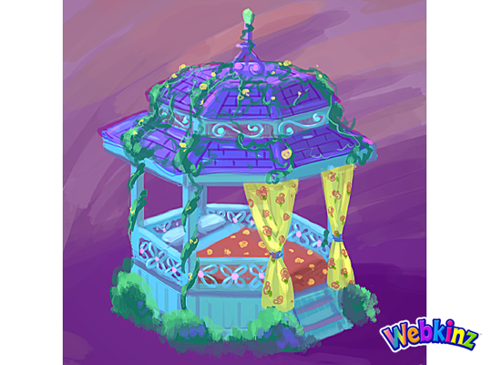
This Gazebo matches the table and looks like the perfect place to have a nap:
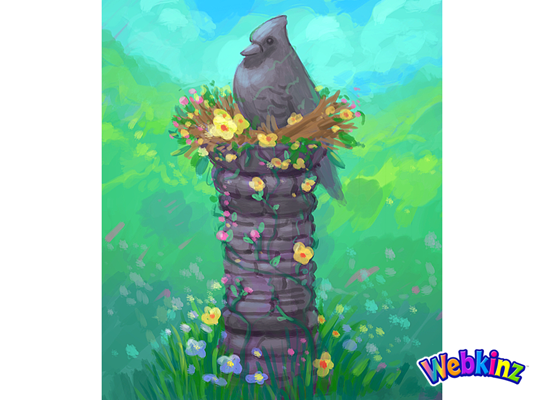
The stone bird featured at the top of this column looks like it’s sitting in a bird’s nest made of flowers:
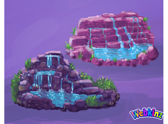
Here’s a couple of color variations for a waterfall. Which one do you prefer, or do you think the stones should match the color of the column?:
This stove is meant to match the look and feel of the Iron Wood Watering Can and Side Table that we released during Spring Celebration:
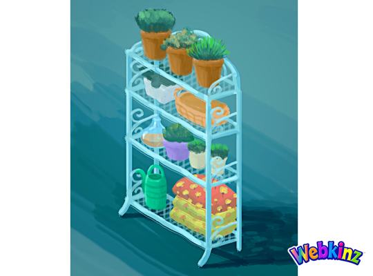
Finally, here’s a look at the shelf that will be included in this theme. It looks like this would also work well as a room divider:
The 3D artist will use these concept drawings as inspiration when designing the final items that will be included in this theme. So, please feel free to leave your feedback in the comments section below.
Remember, the Garden Oasis room theme will be released in the W-Shop, for KinzCash, on July 4th. Stay tuned to Webkinz Newz for more concept drawings soon!


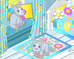





The bed is a beautiful concept. I prefer the bottom left waterfall.
I would prefer the waterfall to match the column.
Wish the waterfall could change colors and perspectives, but I’m greedy lol :) I love the column, it’s majestic and blends so well with the colors. Everything so far is truly beautiful. I love it and can’t wait. We are saving up our Kinzcash!!
I like both the waterfalls!
I want these so bad! :D
I like the darker stone waterfall. It looks like it would be in a cool shady spot. Speaking of cool shady spots… I would LOVE to have a new big beautiful tree or two with this theme. I love a garden yard that has both sun and shade areas! I also would love a tile that can be placed to look like a garden patio area. Right now all I really have to use is the snowy cobblestone tile from the outdoor Christmas village a few years ago. I would love a snow free one of those maybe that could rotate into different color stones for different looks like beige and grey.
I agree that the waterfall feature needs to be more like real rock colors and match the column with the bird and the stove, (which I actually thought was a lantern). The umbrella on the table would look better in all turquoise shades because the orange and yellow don’t match anything. I really like the look of this theme overall and I look forward to decorating a new yard space.
What beautiful designs. I love them all, especially the gazebo bed. I think the purple waterfall is the best one.
I agree the purpleish stones for the waterfall would match the warmer colors in the theme, bringing balance to the two distinct aspects.
I like the dark stones in the waterfall the best – in fact I would prefer a realistic grey to either pink or purple. The pretty plant shelf needs to be a shade darker to match the metal in the table. I am glad the gazebo is a napping spot – I love making outdoor rooms for my pets. Thanks for this new theme!
That is a good point. Or instead of gray a nice sandstone texture and coloration.
I think the waterfall stones matching the column would be the most versatile so it can be used with other themes too. I like the design of the dark purple waterfall the best.