Hey guys, I’m back with some new Garden Oasis concept drawings! If you missed my first post, you can see it HERE.
The Garden Oasis room theme will be released in the W-Shop this July. Stay tuned to Webkinz Newz as we show off concepts drawings and the actual items as they are being created, allowing you to provide feedback to help us make this the best theme possible.
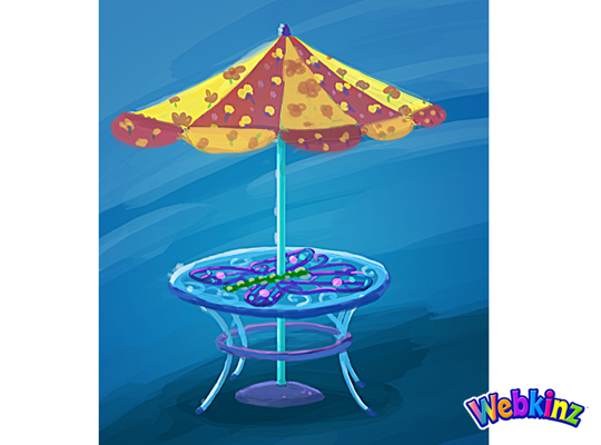
Here’s a look at the concept for the table that will be included in the theme. This will add a burst of color to any outdoor yard:
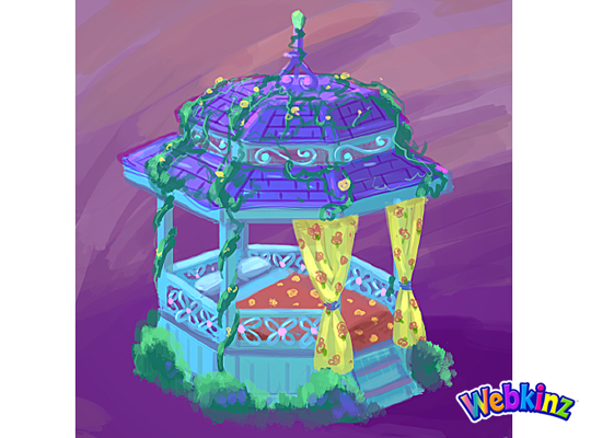
This Gazebo matches the table and looks like the perfect place to have a nap:
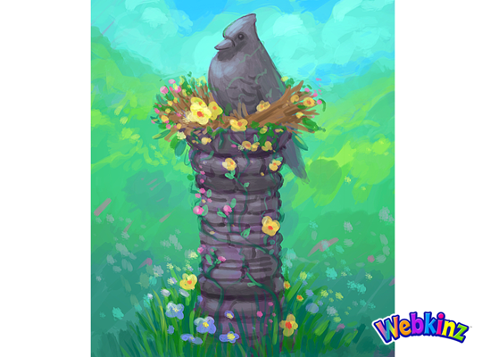
The stone bird featured at the top of this column looks like it’s sitting in a bird’s nest made of flowers:
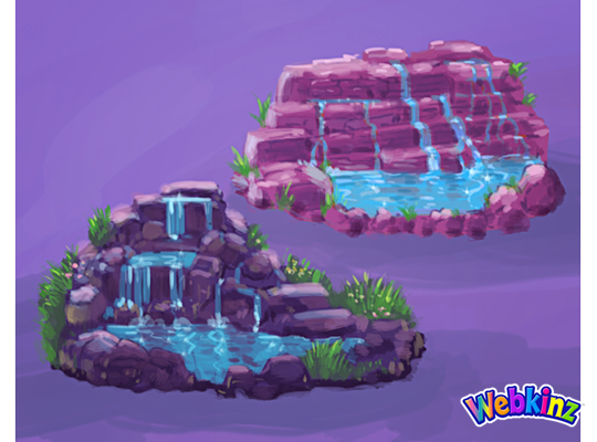
Here’s a couple of color variations for a waterfall. Which one do you prefer, or do you think the stones should match the color of the column?:
This stove is meant to match the look and feel of the Iron Wood Watering Can and Side Table that we released during Spring Celebration:
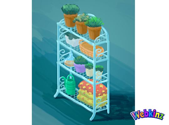
Finally, here’s a look at the shelf that will be included in this theme. It looks like this would also work well as a room divider:
The 3D artist will use these concept drawings as inspiration when designing the final items that will be included in this theme. So, please feel free to leave your feedback in the comments section below.
Remember, the Garden Oasis room theme will be released in the W-Shop, for KinzCash, on July 4th. Stay tuned to Webkinz Newz for more concept drawings soon!






I think the red is a bit too much and while it does , its too different from the rest of the color scheme. Maybe orange instead?
Well I LOVE this theme so far but I agree with the people who said the umbrella looks like a circus tent. It’s interesting how no one has mentioned the same color pattern on the gazebo though, so I guess you just have to choose how you use it wisely. Like the person who requested no “vomit of color”" I think it borders on being too busy colorwise. The red and yellow are accent colors not main colors and they get a little to much space on some pieces. I also agree with the people who have asked for realistic colored stones on the waterfall. The pink is too cartoon/fantasy and the purple is too freaky forest. That being said, I like the design of the purple one best. I’m a little mad that the shelf will come out shortly after I spent estore points on a similar shelf because I’d never seen it before and like the idea but I like this one better. Oh well, I’m sure I’ll find a place for both. Overall, I can’t wait to see this theme.
I prefer the darker rock and the waterfall on the right. It’s more original compared to past designs.
What if the water fall becomes one of those items that changes with each turn; using both of the artist conception waterfalls (with their different looks and coloration) as turn options 1 & 2, and with the darker coloration of the pillar for each one as turn options 3 & 4, so that each person could use them with even more flexibility and creativity in their gardens. ♪♫LadyBeauty♪♫
HI LADYBEAUTY!!!! How are you? Its me-BlackBeauty!
Wonderful each piece is so exciting can’t wait its so wonderful to have a new theme at the w shop well done job Many Thanks!!!! Happy Happy!!!
The darker waterfall is better, I think it goes with the theme better and would be more versatile with other themes. I love the gazebo! Thanks for the update, Michael. I can’t wait for this theme to be released!!
I agree the darker waterfall is more versatile.
i love this new theme! so magnificent! :)
hopefully we will be able to buy all items, and not at the e-store
Ganz please please PLEASE make the waterfall item available for everyone! I am an avid waterfall/fountain collector and this would look REALLY great in my collection yard
As far as the waterfall goes, I would go with the more rose colored one. As for the more purple colored one, hang on to that one until fall to go with the Rocky/Halloween theme.
IMO: The umbrella is way too busy-looking, but the table is lovely; The gazebo bed, bird column and stove are PERFECT the way you’ve shown them here; I prefer the overall look and shape of the lower left waterfall, but whichever design you go with, the colours of the stones need to be the same grey as the column – I don’t, at all, care for the pink or purple colouring as it seems completely unnatural when paired with that bird column; finally, the towels/cushions on the bottom right of the shelf seems off-balance to me, and somehow incongruous. Maybe if you were to change these out for a potted flowering plant instead? Or maybe move the watering can to the right and place a “cement” figurine of a turtle or an owl in the same colouring as the basket on the second shelf?
Wow! These are all great comments, Powerann! Thanks for taking the time to be so specific! Definitely agree that the same colour grey should be used for waterfall. And great idea to add a grey stone turtle or the likes in place of the towels on the shelves!