Hello Webkinz Newz readers, Ella McWoof here with a special report! I recently showed you the first set of concept drawings for the Sweet 16 room theme and now I’m back to show you the second set! The 3D artists will use these drawings as a guide when actually creating the final items that will be available in the W-Shop on July 10th.
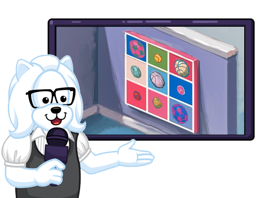
Here’s a look at a colorful painting that you could hang on your pet’s wall. Remember, feel free to leave your feedback and name suggestions for these items in the comments section below this article:
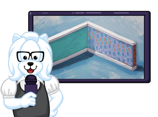
Here’s a first look at the wallpaper for this theme. I really like the pattern on the right wall:
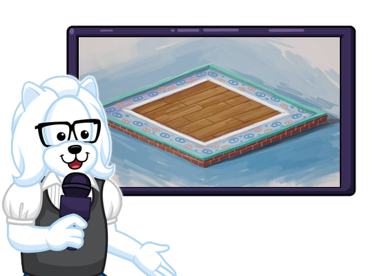
Now here’s a look at the matching flooring. That trim is great and I love that brick boarder:
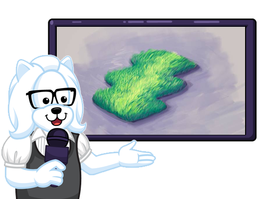
take a look at this carpet. What an interesting shape:
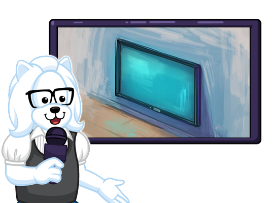
Now this is interesting… this looks like a large screen TV:
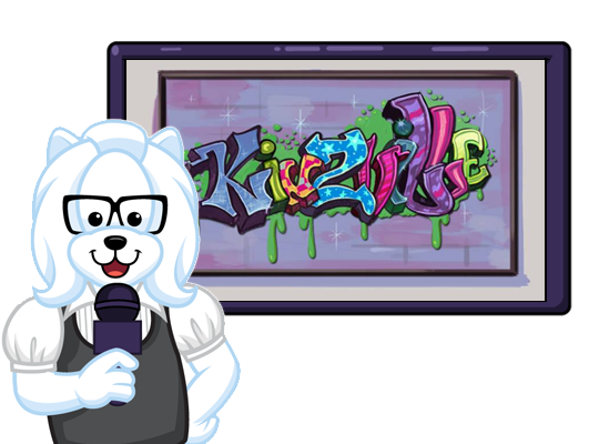
I think that this next poster would be a great addition to any room:
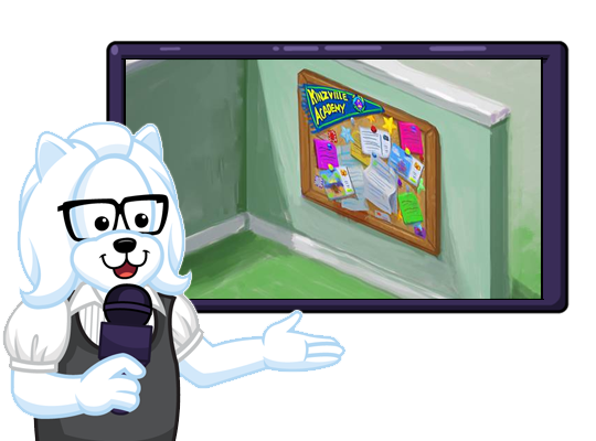
I love that Kinzville Academy banner that’s displayed on this cork board:
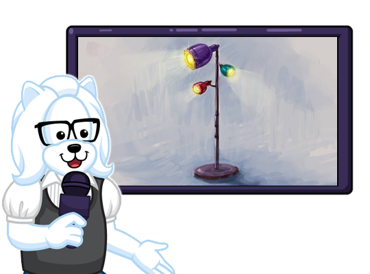
I love this light stand. I don’t think we have anything like it in the W-Shop:
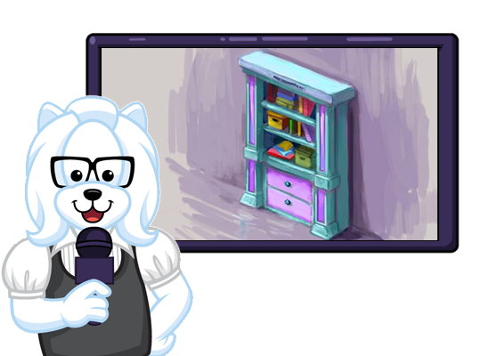
Finally, here’s a look at the bookshelf that will be included with this theme:
Remember, this theme will be available in the W-Shop on July 10th! In the meantime, please feel free to leave your feedback and name suggestions in the comments section below!
Miss the first set of concept drawing? CLICK HERE to see them now!
This has been Ella McWoof reporting for Webkinz Newz…







This is such a cool room theme, I love the bookshelf, lights, and cork board!
Not really one of my favorite themes, XP I think a theme that would be cool would be a wood land theme, with a river drawn out on the floor. Although the Red Wolf’s flooring is kinda like that (:
I love this theme! Not 16 yet, but I want these in my room as soon as possible! (KinzRoom of course ;) )
Cool lamp bulletin board and bookshelf. Does the shelf hold anything or is it just decorative? I think it would look good in a library room.
I’m really happy about this theme. I like the objects a lot.
For the painting I’m going to say it should be called the “Ball Pop-Art Painting” and for the bulletin board the “Busy Schedule Bulletin Board”.
Sorry, but I just can’t find anything positive about any of these items. It all looks like poor copies of items already found in WW, ie. the cork board looks like the kitchen bulletin board and the bookshelf closely resembles the starry theme shelf. The poster looks like the vandalism on the side of train cars! This is all very disappointing.
I know one room theme I won’t be getting…I must admit, I didn’t like a single one of these items. (And since I’m barely out of my teenage years…) Might I suggest a revision of your voting system so that it is fair? I know that until it is redone, no matter how interested in the vote I may be, I do not intend to use it again simply because a few persons can – and have proven they will – manipulate the system to their advantage and saddle us with something like this.
I agree with you about the voting system, juliettastarfly. I believe in democracy, and that each player should have one vote….. But I do like this new theme.
i really must say it has grown on me. Now this I can live with lol.
… My room looks nothing like that. ;) It has Lego posters, video game decals and pictures of dragons taped to the wall; and papers and stuffed animals all over the floor. And a rabbit cage in the corner and 2 Chihuahuas. ;) ~ spottytal
Wow…. :O You have a lot of stuff in your room!!! Mine has lots of posters… and I still have one I need to find room for!!!! :( :P -k19r