I am excited to show you the concept drawings for the second half of the Painted Glass room theme. Thanks to everyone who left feedback for the first set of concepts. Please feel free to do the same with this set. We will be reviewing your comments before modeling the final items in 3D.
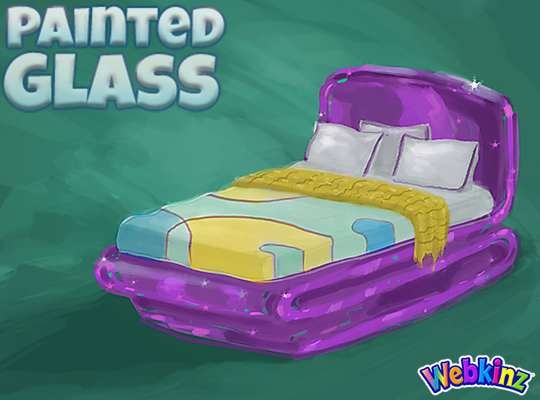
I hope TripleGFarms is happy with the look of the bed that will be included in this theme. I love the dark purple frame. Notice that the sheets match the wall divider we saw in the first group of concepts:
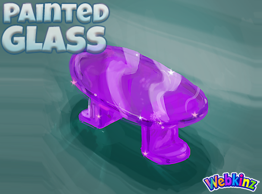
The glass side table will probably look perfect when placed next to the bed. Mike (the artist who created these concept drawings) and I were talking about this item yesterday and we thought the surface might look better if it was circular shaped instead of oval. What you you think?:
I am really excited about the sink that will be included in this theme. The idea here is that you will be able to mount the sink onto your wall giving it a nice, light modern look:

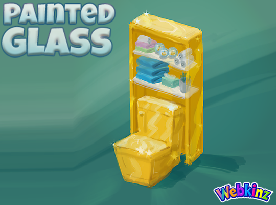
The toilet will have a nice set of glass shelves incorporated into the item. I really like how the items on the shelves match the colors of the other pieces that are included in this room theme:
The modern glass bathtub completes the mini glass bathroom set. Do you think all three pieces should be featured in the same color, or would you like to see some different colors used on some of these pieces?
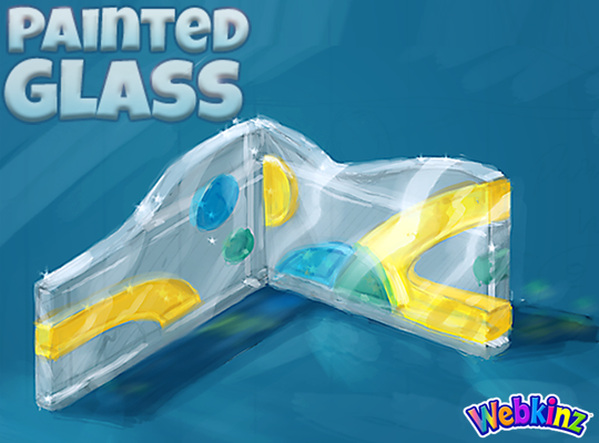
Finally, here’s a look at the wallpaper. I don’t think we really have anything like it currently available in Webkinz World. I love the wavy top and the fact that it will be slightly taller than our standard wallpaper:
Remember to leave your feedback in the comment section below and stay tuned for your first look at the 3D versions of these items coming soon… I plan on posting the first set on April 20th.
The Painted Glass room theme will be available in the W-Shop, for KinzCash, on May 8th.








I’d prefer that the side table be round; oval is fine for a coffee table, but side tables seem to ‘fit’ better when they’re round. I like the idea of the three bathroom pieces being the same colour. The designs look great, so far—bravo, Mike!
I think it needs some teal in there. The tub, sink and toilet all the same color is too much unless they could rotate to change colors. The tub needs to be purple or teal. Otherwise, this is shaping up to be very nice. Love the sink against the wall idea. Still hoping for a window or wall art component. Also a small table fountain or some candle accents would be nice, or maybe a glass vase like planter with those tiny glass pebbles in the base would be lovely.
love it!!! Thank you for my bed hahaha!
Wow! These items look great! I wasn’t super crazy about the painted glass theme early on, but I definitely think these pieces will get some use! The bed is quite nice–I will definitely have to make a room using them. As for the side table, I agree with you Mike and Michael, I think it would look better round. However, as there are many round side tables, an oval one might be interesting to work with. Just something to think about. I really like the wall-mounted sink, and it’s nice that this theme has a complete bathroom! It’s been a long time since a W-Shop theme had one. And the wallpaper looks quite cool so far! I can’t wait to see all of these items in 3D! Great work, Creative Team!
There is way too much yellow in this theme right now. The bathroom needs some color variety, especially since it’s a bright yellow and there’s already plenty of yellow in the other furniture pieces and the wall. and what will the floor look like? There’s already too many wallpapers without matching floors between the wshop, the estore, and the cozy condo theme, so there better be a floor. I do really like the design of the furniture and the walls (though I do think the lamp is a little too retro looking), I just think there is way too much bright yellow.
i would like to see differently coloured versions. if it’s going to be painted glass it should be multiple colours so then you can have variety. I do love what’s seen so far though
You could change the sink to the blue color & the tub to the green color that is on the wallpaper. I REALLY love the green color on the wallpaper. Since the table is a side table & not a coffee table I would go round. Pittiesrule
Hmmm, now I see that the dining room table is oval. Maybe the side table should be round…
These all are great. Very unique. I like the oval table rather than round.
I like the sink and wallpaper :)