I am excited to show you the concept drawings for the second half of the Painted Glass room theme. Thanks to everyone who left feedback for the first set of concepts. Please feel free to do the same with this set. We will be reviewing your comments before modeling the final items in 3D.
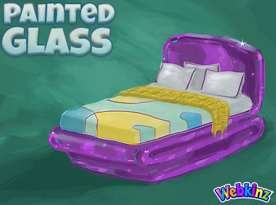
I hope TripleGFarms is happy with the look of the bed that will be included in this theme. I love the dark purple frame. Notice that the sheets match the wall divider we saw in the first group of concepts:
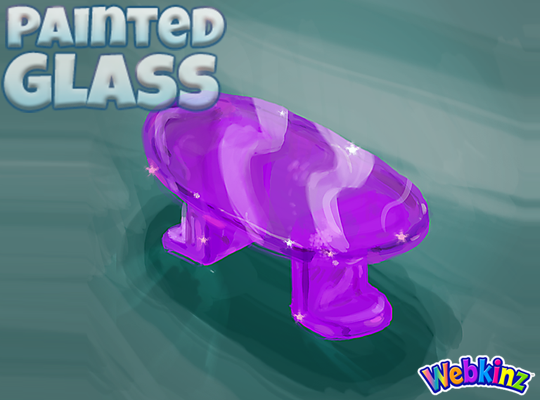
The glass side table will probably look perfect when placed next to the bed. Mike (the artist who created these concept drawings) and I were talking about this item yesterday and we thought the surface might look better if it was circular shaped instead of oval. What you you think?:
I am really excited about the sink that will be included in this theme. The idea here is that you will be able to mount the sink onto your wall giving it a nice, light modern look:

The toilet will have a nice set of glass shelves incorporated into the item. I really like how the items on the shelves match the colors of the other pieces that are included in this room theme:
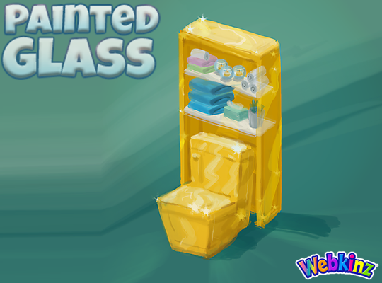
The modern glass bathtub completes the mini glass bathroom set. Do you think all three pieces should be featured in the same color, or would you like to see some different colors used on some of these pieces?
Finally, here’s a look at the wallpaper. I don’t think we really have anything like it currently available in Webkinz World. I love the wavy top and the fact that it will be slightly taller than our standard wallpaper:
Remember to leave your feedback in the comment section below and stay tuned for your first look at the 3D versions of these items coming soon… I plan on posting the first set on April 20th.
The Painted Glass room theme will be available in the W-Shop, for KinzCash, on May 8th.










Love this new design!!
Sorry not a fan. Did not like any of the three choices. The items we have to buy have more beauty. I going to pass on this set.
The bed is awesome!!
Love the theme! I am a huge window fan! Are you doing windows to go with the theme too? Can’t wait to see the final outcome!
Very unusual theme..gorgeous colors.
I like that the bed is purple. I got a lot of purple furniture from Peak-A-Newz a couple of years ago, but the bed was actually brown with a purple cover. Speaking of covers, I this one is a bit loud. It will fit well with other theme pieces, but it might make it hard to mix with other themes. I don’t like the rolled back top section at all. The edges are ratty. The color is wrong. The pattern is wrong. Everything about it is wrong. It looks like someone made a puzzle out of butter and it is melting.
I really like the bathroom set, wallpaper, bed, and side table. I love the items that are one solid color and I especially love the deep purple.
I wish there was flooring and a dresser to this set, but maybe we can get those items as prizes during an event in Webkinz World (like a Bake Sale) or as new exclusive items.
I like this much better. The yellow is more gold, which is what I suggested. It makes the theme gel together better, as bright yellow was too insipid. I’m looking forward to creating rooms with these pieces. I agree a circular table would be better than oval.
Happy to see there is a bed and a bathroom. Whatever is draped across the bed looks like it the family pet tried to eat it. Any chance of eliminating that from the final version? Or at least trimming the edge?