The Painted Glass room theme will be released in the W-Shop on Wednesday, but today, I have a look at the second half of this beautiful theme. If you missed my first post, you can see it HERE.
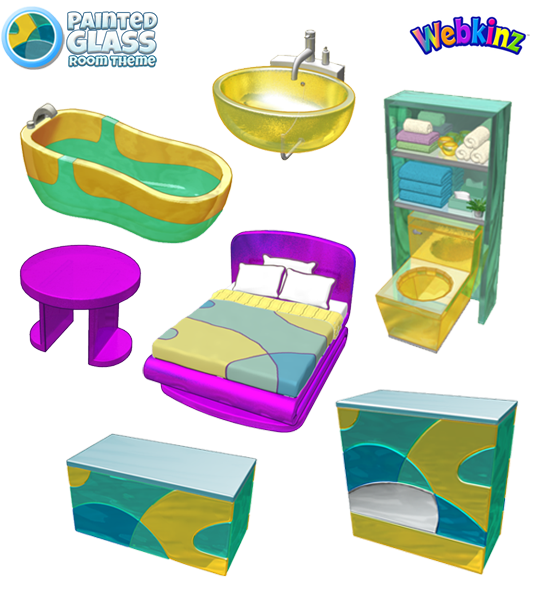
I love the fact that you’ll be able to place items on the Painted Glass Counter AND Room Divider. I can see players using these to create an epic trophy display! The bathroom pieces turned out great. Based on player feedback, we added more colors to them instead of making all 3 pieces solid yellow. Also, the fact that you can add the sink to the wall is a first. I think you’ll really enjoy decorating with these items:
I hope you’ve been saving up your KinzCash, because this theme will be available in the W-Shop on May 8th.
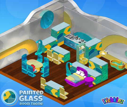
Do you have a favorite item that’s included in this theme? Let us know by leaving a comment below…





I really like everything, except the bed, tub, and sorta the side table.. the purple is too bright! The colors don’t really go together, bright purple and pastel greens and yellows. It seems a bit weird to me, plus the brightness of the purple makes it not look like glass. It should be lighter and more transparent.. same goes to the bathtub. Odd coloring and the “glass” looks very solid and not very shiny/transparent.. but oh well, it’s fine. I like every other item!
Whahoo! I can’t wait until the room theme comes out. :)
Why doesn’t the bed match? :(
It’s pretty, but that bed really stands out as the odd ball in the room.
I very much like this new theme. I think the wallpaper would look good as part of a space theme room.
Great innovations! Well done!
You can put things on the dividers? Wish they’d shown that. I agree with another about the sink–how do you put a mirror above it? I wish that the walls were like the floors, made of squares instead of columns. I can’t properly display a lot of my wall art because of space . Does anyone else think the purple pieces either look lonely or out of place. Hope people have kinz$$ after w-day!
PORT HOLES this theme colors remind me of underwater home.
Wow! This theme is beautiful! I especially love the colors. Hmm… my favorite piece. This is tough, but I think it’s the room divider.
I love the whole theme!! Very different and exciting!! Really like the table and chairs!
Nice, New Theme.