The Painted Glass room theme will be released in the W-Shop on Wednesday, but today, I have a look at the second half of this beautiful theme. If you missed my first post, you can see it HERE.
I love the fact that you’ll be able to place items on the Painted Glass Counter AND Room Divider. I can see players using these to create an epic trophy display! The bathroom pieces turned out great. Based on player feedback, we added more colors to them instead of making all 3 pieces solid yellow. Also, the fact that you can add the sink to the wall is a first. I think you’ll really enjoy decorating with these items:
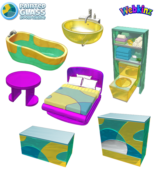
I hope you’ve been saving up your KinzCash, because this theme will be available in the W-Shop on May 8th.
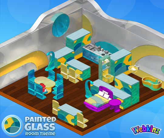
Do you have a favorite item that’s included in this theme? Let us know by leaving a comment below…





I always like the themes and items Ganz creates for Webkinz World, some more than others of course. But this time I have to agree the purple bed base and side table just doesn’t flow with rest of the theme. Perhaps the deeper shade of blue would be better or turquoise. I agree the purple is the ‘sore thumb’ in the room.
Love the uniqueness of this theme! This encourages players to go through other wshop or estore room themes to find pieces that mix and match! Not all the pieces need to be in the same room. I can not wait to find other purple items to compliment the bed and nightstand/table. Michael I would love to see your webkinz room design section feature this new theme and how to make it work by thinking outside of the box. Kudos creative team.
I think the bed and side table would look better if they were the same shade of green as the base of the bathtub or the same blue as the sink. I agree that the purple does not look appealing. I would only buy the bed if it was going to be in a room of its own with different themed accompaniments and wallpaper .
The pieces look ok on their own, but when they’re put together….idk I think it’s kind of an ugly theme
I think it’s probably the brown flooring that just looks a bit off with it. =) I’m sure if you used a white or grey flooring it would be beautiful!
Does anyone have a green leaf wallpaper they can send? Thanks. un Petlover365Bark
I LOVE THIS THEME!!!!
Me too…let’s get creative!
The bathtub should have also been purple, and more rounded and exquisite with accessories. Surely you have made also a flooring? That wood flooring you’ve used here certainly doesn’t work. Also you should have made something besides the bed and side table purple. A desk or wardrobe or window. Something needs to tie in the flair of purple so it doesn’t seem like a sore thumb. Sore thumbs are not good. Sore thumbs are bad.
I like the purple! But, i would like to see it implemented in some of the other furiture of this theme as well. THEN it would be so pretty! For now i will most likely just use some of these pieces for different room themes
I’m going to try the wallpaper in an underwater room – I think the translucent glass walls will create a very unique look.
Where did the purple come from? It’s a nice purple but definitely my eye is always going to the bed first thing when I look at the room since it’s the only purple there. Maybe the bed could have been white glass instead since the wall is and there is white in the divider. Man that bed stands out. Love the rest though.
Could not agree more with the purple though! That was the first thing I thought too, like what the heck?! I does not really match the rest of the set and looks like it doesn’t belong.
I agree! They should change the purple to that silvery/grey.
So sorry to say I do not like this theme at all.