The Painted Glass room theme will be released in the W-Shop on Wednesday, but today, I have a look at the second half of this beautiful theme. If you missed my first post, you can see it HERE.
I love the fact that you’ll be able to place items on the Painted Glass Counter AND Room Divider. I can see players using these to create an epic trophy display! The bathroom pieces turned out great. Based on player feedback, we added more colors to them instead of making all 3 pieces solid yellow. Also, the fact that you can add the sink to the wall is a first. I think you’ll really enjoy decorating with these items:
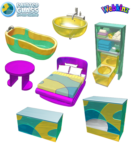
I hope you’ve been saving up your KinzCash, because this theme will be available in the W-Shop on May 8th.
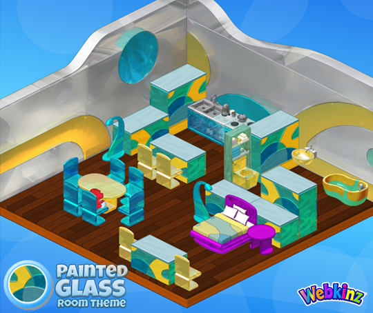
Do you have a favorite item that’s included in this theme? Let us know by leaving a comment below…





I really liked the look of the preview when it was in the voting stages but not so much a fan now that it’s come to fruition. I don’t like the odd mix-up of colors.
I really wanted to love this theme. I “like” it, just don’t “love” it. I will probably use the room dividers, but that’s about it. I love the colors, but not the purple. It just doesn’t go with the look of the rest of the room. Too much of a contrast and doesn’t look like “glass”. I’m glad there are many Webkinz Players that do love it. :-) Sadly, I don’t . :-(
I like how this is put together, and the fact about the purple is 100% fine to me, as I will lay it out differently so it won’t clash.
I feel like the purple is out of place since it’s that bright. Maybe a lighter color, like lavender, would help it not clash as much. Otherwise, very excited for this theme~
bella201223, what an excellent suggestion! Lavender would be perfect with the blue, yellow, and green! The dark purple is just too off! Too much of a contrast! A lovely shade of lavender would be just perfect. Hope Webkinz sees your suggestion and makes the change to lavender! :-)
im not too fond of it. i had pictured something totally different
Right off the bat, here I can think of THREE types of flooring that might suit this wallpaper. #1) Ice Block flooring from the winter theme for 430 KC #2) The Mega Modern flooring for 250 KC and this one I think will really work well, #3) The Beautiful Game Flooring. It has all those colors in it, plus the ‘swoosh’ look on the floor will totally blend with the walls.
SAND works and 10th Anniversary theme floor works too. Sand is used to make glass
I tried the sand with it and it doesn’t look good at all. The soccer flooring is definitely a perfect match. I will give the Webkinz 10 flooring a shot because I think you might be right about it tying the purple furniture into the theme, but I know that the sand doesn’t work.
Please Please don’t make this theme only for deluxe … I can’t afford deluxe but love some of the theme and can’t get items … so please consider a few items at least for regular members. thank you, Tenniss1
@tenniss1 – they don’t make a whole theme deluxe, but often some of the pieces are deluxe. If so, try the trading forums here on WebkinzNewz. There are kind people who are happy to trade/send items you are looking for. Also, I just posted a giveaway on the forum. ~ momssanitytime
Very interesting theme. It’s different and could be used in several different concepts. Personally I’m considering how I can use it in some of my space/future type rooms. Like most others, I’m really not sure why the random purple. None or more would’ve been better and a floor would’ve been nice too. That said though, this is really neat. I do wish that since we almost never get new themes in the Wshop now, we could get a little more with the next one. A 2×2 pool – a shower – a new blender and sandwich maker – swings and slides – we never get these things with the Wshop themes, it’s always estore. A new growing seed would be really neat too. Anyway, nicely done. This will be fun to incorporate.
I think this could be a very cute boys theme room
I think this new line of furniture turned out absolutely wonderful. It reminds me of the “Art Deco” era, and I love it!!!!!
P.S. I LOVE the bed!!!!!!