The Webkinz Newz community recently chose the Treat or Treat Street theme as this year’s Halloween room theme and today, I am excited to show you the first set of concept drawings!
I really like how this theme is turning out, but there is still some time before the artists start modeling each item in 3D. This is your chance to leave feedback in the comments section below. Tell us what you like or don’t like about each item or how you would make them better. We will be reading each comment carefully and take all your suggestions into consideration before making the final items.
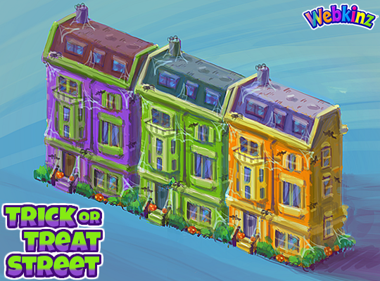
Here is a look at the homes that will be included in this theme. You will be able to add the homes to the border of an outdoor room to create the feel of a neighborhood that is decorated for Halloween. There will be three different homes, each featured in a unique color. You’ll be able to mix and match colors or set up a neighborhood using only one. Do you like the colors we used?:
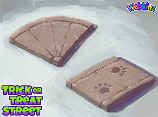
We added the road tiles that you could collect playing SPREE to the W-Shop and now you’ll have sidewalk pieces to match them. I think they will be perfect to use as pathways leading to each house as well. The paw prints are a nice touch but you don’t need to use them if you don’t like. The sidewalk tiles will change slightly when you rotate them in your room:
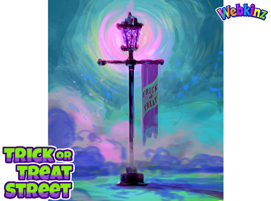
This lamp post is beautiful and I love that it will glow purple when it’s turned on. The Trick or Treat banner is also the perfect touch. What do you think?:
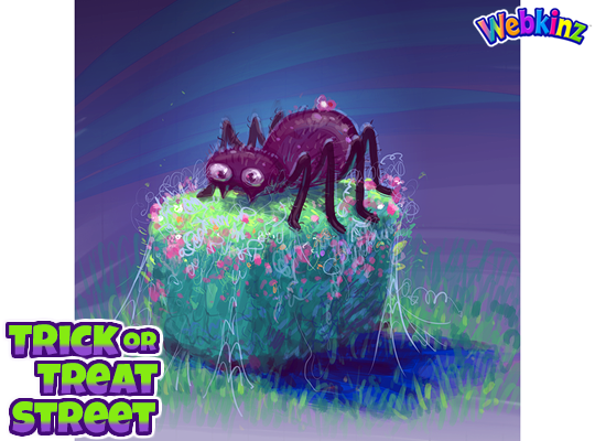
The last concept drawing I have to show today is a hedge that is decorated for Halloween. The concept drawing features a giant spider decoration resting on top of the hedge, but it will change with each rotation, giving you lots of design options:
Don’t forget to leave a comment letting us know what you like or don’t like about each item. You could have a hand in how the final pieces will look! We will be taking every comment into consideration.
Stay tuned for some more concept drawings coming soon. I plan on posting them on Saturday, Aug 17th.





I love the idea of an outdoor room but could we also get items you could put in an indoor room too? :) xx
A log in front of a well or 1 of the haunted tree house beds could be used on a grassy area. There is a withered grass area if you LOOK in the WShop ;)
This might get lost in a sea of comments, but I was wondering if anyone had an extra pink diving top and zodiac air shoes? My username is SillyGoose9 if you’re willing to send them to me.
I will, SillyGoose9! Sending you a friend request. I am farout4. :-) I have an extra pink diving top, but not sure about the Zodiac air shoes. I will have to check on those. If I do have them, I will send them. :-)
Oh, and you need to post these request in the Forum, in the Trading comments. :-)
Thank you for letting me know. And thank you for saying you’ll send me the items. I really appreciate it.
I can, I will send a friend request
One main question I have about the homes that will line the border of the outdoor room is: Will there be any gaps? Meaning I like it when the border is completely filled because the empty spaces look weird. I get that when you put a large room next to the smaller rooms it moves the placement of the doors, but I’d rather have it so that the homes will actually line the whole border. I don’t even know if this makes any sense but a long time ago we got a Christmas outdoor street kinda theme and the houses don’t line the edges perfectly. The empty space left behind creates an awkward gap that’s hard to fill.
Yeah I noticed how there’s gaps in the Christmas theme, It kind of messes with the whole look haha! I would love for them to make them fit perfectly with no gaps, great idea SillyGoose9! ;)
Love these ideas. It would be nice for the houses to fit. The Christmas houses I used the black iron rail fence to fill in the gaps. So If it is not possible to the houses fit maybe you could make some fencing to fill in the gaps. Thanks
I really like the colors here for the houses, they look great! I agree with Silly Goose about the sizes though, I have the same problem with the Christmas ones. Would need some of these in sets of 2 and some in sets of 3 (or some singles) to be able to fill an outdoor room nicely. I love the paths too, great concepts here, I’m really looking forward to this theme!
A small black cat lamp, wacky as a witch small lamps, jack o lanterns that our pets can carry. A fountain, a waterfall, a geyser. A small pumpkin that can work as an outdoor bed.
Maybe there could be a cat lying on a pumpkin or hay bale that could try and catch flying bats or fireflies. love all the concept art. :)
The spider on the hedge is cross eyed and doesn’t look normal. Please change. All of the other drawings look great.
LOL – The eyes do look a little funny, but I like this spider, I think it’s so cute! I’m not quite sold on that it looks like spring flowers in bloom though under the spider. Unless there’s a fall blooming bush that I just can’t think of right now.
Oh my goodness!! This looks so good!! I’m already excited for Halloween and it is still a ways away!! Thanks for sharing!!
I love the look of the row houses. These are from a day gone by, but ideal for this theme. You should check out the Edwardian row houses in London or the “painted ladies” in San Francisco before judging. It’s a grand look. I hope they don’t change. Can’t wait to see the rest of this theme.
I think that the pole for the lantern is missing something… maybe a web pattern?
Yes! A web (maybe not too big) hanging on the opposite side of the banner would really tie it in to the theme.
I agree! I like the lampost, but it seemed a little lopsided to me too. A little spider web is a great idea! I had thought maybe the same banner on both sides, maybe a different saying on each?
Were you aiming for “cookie-cutter” houses? If you were, then it’s fine, but you could do some variations in the detailing. Like, different styles of balcony railings, varying the locations of the cobwebs and bats, etc.