
Hey guys! It’s Michael Webkinz and I am very excited to share the first set of concept drawings for the brand new Home for the Holidays room theme with you! This theme is still a work in progress but it will be available in the W-Shop this December!
Check out the concept drawings for the Home for the Holidays sofa, wallpaper and flooring:
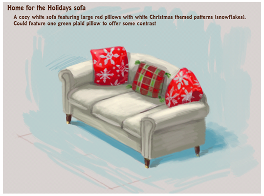
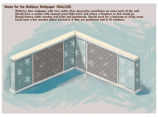
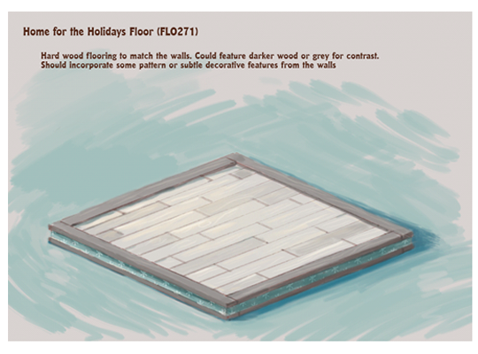
How would you change the look of these items? Do you have any name ideas for them? Please leave your feedback in the comments section below…




I think it should be called “Comfy Christmas Spirit”.
Maybe a blanket thrown over one of the corners, to give it a cozy feel.
hmmm, not too sure about so much red on the pillows. It might me too much for the blue/silver theme. Maybe a green would look prettier with hints of red? Can’t wait to see what else you come up with, this should be a very pretty theme.
Maybe you could call the sofa “let it snow sofa”.
This is a beautiful theme so far! I love the wallpaper and flooring. I imagine that the genericness of the theme gives a lot of leeway to where your imagination can take it, which is great
even if I kind of wanted the gingerbread house more ):I can’t wait for the rest of the theme to come out!I think the walls or floor could use more color but if the furniture has color like the sofa pillows that would work. I am happy to see Webkinz having an indoor Christmas room.
anyone reply
i think that the best name for this sofa would be plush bang bang sofa and by the way ad me on webkinz im rameenkhattak and plz okay
I don’t like the exposed brick on the wallpaper, and I think you should make it have a string of Christmas lights hanging on it. My dance studio does that. Otherwise, I LOVE IT! I think the couch should be called the Snow Soft Couch, the wallpaper and flooring should just be called Happy Holiday walls and flooring. I can’t wait to see the rest of the theme! And, I think you should make windows for this theme, big beautiful windows that are piled with snow! Otherwise, this room would seem a bit dark and dreary, don’t you think?
I would make them more bright to be honest. The gray casts a gloomy look over the whole theme in my opinion… Like add more white or make the wallpaper brighter… Past Christmas themes have always been cheerful and sweet! This one looks kind of snobby and dark in comparison.