
Hey guys! It’s Michael Webkinz and I am very excited to share the first set of concept drawings for the brand new Home for the Holidays room theme with you! This theme is still a work in progress but it will be available in the W-Shop this December!
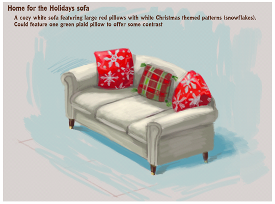
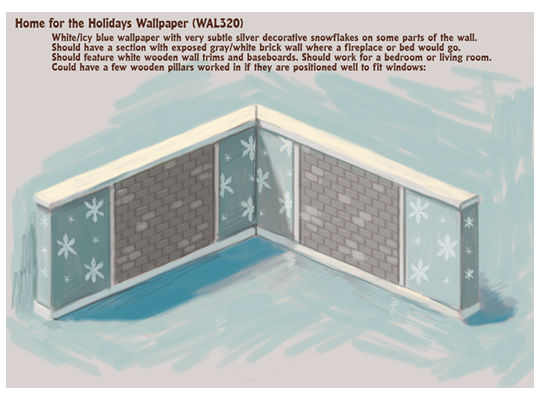
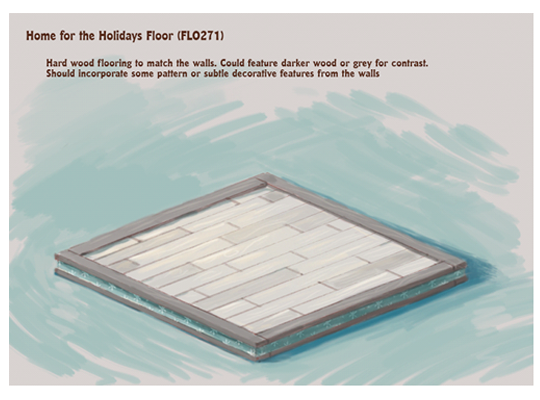
Check out the concept drawings for the Home for the Holidays sofa, wallpaper and flooring:
How would you change the look of these items? Do you have any name ideas for them? Please leave your feedback in the comments section below…




I really like the sofa! It could be either be part of a very cool room theme or it could go with existing rooms as just a touch of the holiday spirit.
I really like the sofa but the walls and floors seem a little boring.
I agree Temmesseefrogs completely. i like the couch the walls and floors are too depressing for Christmas
Cool, but I still wanted the gingerbread theme to win:(
ya I like that them
Don’t be a bad sport balletbear5M :( Try to think positive :) But yeah I still wish the Candy Cane Lane theme had won :( Oh well
grey is not christmas
no grey is not a christmas colour red& white or read & green.
Yes but grey is a style choice to go with the blue and the lighter tones in the items :) and think about it, It’s not like u have like green brick in real life on your walls for Christmas :)
yeah i guess grey would be a choice of colour but green brick? in real life i don’t brick on my house.
The theme sorta looks like a Christmas Apartment, I like that about it!
Yeah exactlly! But my house has brick on the outside :) not green or bright red brick :)
please dont make any of this theme deluxe especially the couch and the wallpaper, ARE you bringing back the outside christmas room theme?
No, this year this is the only theme for Christmas, sorry if you’re disapointed winter13579 :(
no i don’t think they are.
i also think you guys should make a new Christmas tree and a nativity scene that would be awesome :)
i like all of them… they are a little plain though. i would make the wall paper animated so the snowflakes fall down or hang up some strung christmas lights on the walls. make it a little more special
I like how you think! Make the snowflakes animated…love it! :D But I think they should make the lights a choice, so it could be a seperate item, you know? :)
Yeah animated items! They could fall down and then rise up! It would be so pretty!
It doesn’t look very “holiday-ish.” It looks more like a winter theme. It needs more color, especially green and red. I definitely think a darker wood would be better for the floor and the walls would be better with a traditional red brick and wood trim. I like the traditional theme, but please make it a little more festive. Thanks for all that you do!
Oh, please, keep the wallpaper the same and flooring, ganz, make the furniture more like that! I think you would have liked the Candy Cane Lane theme way better than this with your description! Maybe all who think this way should have voted for Candy Cane…
Those are my thoughts as well. I was surprised to see the blues and grays since that is not what was described to us. These walls and floors would make a nice winter room but they do not look like Christmas at all. If they made the paper red or green toned where it’s currently blue gray it would look more festive for Christmas. I understand people who don’t celebrate Christmas are happy it’s not Christmassy but that’s not what was described to us so I feel the description was misleading.
Awesome!!!!
This looks amazing! I love the subtle grays and blues, and the exposed brick looks wonderful! Wonderful work, Ganz. My only suggestion is to make fewer deluxe-only items.