
Ella McWoof here! With your help, I’ve sniffed out some important information about the X-citing new project, Webkinz X!
Now, in my EXCLUSIVE SCOOP, here’s more information straight from the TOP SECRET documents!
Players using our mobile app had an early preview of the new room and a few of its updated features. But now everyone will be able to play and design in the new version of the room when they log into Webkinz.com on July 8th!
Here’s what the new room will look like:
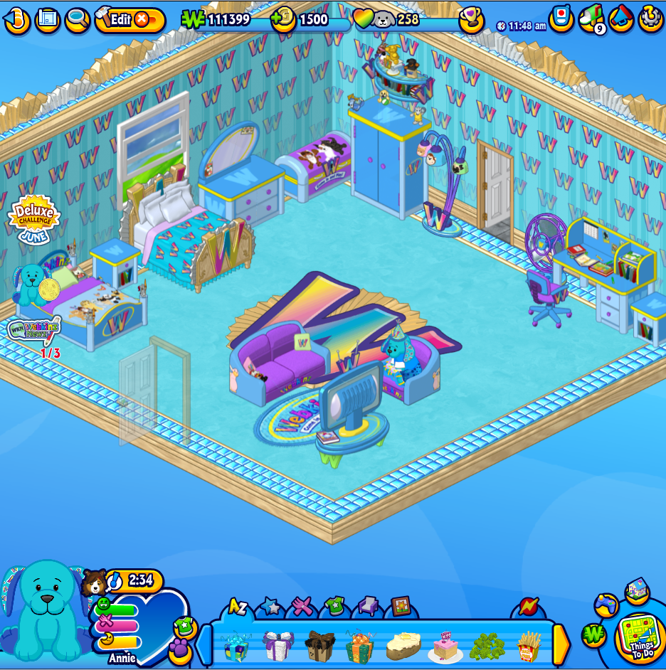
One of the best features of the new My House room is that it will now expand to fit in any size screen. We’ve also updated the look and layout of all the buttons and tools, some of which we’ve already previewed, like the new meters including the Pet Care Heart, the new Dock and the new Things To Do menu.
The buttons and options along the top of the room have also been updated and improved.
Top Left:
- NEW Hide/Show challenge icons
- House map
- Zoom (with NEW feature for scrolling in and out)
- NEW Edit ON/OFF button design

Top Center:
- KinzCash and eStore Points Display
- NEW Pet Care Hearts filled (for KinzCash and Family Score bonuses)
- NEW Family Score Display
- NEW Show Family Score Prizes button

Top Right:
- KinzTime display
- Friends List cell phone
- KinzPost mailbox
- Message Center
- NEW Options menu

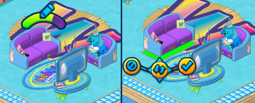
Editing items will also work the same as they do on the mobile app, with new edit controls and the ability to switch into edit mode by clicking and holding on an item. While you’re in edit mode, the doors at the bottom of the room will disappear to make it easier to move and add items.
While being able to change and remove doors from a room isn’t quite ready yet, the new room was designed with this long-awaited feature in mind and will be added in a future update soon.
The new room will also do a better job at handling stuck items or decorations misplaced by the doors added between rooms. If an item becomes stuck or misplaced, when you reload the room, it should automatically be removed and sent to your Dock.
Stay tuned to my column on Saturday, July 4th and I’ll reveal MORE about the X-citing secret project, Webkinz X!
So, fellow detectives, what do YOU think about Webkinz X so far? Let me know in the comments below!
Want to know MORE? Check out our Webkinz X Newz Article Archive here.





Ganz, Please, Please, PLEASE put the Webkinz Super fan theme back in the w-shop! It is my favorite theme and I want it back SO bad!!!!!! ~ Catqueen2014
WOW!! These are some BIG changes. Can’t wait for them to come to Webkinz World!! :) ~Midnight_Star
Hi! Could somebody tell me when will all these new stuff appear, so we can play with these changes?
Some of this is on MOBILE but my HAMSTER CROWN floats way above the pets head and watermellons are just signs . There is no harvesting and feeding pets hmm FORGET ABOUT IT IT WON’T WORK. But you can NAME ROOMS there in Mobile.
Yea!!! I can’t wait- except that after a while, I might get sick of all the blue…. :D
I would like to have them make it to where we could move our rooms around and place them in an order. also to be able to expand our small rooms to larger ones.
Great! moving doors! thatll be perfect!
I started playing in 2007 and I was very skeptical at first. But the more you show me the better I like it! I think it will be a wonderful change once we get used to the new icons, new locations etc. It’s still Webkinz only better! Keep it up!
The ability to remove doors??? EPIC!!!!!! Finally!!!!! Thank you thank you thank you :)
i AM HOLDING MY BREATH for OUTDOOR YEAR ROUND SNOW and MUD. Snow for my winter fun rooms and mud for grtden yards and kids play area.
Seriously, doesn’t it bother anyone that the menu is covering up part of the room? There is room at the bottom of the screen before the dock, why can’t the top menu be moved down there. This is so distracting and really ruins the look of the room. While I like some of the features, I don’t care for these icons and menus covering up rooms that we work so hard (and pay so much sometimes) to decorate. Total bummer!
I’m definitely excited. Two things: The icons seem small but maybe because it is a screen shot and also, sometimes the challenge buttons get in the way of decorating/catching floaties etc. Couldn’t they be moved down in the blue/out of the room?