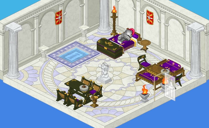
There’s something to be said for simplicity, and that’s probably why I like the Ancient Civilization theme so much! It works with such a basic palette, but looks so striking. See what I mean?
The flooring and walls are a lovely muted gray/grayish blue color. This works perfectly with the rich wooden tables and chest, and the deep purple upholstery. The bright red shields on the wall are the ideal accent in this lovely, understated room.
Now, I have to say that Elwin and I don’t exactly agree on how wonderful this theme is. I LOVE it. His comment? “It needs more color.” Some designers just don’t appreciate subtlety.
What do you think of this theme, friends?


Hey! I have that pool which, by the way, your pets cant swim in,
Well, the darks and the lights have a lot of contrast. It kind of hurts my eyes, no offense.
i have the pool, yes it IS a pool…
Oh, for all you people who think that the room needs colour, you can just get a different theme! This theme is SUPPOSED to be gray/white. It’s ancient Rome, not rainbowland! (or whatevs) ^_^
Hey, I like this theme! I can tell that it’s based on ancient Rome. :)
I don’t know what to think about this theme, i wish it had more to it, but it looks and sounds cool! But i agree with Elwin, it neeeds more color.
love it! but I would add a few windows…
I really like the new room theme, but I would definitely add more new things to the room theme because otherwise the room would be too empty!!!
I really like this theme. I have the pool and some of the furniture. I would like to get the wall and the floor. Hope you put it into the W Shop.
queen and kinds and princess