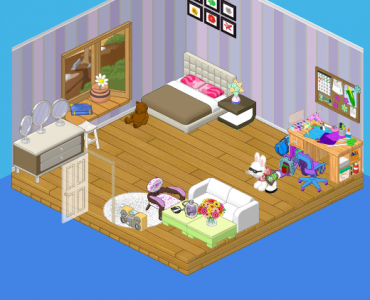
Hey everyone! Roberta here with some SUPER exciting news – the Designer Elephants redecorated my room today! And it’s BEAUTIFUL. Elwin and Hailey both drew up designs to show me, and then told me I could pick one…but I think I need some help to choose. Here’s Hailey’s design:
Really simple, very chic and definitely not little-girl-ish at all! I love the couch so that when Cowabelle sleeps over, she doesn’t have to sleep on the floor!
Then Elwin showed me his design. Look at those colors! And the bay window – LOVE it! It’s funny how both Hailey and Elwin used shades of purple, but in such different ways.
So help me out, friends. If you had to choose one of the designs, which would you choose?


Hmmm, there are things I like about both rooms, but I think I like Elwin’s (second) better. It looks more together and soothing for a bedroom. The first one is a bit too bright for me.
I would have gone with more blue, but I definitely would go with Elwin’s design.
ELWIN!!!!!
I’d choose Elwin’s design for sure. It looks more mature and comfortable.
i think roberta should chose elwin’s. it’s more organized. ~*~*PLG*~*~
That’s what I though peacelovegymnastics! I like the contents of Hailey’s room, but they should look more organized. Elwin’s is a welcoming, clean look.
THAT LOOKS AWSOME!!!!
For sure pick Elwin’s design.
I like Elwin’s design much better.
Never thought I’d say this, but, elwins. Hailey’s is too jumbled. Elwin’s is perfect!
I agree, Star! Elwin’s has a window, which I love, and his design feels more open than Hailey’s. Hailey’s seems too cramped, and it doesn’t really fit Roberta’s style. Hey, did you notice that now Hailey’s room has food? Remember when all of Elwin’s rooms had food? ;) :lol: ~*Dawn*~
I really love that window, I wish it was in my room! ; ) You’re right Dawn, that’s true. I hasn’t noticed that, but I know what you mean. : )
Cute………….and welcoming! Peace,Love,and Happiness from flitterfly1
Elwin’s is the best with that beatiful window. I love to have sunny windows to light my room, and sometimes I feel better about problems if I stare out a rainy window
elwin
Elwin’s. It has the window and it has a couch too. Also both have craft supplies which is good because it’s totally Roberta. ~(*)sparklegirlLT(*)
i have to say that both have great options, but I’m going with Elwin’s. it has the beautiful bay window AND the couch!!!!!!!
I like the second one WAY better. first of all the first one doesnt have a window. i love my big window in my room. :). second, the first one looks a bit empty. anyone agree?
elwin in spacing! but neither of them match totally.
Ooh! Those are both very cool. :D Sorry, Hailey, but I’m going to say that Elwin’s wins this time. The window is just so perfect for the room! :mrgreen:
Elwin!!!!!!!! I want the room
Those are both really good designs, but Elwin is just more ‘Roberta’! But I think it could use a little brighter colors. They are both great! :mrgreen: ~KK♥
Definitely Elwin’s design. :) Hailey’s is a little too crowded along the sides of the room, with nothing in the middle. . . . .
This is hard. I love the bed and the clothing rack in Hailey’s, but the window and desk area really fit in Elwin’s room. I’m going with ELWIN. (*(*dragonfish*)*) P.S. Did anyone else notice that the door is in two different spots?
LOL I was about to say the EXACT thing xD Maybe they did the door that way because she has two different room choices?
I agree. Sorry Hailey, But yours just doesn’t cut it.
I would choose Elwin’s room design. :D
Definately Elwin’s. Everything matches better and it would also be nice to hang out in.
AWESOME!! i like them both, but i like Elwin’s better. sorry, Hailey! :)
add me on webkinz world username: kathlyyn
flitterfly1 – You are so right! Both rooms are welcoming. I also agree that Elwin’s design is the best. I love the window, it still has a couch, and a work area. Roberta – aren’t you suppose to be getting a craft room, too? I am so glad we finally have seen Roberta’s bedroom! Sorry, Hailey, but Elwin wins this design. All the best! MDIChickadee
ELWINS ROOM LOOKS MORE PUT TOGETHER AND MATURE….AND SINCE YOU ARE BECOMING A BIG SISTER YOU SHOULD GO WITH IT!!!!!!!!
I like elwins room the best! Your friend sarahandlacey! :lol: :mrgreen: ;-) :-) :roll:
I’d choose Hailey’s. I’m totally one for the CHIC and MODERN style. Elwin’s is just not me. ~Phoenix Wind~
I like Elwin’s better. The Window has the best view, it’s really nice too! Also, the point of a bedroom is like a relaxing place (when you just want to be alone, that type of stuff), not to PARTY!!! ~CC~
Elwin’s. Definitely Elwin’s. H is too bright, sunny, chic, modern, party-ish, that type of stuff. E is really comfortable, cozy, warm-ish, welcoming, that type of stuff. And that’s exactly how a room’s supposed to look like, no? ♥
totally hailey! it’s funky, and totally MY style!!! redesign my bedroom!!!! plz!! -zodiac princess-
Elwin’s. Definitely Elwin’s. His design has that nice, cool, relaxed feeling, like a bedroom should. But, yes, as I just said, I DO like Elwin’s better, but neither of them look……oh, how do I say this……Roberta-y. They both seem a bit, just a bit, like something that would be better with Purrcilla, or Fire (Fire is my alley cat). No offense to you Roberta! But I guess that if I HAD to choose one for her, it would be Elwin’s. But I would have preferred this option instead of the Elephant’s designing hr room- A contest! Who doesn’t love a good contest? You could decorate a room in your house, send it in, prize would be…… Ahh…. Hm. Hadn’t really thought that one out. Oh well. It’s probably too late anyways. Byes! ○♥○MRT○♥○
I vote Elwin………..I love the window!! Peace, Love, And Happiness from flitterfly1
Am I the only 1 who likes Hailey’s better????
If i were you i’ed pick Elwin’s design because of the window!!!!!!!!! It makes the room look bigger!!