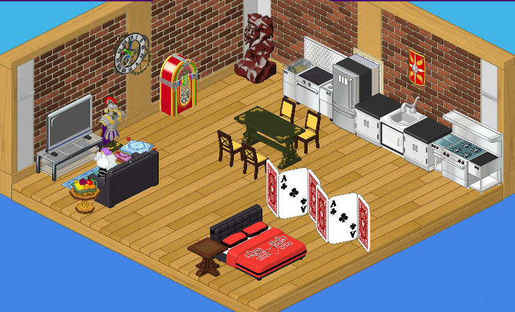
Elwin: Since Plumpy is going to be getting married, her best friend Wiggles is moving into a place of his own – his very own bachelor apartment! He asked us to make him a room that’s not only open and airy, but also chic and cool. Hailey and I put our heads together and this is what we came up with.
Hailey: I actually love this room! From the bare brick walls to the stainless steel appliances, it’s incredibly cool.
Elwin: I agree. My favorite pieces have to be the card dividers. Wiggles is an ace poker player, so he quite liked them.
Hailey: That TV is something else…I hope Wiggles invites us over for a movie night.
Elwin: And the jukebox? And hand-carved statue? How awesome are those?
Hailey: Very awesome. Just goes to show: you don’t need to use a theme to make a room look put together!
Elwin: So true. Having a lot of Rare items doesn’t hurt, though, does it?
Hailey: Definitely not.


This is one of my favorite rooms that y’all have designed. A perfect bachelor pad. I see you used the refrigerator to cover up the door. We do this a lot. Hope someday we will be able to eliminate doors for the wonderful wallpapers that need two walls. Keep up the designing. Always love to look at your ideas.
What a lovely room – I think it is perfect for Wiggles! All the best! MDIChickadee
Exactly what a good functional studio apartment should look like. Just like a basement or an attic room, it is furnished with the type of things you can get from family or friends. Odds and ends….Things don’t have to match. You gradually replace things as you can afford them. A couple of personal items, jukebox, statue, etc, a place to eat, relax and sleep, What more could a person/pet want? Personally, I LOVE it.
I agree with you. It is the perfect bachelor pad. Filled with mix matched furniture you would get as donations from friends and family when they got new things, but of course having the biggest best TV you can get. I am not a fan of the kitchen lay out though, but besides that I think its great. Good Job E & H!! **Robyn
sorry guys but your losing your touch its not nice but maybe for guys its ok
agreed! i never want them to decortate my rooms(i used to though)
I like it! It makes the room look put together, but what kind of table is that for the dining chairs? ~ Ke$hafan001
i don’t like it
The table is from the ancient civilization theme and it is definitely outta place with those chairs. **Robyn
But how come H & E are doing the design, I thought Wiggles was a designer too. How come he wasn’t at least helping with it?**Robyn**
ikr?! Glad that Robyn could remember this! I don’t like it. + Wiggles doesn’t live w/ Plumpy!
ok good cuz didnt know if wiggles lived w/ plumpy or not. cuz when i was first reading it i was like does he live w/ her! and yeah he is a designer and i dont really like the room i just like the kitchen.
I agree it’s ok, alittle too…… errrr….. mixed for me, I prefer a theme that matches, not sure about the rock bed and playing card divider.
i love this room/apartment i just bought one of the card dividers about an hour ago, ( their rare so i could only buy one ) ,anyway I love the different themes that are used in this room/apartment. too doodles ~ Mrs.DCriss :D
I LUV this apartment. I hope Wiggles invites ME 2 a movie night. :) I LUV the jute box & divider. Gives him some privacy. Andddddd music 2 rock out 2. I would LUV a jute box in my room. I’m a dancer soooooo I would be dancing 2 the music 24/7. ~Lemon*Starburst~
Hey, guys. Anyways, about this room, I find it way too random. A lot of the furniture doesn’t even match. The flooring and brick walls looks good, but the furniture looks nothing decent. The table and chairs should be where the carved statue is and put the statue next to the jukebox. The card dividers don’t match, I think. They should take those out. And the bed is in a random spot, and I think it’s not in a good spot. A bed and dresser in a way that would make it more closed off (That being said by Moonstar). Do Hailey and Elwin even think when they decorate these rooms? ~Chicago Made☠
The kitchen is the only part that looks normal and matches. I like the jukebox, but it seems so out of place in that room. I’m sorry to hear you’ve been sick, Chicago Made, but I do agree Lemon Starburst that I would love a jukebox in my room
I agree Lemon Starburst! A lot of people are saying they don’t like it, but I really like it. The design just…………… makes sense.
I love it! I wish I could design like you!:)
It is ok… ~Hello Kitty ROX! ^.^
I agree. Not one of my favorite designs ever, but it’s okay. :-)
I don’t like it… it’s too random.
the refrigerator is blocking the door!
I agree! It’s ok! You wouldn’t find this room in my house! Your friend sarahandlacey! :lol: :mrgreen: ;-) :-) :roll:
I’ve gotta say, I like that jukebox…sorry we haven’t been commenting much, we have end of school year tests running
It would be great…now I’m going to keep a look out for that space themed one in the curio shop!
I just dont like it. Agreed Moonstar, sometimes I wonder if they know what theyre doing because I wouldnt do that! If I had an apartment Id put 2 white leather sofas in a corner shape next to each other with a white shaggy rug in the middle and a mocha TV. Then Id make the kitchen look cooler by adding a grey and white cat kitchen counter and other sinks, fridges and counters. Then a tuxedo cat psi dining table or a mocha theme table and chairs. And Id make the bed more seperated. Plus wheres the bathroom in this apartment? ~KK (on LT)
Okay, that must suck having to go all the way down to the apartment lobby, if there even is one, to use the bathroom. And then showering would be a trick…
IKR? I hate it whenever sombody decorates a room, and something is blocking the door! It’s an ok room, but I wouldn’t like to have it in my house. *Peace, Love and Hope, Icewolf*
I don’t think there’s suppossed to be a door.
Kitchen DOES NOT MATCH AT ALL. and a nice rug would warm it up a little. I think the cave one would fit the supposed theme/