When we create a new character in Webkinz World, an artist creates a series of concept drawings of what the character could look like. Once a design is chosen, the artist then provides some color samples and finally, the character comes to life in Webkinz World!
Here are the concept drawings for PJ Collie who you can visit at the KinzStyle Outlet:
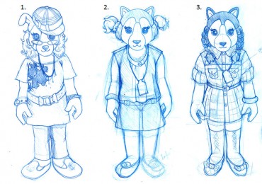
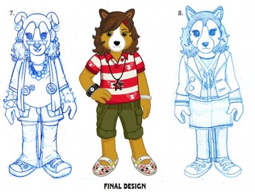
Which concept drawing of PJ Collie do you like best? Do you think that we made the right decision? Please leave your comments below…

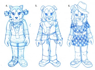



I really like 4 and 8 but I do think the final design was the best choice.
Mainly 3.
I like the designs 2 3 and 4 the best.
i agree what both of ur comments said she really should change!
Oh my, glad you decided to use the final design. She looked creepy in the first designs..
That’s exactly what I was thinking. The one they picked is WAY better than the other ones.
I like #8! It is pretty cute! but I really like how she is now! Don’t change her!
These are really fun to look at – a lot of detail went into all of the concept drawings. I think you definitely made the right decision. I love everything about PJ Collie’s look – her coloring, hair, outfit. The only thing I see that looks off to me are her feet. They just look misplaced – the right and left. The shoe buckles seem to be on the wrong side. But other than that – she is perfect!
I actually think number 2 and number four could have been adorable!
I think PJ is just perfect in her final design! They are all cute designs~ but the one that you decided on is by far the best!!!! I love her style!
Definitely made the right choice!
I totally agree. The PJ Collie that we have is really cute and the most fun choice of all the sketches. Great choice Ganz.
I like PJ collie just the way she is, I like your final design that you have there.. Just don’t make her look creepy, or weird looking like you did to Mrs, Birdy.
I agree~ she is absolutely darling! As 4 Ms. Birdy~ I still can’t get used to that shocking black hair…. How about a shorter cut 4 Ms. B., and maybe highlights?
the right choice was definitely made! but it is so interesting to see these concept drawings and brainstorming ideas… keep up the good work!
I totally agree with you they picked the right one! Keep up the good work Webkinz.
well, i like number 4 a lot better. she’s cute.
Same here
HA! I agree all the way. Amen sister. ~Storm
Yeah, what was with that new style of Mrs.B. I like the design of pj collie, but i would like it if u would change what she says, she always says the same thing, like when i buy one thing she says that’s a bunch!
No she is fine the way she is. It makes her look yongor
WOAH. O_O if PJ was going to look like those others, then that would be bad…. I like PJ just the way she is. ;)
Thank goodness webkinz chose the one they did!!!!! good choice webkinz
I’m sorry but I personally think that numbers 2 and 6 are the best designs, I think 6 would be perfect without the glasses. I do agree though the last one does kind of look like Mrs.Birdy
number 7 makes her look like an old person.
I like Mrs.Birdy the way she is to. Just like PJ collie