By Wiggles Pig
My clients were so happy with the living room I designed for them they came back and asked if I could work my magic on their kitchen. I managed to convince them to spend a little more this time around – after all, kitchens have some big ticket items. A fridge and stove can eat up most of your budget if you’re not careful.
So, with $3,000 burning a hole in my pocket, (okay – so maybe I went the teensiest bit over budget) I designed a kitchen in which the impact came from the contrasting colors – not from my clients’ pocketbook.
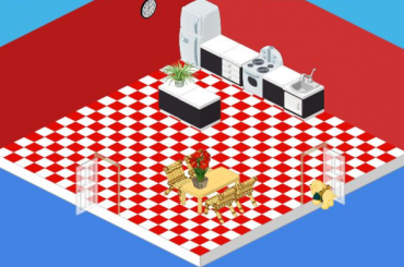
I began with a standard white fridge and stove. You can’t go wrong with the classics and at just $500 and $600, the price was right. With white appliances as my starting point I used red and black to create a sense of drama. Red and white tiled flooring combined with red painted walls make a bold statement. I then selected the Chic cupboards and sink. The black base and white countertop of my counters and island were a stark contrast against the red.
For my table and chair I didn’t want to detract from the effect I had created with my black, white and red theme, so I went with a simple Polished Oak Table. The Bamboo Study Chair may not have been designed for the kitchen, but when you’re working on a budget you’ve got to be creative. The chairs were a whimsical touch and picked up the color of the oak table and at $85 each they were a steal!
With a couple of plants (I love plants in a space!) and a simple Classroom Clock, my clients were eating their hearts out in their new kitchen.


I like it but if they would have put more things in the room instead of so much space I think it would be better.
Is this really the “after” picture? I thought it was the “before” and they just forgot to post the after – till I read the blurb. You are all correct – too BIG of a room for too FEW items. And the flooring does accentuate the bareness of the space. It doesn’t look ‘spacious’ – it looks EMPTY. Perhaps some designers with DESIGN background should work behind Elwin and Hailey…
can you do my ultimate kitchen!!!!!!
I have to agree the Red/White tile floor is too much, so I would change it to something maybe green with flowers and then add some plants along with some windows to break up the Red walls…put is some wall dividers, a sofa, 2 cofy chairs, and coffee table so that after maiking a wonderful meal for pets and friends you can retreat to the lounging area for chat and a game…
It’s SO bare! I whould add more stuff and TOTALLY change the walls and floors :)!!!!
I think I’ve gone blind…if ya know what I mean?
This room looks EXTREMELY empty! Needs more items in it so it looks better. Or, use a smaller room.
The red and white tiles of the floor are too glaring of a colour with so little in the kitchen irself. If there were more black and white cupboards around the kitchen and possibly even a kitchen island I think it would be more attractive and pleasing.
oooohhhh, my poor eyes.
I agree so much.
I am not a big fan of red, anyway, but this really hurts to look at.
I soooo agree with SoccerSquirrel.
Yawn….
THIS ROOM IS ALL RIGHT BUT BECAUSE IT IS SO BIG MAYBE USING COLORS THAT WOULD STAND OUT MAYBE MIGHT MAKE THE ROOM LOOK A LITTLE LESS BARE!!! THIS IS JUST MY OPINION BUT THANKS AGAIN FOR ANOTHER IDEA ON DECORATING ON A BUDGET…USING WSHOP COUPONS IS ANOTHER WAY TO SHOP WITH LITTLE MONEY..THE BIGGER THE COUPON USED ON THE EXPENSIVE ITEMS THE CHEAPER YOU CAN DO YOUR ROOM…THIS IS MY DECORATING ON A BUDGET IDEA!!!!
Its too bright and blod, also if they wanted to only use a few things, then they should have gotten a small or medium room, too much space left over looks bad!
HEY HARRYPOTTERNARWHALS! I SEE YOU SO OFTEN ON FORUMS!
Undoing the caps lock button goes a long way, THIS ROOM IS ALL RIGHT BUT. You don’t seem so loud then, and it’s easier to read your comments. :)
I really don’t understand how this room cost 3000 Kinzcash, because it looks so bare and there’s hardly any items. It IS a very bright room though… that’s the best word I can use to describe it!! :D
it UGLY!!!!
lol, calm down
i kind of agree, the tiles really look bad, and yes, they should have picked a smaller room, the large room itself costs 1000$!
AND the black and white with the red looks EALLY BAD.