By Wiggles Pig
My clients were so happy with the living room I designed for them they came back and asked if I could work my magic on their kitchen. I managed to convince them to spend a little more this time around – after all, kitchens have some big ticket items. A fridge and stove can eat up most of your budget if you’re not careful.
So, with $3,000 burning a hole in my pocket, (okay – so maybe I went the teensiest bit over budget) I designed a kitchen in which the impact came from the contrasting colors – not from my clients’ pocketbook.
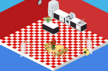
I began with a standard white fridge and stove. You can’t go wrong with the classics and at just $500 and $600, the price was right. With white appliances as my starting point I used red and black to create a sense of drama. Red and white tiled flooring combined with red painted walls make a bold statement. I then selected the Chic cupboards and sink. The black base and white countertop of my counters and island were a stark contrast against the red.
For my table and chair I didn’t want to detract from the effect I had created with my black, white and red theme, so I went with a simple Polished Oak Table. The Bamboo Study Chair may not have been designed for the kitchen, but when you’re working on a budget you’ve got to be creative. The chairs were a whimsical touch and picked up the color of the oak table and at $85 each they were a steal!
With a couple of plants (I love plants in a space!) and a simple Classroom Clock, my clients were eating their hearts out in their new kitchen.


This room is WAY too empty. Use a smaller room or fill up the space!
it is ok i gess
Here’s my thoughts when I first saw a glimps of this room… WOW, SO RED! It’s very red, not saying that’s bad but I’d rather have a kitchen that’s not ALL red.
I dislike that room. Too empty! The colors are also too bold.
If anybody wants to be my freind my username is LittleCat401
I think the kitchen is too empty.
GROSS! TOO BARE
It is all little too red if ya know what I mean!
HORRIBLE!!!!!!!! :(
Well, I redecorated my kitchen just yesterday… I think mine looks much better than that… I used yellow walls and wood flooring. It might be a little bright, but it looks really nice! I think it needs a plant though… I look into that…
P.S. Anyone who’s had their letter to Plumpy answered!!!! O.K. Do you need to put ‘Dear Plumpy’ first? PLEASE HELP!