Hi, I’m Fred Rover. You may know me from such books as Fred Rover’s Big Win, Superstar Spring Break and as host of the Webkinz Stadium.
The other day I was having coffee in my kitchen with my good friend, Quizzy, when he asked whether I’d ever considered updating the décor in my kitchen. Now when you look at my kitchen, you may wonder why Quizzy would ask such a thing. I designed this kitchen myself and my use of bold primary colors is quite striking.

However, it has been quite some time since I last decorated in here and I realized Quizzy had a point. When I said that maybe I would redecorate, Quizzy stopped me and said that rather than do it myself, why not let two good friends of his who are up and coming designers have a go? Well, I’m not sure they could do any better than me, but I’m always open to helping out a couple of young entrepreneurs on their way up so I agreed.

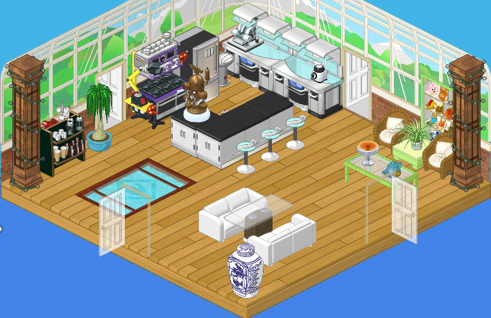
Well, I must say I am impressed with the results. I think I might have used some stronger colors myself but I do like the way the Conservatory Wallpaper lets the outdoors in. The Café Flooring really works well with the open feel, and I just love the way they incorporated the Internal Reflections Bridge. It’s a great conversation starter and adds a certain zen to the room. The High End Kitchen Counters, combined with the the Mega Stove and the Brushed Steel Fridge, are state-of-the-art, ideal for a great chef like myself. There’s plenty of workspace at the Stainless and Granite island, complimented perfectly by the High End Kitchen Stools. A comfortable breakfast nook with a couple of Wicker Chairs makes a great spot to sit and enjoy my coffee, but my favorite part of the room is the Glass Topped Dining Table flanked by a pair of White Sofas. I will be entertaining in style and Hailey and Elwin explained that I could bring over the Wicker Chairs when I had more than four guests. Ingenious!
I have to say, this isn’t at all what I would have done myself, but I really do love it! I guess that’s why one hires interior decorators.


That’s a kitchen? Looks like one of those Hotel Lobbies!
I *love* this room! So light, airy and functional. I think my mom would like cooking here, and I would too! All the best! MDIChickadee
One of the best makeovers yet! Of course, I’m so clumsy I’d probably land in the reflection pond at least once a day.
Love the new kitchen, Fred!
>^..^< Catkin
WOW!!! That is a cool kitchen!!! I totally like the new kitchen better!!!! congratulations Fred Rover!!
~basketballstar3~
I liked it better before it was redone. And I don’t like having a pool in the kitchen.
i just do not get having the internal reflection bridge in the middle of the kitchen, and the two big columns bring this nice light kitchen down; other than that i think this is one of hailey and elwin’s better make overs.
**my ryelee**
Awesome job! I love it! And Fred, try not to be too fulll of yourself. ;)
WOW ,I just love this kitchen, it’s beautiful, I always love the makeovers, I am only new at commenting, not to Webkinz.
~GloryWind
Well, wellcome! We have the nicest people here! Your friend sarahandlacey! :lol: :mrgreen: ;-) :-) :roll:
I agree GloryWind! This Kitchen……… is Epic!!!!!!
I like modern rooms, so in my opinion, its perfect! Except…. why is their a pool… in a kitchen! lol
IT looks so cool.
Sky the Wolf :D
Amazing! Nice job guys, you really transformed this room! I love it! You should, like, come redecorate my rooms sometime, LOL! :mrgreen:
LemonCandy
I really like the new room! They did a great job! Your friend sarahandlacey! :lol: :mrgreen: ;-) :-) :roll:
This room looks amazing.
i agree w/ all of u!!! i love the new room
~*blahblah*~
i am SO glad he hired hailey and elwin instead of doing it himself. :roll:
I, in fact, really love this room. Great job! :D :D
*Luv from LillyLuvie*
Wow, I actually think it is quite nice. I wish they could help me, I really want to make a Spa but I just don’t know how to! Well, I mean, I DO but I don’t know how to make a Spa look as good as the rest of my house. They should do a Deluxe only challenge where you get something from the Spa eStore theme as the grand prize. -Moonstar◙◙◙
You’re Deluxe? I would be but I am lacking money after a MAJOR shopping spree. I mean a real one. NOT animated.
I LOVE it but what’s with the pool? And the whole room is mostly estore. Anything but that, I love it! :) :D :P ;) :lol:
♠♠♠TheGameStar♠♠♠
It’s okay I guess … Not your best Hailey and Elwin but you could do better … especially for the fact that there is couches at the kitchen table? xD Not much like a kitchen. I feel like the first one is a bit better though the little office in the corner is weird.
THIS ROOM LOOKS, airy?
I agree skywolfdemon , it is very fascinating.I am sure my mother and I would LOVE that kitchen.When ever we move we always look for a BIG kitchen. Enjoy your kitchen Fred Rover.
Love ccaterpillar
cool new kitchen, i liked the first kitchen but when i saw the after one i has like WOW! I think its cool that for the final kitchen they used mainly w-shop items :)
I personally think it looks a bit mixed up. A few too many different themes going on at the same time but otherwise it’s all right.