Hi, I’m Fred Rover. You may know me from such books as Fred Rover’s Big Win, Superstar Spring Break and as host of the Webkinz Stadium.
The other day I was having coffee in my kitchen with my good friend, Quizzy, when he asked whether I’d ever considered updating the décor in my kitchen. Now when you look at my kitchen, you may wonder why Quizzy would ask such a thing. I designed this kitchen myself and my use of bold primary colors is quite striking.

However, it has been quite some time since I last decorated in here and I realized Quizzy had a point. When I said that maybe I would redecorate, Quizzy stopped me and said that rather than do it myself, why not let two good friends of his who are up and coming designers have a go? Well, I’m not sure they could do any better than me, but I’m always open to helping out a couple of young entrepreneurs on their way up so I agreed.

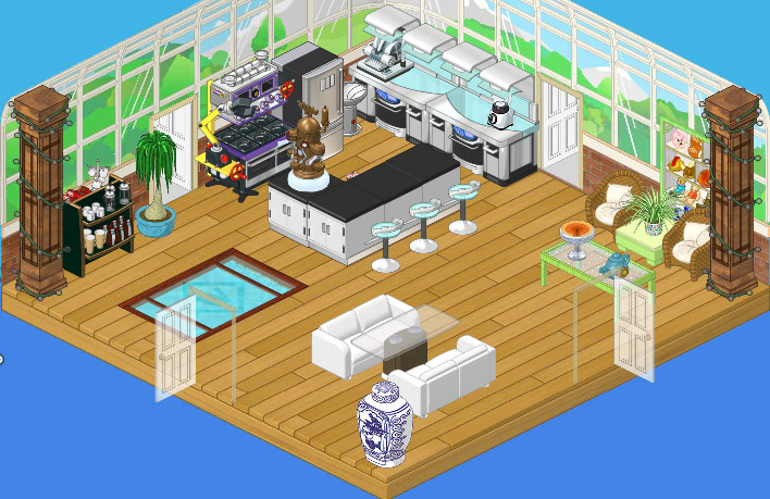
Well, I must say I am impressed with the results. I think I might have used some stronger colors myself but I do like the way the Conservatory Wallpaper lets the outdoors in. The Café Flooring really works well with the open feel, and I just love the way they incorporated the Internal Reflections Bridge. It’s a great conversation starter and adds a certain zen to the room. The High End Kitchen Counters, combined with the the Mega Stove and the Brushed Steel Fridge, are state-of-the-art, ideal for a great chef like myself. There’s plenty of workspace at the Stainless and Granite island, complimented perfectly by the High End Kitchen Stools. A comfortable breakfast nook with a couple of Wicker Chairs makes a great spot to sit and enjoy my coffee, but my favorite part of the room is the Glass Topped Dining Table flanked by a pair of White Sofas. I will be entertaining in style and Hailey and Elwin explained that I could bring over the Wicker Chairs when I had more than four guests. Ingenious!
I have to say, this isn’t at all what I would have done myself, but I really do love it! I guess that’s why one hires interior decorators.


Meh. I could take it or leave it. It’s not better than the first one, but it’s not worse. Personally, I prefer the first one because I like BOLD!
WOW>>I love BOTH rooms. What a kitchen.. I’m truly impressed..
Beautiful transformation! But one little part won out of wack. If you look at the stove/counter/dishwasher/cabnet, you will see a sandwich maker. But right in front of the sandwich maker is a sink. So how are they able to use the sandwich maker? And the cabnet that is next to the sink? But anyways beside that little detail, it looks awesome. :)
~Wackadoodle Muffins
I love the new reflection pond.
hey look another MAKEOVER!!!
Love it!!!!!!
ur new style looks great I know ur enjoying it What size rm is that – it looks pretty big
wooww! I should reallty decorate my kitchen like this!! LOL or maybe I should just hire Hailey and Elwin.
Much more open looking! I love open spaces! :)
I *LOVE* this room! So light. So airy. So … FUNCTIONAL! I’m more than a little jealous, and I adore Hailey and Elwin’s Makeovers.
~*~*~Gabriella♥~*~*~