Hey readers! It’s me, Elwin. Recently Hailey and I got a call from our friend, Ella McWoof. She’s been helping out in her uncle Sam McWoof’s office lately and she said that it really needed a pick-me-up. She thought it was a bit dated and that it could be organized so that Sam had better access to his files as well as a place to meet with clients. Sam agreed with Ella and said that she had carte blanche to change up his office however she sees fit. He even gave her access to his account at the W Shop and the eStore. Of course Ella knew exactly what to do – she called us!
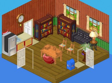
So this is Sam’s office before. It’s okay, I guess. Kind of has a country feel to it though. It just doesn’t say ‘Big City Detective’ to me, you know? I’m not sure how much he gets done at that desk either – it’s more decorative than functional, and if there’s anything a busy guy like Sam needs, it’s function.
Hailey and I felt that we really needed to add some sophisication as well as hi-tech gadgetry to this private eye’s workspace.
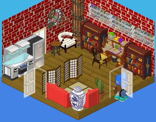
Now this is more like it. This Downtown Penthouse wallpaper says that Sam really has his finger on the pulse of Kinzville, while the Downtown Core Windows let Sam see what’s going on without being seen – perfect for a super sleuth. We loved the Downtown Penthouse theme so much that we also added this funky white Downtown White Armchair. It may be comfortable but not enough to stop a suspect from squirming when being questioned by Sam.
As for the Writer’s Desk, now this is where a guy like Sam can really get some work done. There are plenty of drawers and cubbies to house his clues, and we placed it right between his bookcases so that the facts are right at his fingertips when he needs to look something up. We paired it with the Downtown Windsor Chair, a classic choice for a classic guy.
Of course, a detective can’t operate these days without the latest technology to help him crack the case. We thought the High End Counter would make a perfect lab where Sam could test samples and examine evidence. And the Time Warp Clock is just what a private eye needs to help him jump back in time to the scene of a crime and put himself in the mind of a criminal.
Sam also needed a spot to sit down with clients and gather information before taking a case. The Rockin’ Red Couch and Lounge Chair add some colorful flair to this cool office, while the Studio Room Divider protects his lab from prying eyes.
When we were all done we brought Sam in and questioned him, then we put the clues together and deduced that he was thrilled with the results!







This is really nice but i prefer the 1st one kinda……what happened to the Salley’s
Detention Day thing???They never finished it………
~*♥*~Snowflake~*♥*~
I was wondering the same thing Snowflake!
BTW I like the second room better, except the couches. Either the couckes should go, or the wallpaper. The two reds just do not match.
Hey oldwoofie I agree with you about the back ground thing..maybe the couches should be
black or something…
~*♥*~Snowflake~*♥*~
I’m going to make my office look excatly like it cuz i have delux membership plus 100,000 e-store points!!!
wich 1? the old 1 or the h new 1? :lol: :D
~*blahblah*~
P.S. good luck!!! :lol: :D
~*blahblah*~
Wow! I love it. when ganz puts up pictures of rooms it always gives me ideas! I just adopted my new lit’ kinz chihuahua, her name is Twinkie!!!
cute name!!! :lol: :D
~*blahblah*~
i dont no i think it MAY hav 2 many windows and not a big fan of the red couches and the red wall but other then those 3 things its kool!!!!!!!!!*GO GOLD*
I LOVE IT!!!!!!!!!!!!!!!!!!!
Hi Elwin and Hailey! I think I can understand why you did what you did – I am just not certain it would be good for me. As you did it for Sam, and he is thrilled, all is well. All the best! MDIChickadee
cool new arrangement!!! the old 1 is OK. both have bad stuff so ? :lol: :D
~*blahblah*~
the new arrangement is OK. I like the old 1 better. actually, both have bad stuff, so ? :lol: :D
~*blahblah*~
cool arrangement!!! i like the old 1 better though… :lol: :D
~*blahblah*~
These rooms are both awesome, but think the 2end one is better! Your friend sarahandlacey! :lol: :mrgreen: ;-) :-) :roll
as i said so many times below :lol: , i like both, but both have flaws… :lol: :D
~*blahblah*~
I love everything in the second one except for the wallpaper because I feel like the red’s a little loud. Other than that, beautiful! :mrgreen:
*~♥SwedishLatte♥~*
Upscale condo walls would have been less overdone while conveying the same idea
I actually liked the old one. But the second one is cool too. ;)
*Luv from LillyLuvie*
Neat. The second one’s better but the walls make the room feel a bit crowded and sort of weird.
The *~Webkinz Wizard~* :)
Great job Elwin and Hailey! Sam’s office is great-looking now! ^.^
I liked the old one as a room. But.. the 2nd on is ok for a detective. # 2 doesn’t really match…
Great job guys!
~KK♥
Actually, the first one is way better. The second one is just crazy with not sense of orginzation or matching whatsoever. Sorry Hailey and Elwin, but the ‘function’ you were going for was better achieved BEFORE you remodeled it. But I have to say, I AM USUALLY a fan of your work. :) ;) :P