So Elwin and I were asked to make over the cabins. We started with the girls’ and boys’ cabins. Guess which one I chose? That’s right – the girls’! GIRL POWER!!!
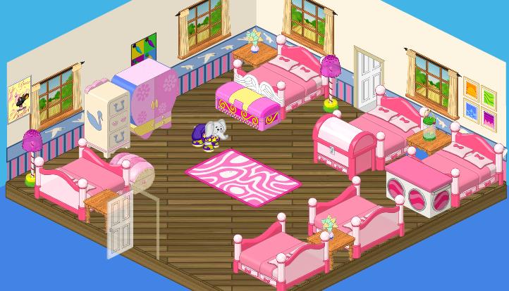
Okay, I like pink as much as the next girl, but um – HELLO? This is a camp! Camps are made for getting dirty and getting wet and getting back to nature. This cabin belongs in a fairy princess camp! It looks like pink exploded in here! And who the heck puts WALLPAPER in a cabin? I don’t think so. We’re going to need to start from scratch to create a space that brings in the natural surroundings yet still has a feminine touch. Have I got my work cut out for me!
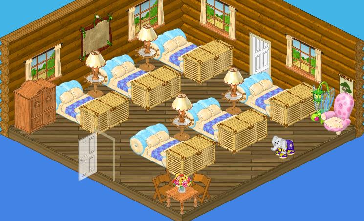
First things first – and that meant stripping off that wallpaper to reveal the natural beauty of the log cabin underneath. I think order is important when there’s a large group sharing a room so I decided to line up the bed in two neat rows (Elwin doesn’t necessarily agree with this choice, but – whatever, dude. He can decorate HIS cabin his way. This baby is mine!) I just love these supersoft Plush Pillows Beds – they recreate the look of a puffy sleeping bag and the colors are soft without being too girly. Some woodsy accents pick up the natural tones of the log cabin walls and the Ship Wheel Side Tables are a nautical nod to the nearby lake. And just so they won’t be completely distraught at the lack of pink, I threw a comfy, rosy Lush Lounge Chair into a reading nook in the corner.
I sure hope the girls won’t miss their pink palace – I think this soft, woody, understated cabin is much more appropriate.





I wish I could design it…
The room is pretty good but maybe they should get different beds. They should also have other things in there for the webkinz to do.
If anyone wants clothing recipes then please ask me.
-_Ilovemypets8_
is there a recipe for a gold dress? do you know any recipes for dresses besides the beautiful blue ball gown?
I agree, the first room had way too much pink in it. But this room doesn’t exactly look like a girls cabin either. Like if I were to walk in that room not knowing it was the girls room, I porbably would think it would be for boys. I mean yeah, it has pink. But it reminds me of a guy, and to be honest I don’t really like it. It looks better then the “pink palace” but I probably wouldn’t wanna be in that room. Nice change Hailey, but yeah.
I like it so.o.o.o.o much better!
The second one definitely looks more like a cabin than the first one. -Dawndrop*
THANKS YOU FOR GETTING RID OF ALL THE PINK!!!!!!!!!!!!!!!!!! no offence to people who like pink though
I LOVE THE ROOM MAKEOVER…GREAT JOB HAILEY!!!!!!!!!
I like it! It’s organized and woodsy! Perfect for a camp cabin. :D
The second one is def. an improvement! Good job Hailey!!
Nice! It looks awsome.mrgreen(:
I honestly don’t like either. The pink in the first room, doesn’t say camp at all. Too many bright colors, no yellow, green or blue in there! It needs a variety of camp colors. The second one doesn’t really scream summer camp either. The Plush theme peices somewhat remind me of my grandma, not really camp. The bamboo tables really don’t go at all with the beds.Then, there is a country table for 2 ‘Kinz, not 6 like there should be. The dargon fly lamp and the plush seat don’t go well either. And really, why would they need a wardrobe? Haily shoudl have used plain white beds. Then a big table with some chairs. A small space to play games would be nice too. Mix some more greens and blues in there! And some more yellow too. -Moonstar§
The name Newstar was only a temporary name, Moonstar. I’m back to Dawnstar. -*Dawnstar*
I like the new design of the girls’ cabin! It makes it more like the outdoors, more like nature!
Good job Hailey!! :D *Luv From LillyLuvie* :^)
P.S. Lol a smiley face with a big nose!! :^) :D
The first room made me shudder. O_o
I disagree, Moonstar. There’s room for at least for 4 people. Plus, at most summer camps, you’re spending a lot of time doing activities. At my summer camp, we only spent 30 minutes in the cabins (not including sleeping of course!).
*:)HersheysKissed:)*
There is only room for 3 people, when there is 6 beds. That doesn’t make sence. -Moonstar§
I dislike how the beds are set up on the second one but it is better than the first one!
My camp starts on July 11. And it’s DAY camp! Am I a baby? No. Am I under 8? No. And this was my Mom’s lousy fault. :roll: I like the cabin though. The new one not the princess castle. ~:: kkf~~kinzklipfan~~ :: $ :D
Oh, good! I like the name Dawnstar much more than Newstar. Newstar feels like a name that you would have to upgrade. Like Newstar for a new commenter. Amatuerstar for a. . . and . . . -Moonstar§
I never intended Newstar to be a premanent name. I just used it because I needed a simple, temporary replacement because I was “posting too quickly.” Oh, and that Road Trip van is getting in the way of my typing. Gust go away. I already clicked on you!!! LOL -*Dawnstar*
what are you talking about??
The second one is way better but the plush beds aren’t right. It needs more nature inspired things. Also the plush chair and dragonfly lamp don’t go. It should have more seating.
I agree.
you `re right Moonstar .it reminds me of my grandma too.(the beds. ) the first room is waaaaaay to girly for me!!!! ( i am a tomboy .) i am glad you kept your name Dawnstar.
I partly agree, Moonstar. I think the first one is way mismatched and too much pink. They could at least change the walls and get matching and less bright trunks. The second one is way better and looks great but I think it needs a little more color. They could add some flowers if they want to keep it natural. I love the beds, actually, but Hailey could do better with the lamp next to the sofa. Overall: Room 1 is 4/10, room 2 will be 7.5/10 ~Amethyst Sparkle ♫♦♥♦♥♫
I totally agree! elwin’s design was waaay better.
I agree, too. Hailey should’ve asked what the girls wanted. Plush beds are more for home, and sleeping bags are uncomfortable for me. The colors are way too mismatched in this cabin. Even though I’m a girl, I’d rather this cabin have the boy’s cabin design. I would like to experience sleeping in a hammock, and I do not like pink.
I agree too.
I’m on vacation whooo hoooo. Yeah this cabin isn’t so great.
I know! Totally agree! I don’t like either-I’d rather sleep in Elwin’s after! This is like being in military camp! All the beds lined up, and there not facing each other so they can talk before bed! There’s no room to play or read! Ugh! :(
I know what this room needs!!! Bunk beds!!!!! A cabin isn’t a cabin without bunk beds.
i agree with u Moonstar. there needs to be more color and the beds arent very campy like:)
I do agree pink litterally EXPLODED in the first room.The second room doesn’t say this is a GIRL’S CABIN.I just don’t think that it is girly enough, i would think this is a guy’s cabin.But I do like the wallpaper:)
Totally agreeable luvsdragons10 I don’t like either room for a summer camp
Yeah, and I think it was better when the beds were against the walls, it gave the illusion of space more, and THREE chairs, really. It definitely is an improvement, but If I was staying there, I would drag the beds around a bit. Course, considering I slept on the floor in my last summer camp:)
The second one is much better, though the pink chair and green lamp don’t match. I also think there isn’t too much room to play with the beds taking up all the room. But I love the wooden theme.
-Always :-)