Hey guys, I’m back with some new Garden Oasis concept drawings! If you missed my first post, you can see it HERE.
The Garden Oasis room theme will be released in the W-Shop this July. Stay tuned to Webkinz Newz as we show off concepts drawings and the actual items as they are being created, allowing you to provide feedback to help us make this the best theme possible.
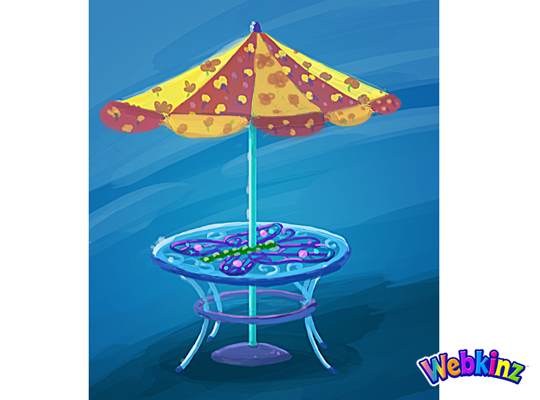
Here’s a look at the concept for the table that will be included in the theme. This will add a burst of color to any outdoor yard:
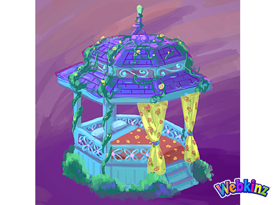
This Gazebo matches the table and looks like the perfect place to have a nap:
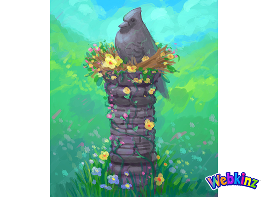
The stone bird featured at the top of this column looks like it’s sitting in a bird’s nest made of flowers:
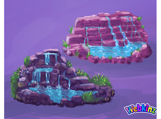
Here’s a couple of color variations for a waterfall. Which one do you prefer, or do you think the stones should match the color of the column?:
This stove is meant to match the look and feel of the Iron Wood Watering Can and Side Table that we released during Spring Celebration:
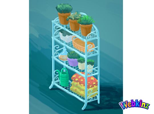
Finally, here’s a look at the shelf that will be included in this theme. It looks like this would also work well as a room divider:
The 3D artist will use these concept drawings as inspiration when designing the final items that will be included in this theme. So, please feel free to leave your feedback in the comments section below.
Remember, the Garden Oasis room theme will be released in the W-Shop, for KinzCash, on July 4th. Stay tuned to Webkinz Newz for more concept drawings soon!





I like the darker waterfall better! Both the color and the design. I am very excited for this theme!
Me too!
I like the darker waterfall better. It is a better color to match the other pieces but I like the shape of it better too.
This theme is so beautiful… I would prefer the purple waterfall.
They are all okay, but need some serious design fixes. The table top should be clear, like glass, and the umbrella should have the butterflies on top. I know that blue and orange are complimentary colors, but personally, I do not like blue and orange used together. The umbrella top is too cluttered. The gazebo is lovely, but get rid of the yellow curtains. The stone bird column is perfect, but why is it “nesting”? Unless the “nest” looks like it’s part of the stone column, it doesn’t look right. Would you put sticks, twigs, and grass under a stone bird outside? I think not. I LOVE both of the waterfalls, but they should be grey like stones, not pink or purple. Yuck! The stove is perfect! The shelf is nice, but don’t get adding the watering can and blankets (or seed bags?), on the bottom shelf. Add extra potted plants on the bottom, or perhaps some books on planting flowers and gardening. I would want to use the shelf in an inside room if it looked like it should go outside on the patio. Keep it pretty. Over all I love the theme, but kind of tired of the pink, purple, and butterfly motif.
The next to the last sentence I wrote should read, “I wouldn’t want to use the shelf in an inside room if it looked like it should go outside on the patio. (Sorry! I didn’t see my mistake before I hit “Submit”.)
I agree about the umbrella.. it seems too busy. The butterfly in itself seems kind of bright and busy to me, but with that bright and busy top, too.. It looks a little crazy and almost carnival esque. =P
Absolutely Lovely! Can’t wait for this theme to come out!
For the color variations of the waterfall, I don’t think its either or, its both AND! Cause I really like both of them, the light purple would go well with other things as well as the dark purple one. Why can’t we have both? :D
Oh how pretty! I will TOTALLLY get this theme!
I like the dark waterfall on the left better and I agree that it goes with more rock items.
This room theme needs a bed, and I am so excited to see it incorporated into the gazebo.
love it!