Hey guys, I’m back with some new Garden Oasis concept drawings! If you missed my first post, you can see it HERE.
The Garden Oasis room theme will be released in the W-Shop this July. Stay tuned to Webkinz Newz as we show off concepts drawings and the actual items as they are being created, allowing you to provide feedback to help us make this the best theme possible.
Here’s a look at the concept for the table that will be included in the theme. This will add a burst of color to any outdoor yard:

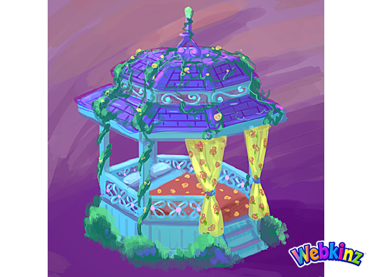
This Gazebo matches the table and looks like the perfect place to have a nap:
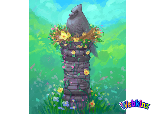
The stone bird featured at the top of this column looks like it’s sitting in a bird’s nest made of flowers:
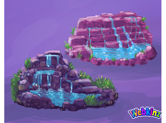
Here’s a couple of color variations for a waterfall. Which one do you prefer, or do you think the stones should match the color of the column?:
This stove is meant to match the look and feel of the Iron Wood Watering Can and Side Table that we released during Spring Celebration:
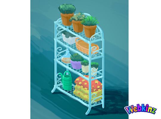
Finally, here’s a look at the shelf that will be included in this theme. It looks like this would also work well as a room divider:
The 3D artist will use these concept drawings as inspiration when designing the final items that will be included in this theme. So, please feel free to leave your feedback in the comments section below.
Remember, the Garden Oasis room theme will be released in the W-Shop, for KinzCash, on July 4th. Stay tuned to Webkinz Newz for more concept drawings soon!






Why not make both waterfalls? It’d add a good variety for room decoration and atmosphere !
I think the stones of the waterfall should match the column. Loving these designs!
I like the design of the waterfall better in the bottom/leftmost one, and it feels like the purple hue to the stones matches the other pieces in the theme more than the stone bird does.
Hey Michael, when is June Peek-a-Newz going to start?
Very pretty! But yes, I’d have the stones on the waterfall match the stones on the bird pillar (which I LOVE!) and also have the fabric on the patio table’s umbrella match the purple colors of the gazebo top. The patio table is just too “busy” to me (what wise person posted here, “please don’t make this theme a “vomit of colors’”? Just sayin’) This is a beautiful theme but all the patterns and large colored areas border on “too much”. I’m sure we’ll all add flowers and trees of our own design to the room and it would make the whole thing an overly busy pattered clashing-color-bomb. My 2 cents! :)
The Lower Left waterfall looks to have a more natural look.
OMG I love it already! I can’t wait!
I like the style of the dark purple waterfall, but think the stones should match the column.
Nice. The grey rocks for the waterfalls, only because they will look good on another project I am working on. I do like the red color better. Soooooooo really I would be happy with either. Really like the Robin on top of the post.
Second look that’s not a robin. More like a blue jay. LOL
I think the waterfall that is at the bottom with shades of purple is the best choice for the Garden Oasis theme. The purple shades are all through the theme.