Hey guys, I’m back with some new Garden Oasis concept drawings! If you missed my first post, you can see it HERE.
The Garden Oasis room theme will be released in the W-Shop this July. Stay tuned to Webkinz Newz as we show off concepts drawings and the actual items as they are being created, allowing you to provide feedback to help us make this the best theme possible.
Here’s a look at the concept for the table that will be included in the theme. This will add a burst of color to any outdoor yard:

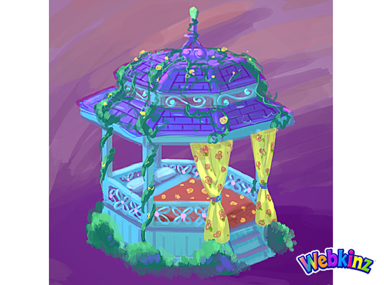
This Gazebo matches the table and looks like the perfect place to have a nap:
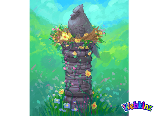
The stone bird featured at the top of this column looks like it’s sitting in a bird’s nest made of flowers:
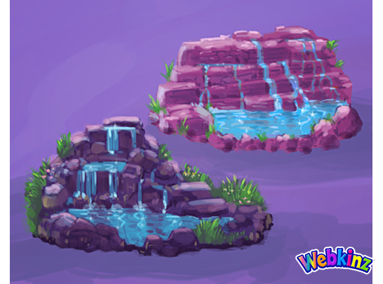
Here’s a couple of color variations for a waterfall. Which one do you prefer, or do you think the stones should match the color of the column?:
This stove is meant to match the look and feel of the Iron Wood Watering Can and Side Table that we released during Spring Celebration:
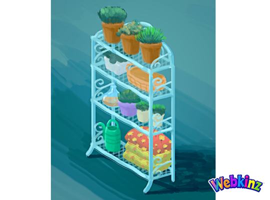
Finally, here’s a look at the shelf that will be included in this theme. It looks like this would also work well as a room divider:
The 3D artist will use these concept drawings as inspiration when designing the final items that will be included in this theme. So, please feel free to leave your feedback in the comments section below.
Remember, the Garden Oasis room theme will be released in the W-Shop, for KinzCash, on July 4th. Stay tuned to Webkinz Newz for more concept drawings soon!






Can’t wait! ^o^
id go with the purple version of the waterfall not the pink one
The gazebo bed is jaw-droppingly gorgeous!
About the Waterfall colors, would you please consider making the stone color both gray and purple? The top stones would be gray, transitioning to purple the closest to the pool of water. Thank you.
I am glad to see the iron wood theme represented. I hope the stove is as large as it looks above and that is not just a close-up view. Even if I don’t buy the whole theme, I will definitely be using that.
I love it all and am glad I voted for this theme. I am excited about the gazebo and the stove, but my favorite piece so far is the stone bird. It is so unique.
Stove is a CHIMNEA
STATUE BIRD = Let EYES LIGHT UP and I will get MORE. !! But it is comfusing because it is BLUE but the bird is a Cardinal ! SIDE WATERFALL PLEASE !! Bur could we have THE COLOR OF THE PURPLE shown and a 2 version that is gray also !! MAYDe SOMETHING a Ying Yang pattern 2 of these pools that can sit side by side . THAT way 2 pets can swim in pools next to each other ;)
Actually, that bird looks like a Steller’s Jay, which is blue.
Stellar’s Jay totally lives up to it’s name! If you are ever at Bijoux Falls in BC, that is the home of Stellar’s Jays and they are the most brilliant blue!
We have them in Southern California too, in the mountains. Awesome bird.
I wish that the stone bird on the column will be red or blue, more colorful. And that the plants on the shelf will have flowers.
Wow. So impressed with all of these! I like both water features; it would be hard to choose between if we could only have one. But what really gets my attention is that the butterfly is not going to be ‘pride of place’ on all the pieces, and for that I’m so glad! A lot of times one element gets repeated too much on a theme, making it look overdone when several pieces are used in the same room. Having it on the table and chairs makes a nice set, while leaving it off the other pieces makes them so versatile. I didn’t vote for this theme, but I am definitely liking the concept art! ANY room dividers are welcome, and that shelf is gorgeous! As to stone color, I sort of hope the stones in the column match the stone walls already released, or that this theme comes with a wall too.
I prefer the darker purple fountain! It looks more natural than the other