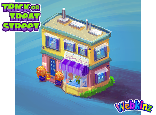
I wanted to thank everyone who left us feedback for the first set of Trick or Treat Street concept drawings. I read over each comment and was really impressed with your suggestions. There was a lot of focus on the Halloween homes, in particular, the colors and look & feel of each home. I really like how the concept drawing for the costume shop turned out (you’ll see it in this post). I think that we will model the homes to match the look and feel of the shop, but still keep the bright colors that were used for each one. This way, they will look less “haunted” but remain colorful and feel as though they belong in a charming neighborhood. In any case, I really like the suggestion of triggering a doorbell sound effect and having your pet say “Trick or treat!” when you click on each home.
Now, I’d like to share the concept drawings for the second half of the Trick or Treat room theme. Please leave your feedback in the comments section below. Tell us what you like or don’t like about each item or how you would make them better. Just like before, we will be reading each comment carefully and take all your suggestions into consideration:
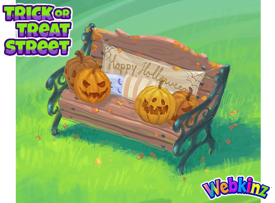
Here’s another look at the bench that will be including in the theme. Don’t worry, “Halloween” will be spelled correctly on the final item:
Here is the costume shop I was referring to earlier. The shop will be 3 tiles in length, so there won’t be any gaps along your yard if you decide to add a door to the room:
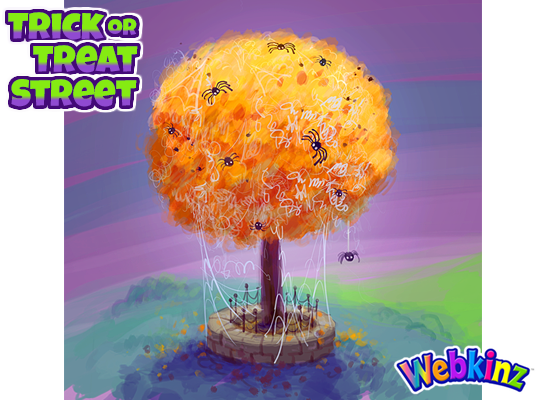
The idea behind this tree is that it will change slightly when you rotate it. 3 of the rotations will feature unique Halloween decorations and the last one will simply be a plain, fall colored tree that could be used for any type of room design:
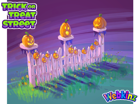
I really like how this white picket fence turned out. The expressions on each of the jack-o’-lanterns faces are priceless:
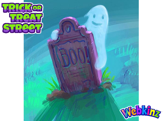
Finally, here’s a look at the novelty gravestone that you’ll be able to use to decorate your front lawns. Similar to the tree, this item will also change slightly when rotated in room:
How do you think this theme is coming along? Let us know in the comment section below and stay tuned for your first look at the final items that will be modeled in 3D. I plan on showing the first half on Saturday, August 31st…





Now these designs are more like it!! Thank you for listening!! If possible, make it so the dummies in the window of the the Costume Shop are wearing Halloween costumes. I like the tree, but could one of the rotations be almost leafless twigs with “paper” ghosts (etc.) hanging off it? Love that fence! As others have said, it will hopefully be placeable anywhere in-room. And that rotateable novelty gravestone – love it! Make it so the ghost jumps out periodically and small (1×1) so we can fit in other yard decorations. I hope you keep the shrub from the last set of concept drawings but make it so that when you click on it, bats fly out of it (in the same way that butterflies fly out of the Floral Fox’s PSI). I’d still like to see more yard decorations (also small – 1×1, too, so we can fit several in each “yard”). Examples I can think of – black cats, decrepit pine box “coffins”, witches, glowing jack-o-lanterns, skeletons in various poses, etc.
It would be really great if we could have at least one more shop. It could be called the “Bubbling Cauldron” or “Sweet Shop Cauldron” or something along those lines. Just having one shop seems a little weird. Don’t get me wrong, I love the “Costume Shop” but we need at least one more. I know it’s a “Street” but now that we have one shop if we had one more it could be like a little town. Also, when we rotate the tree and it changes could one of the changes be to purple with maybe ghosts hanging on it? It would give us an option for more spooky without making everyone stuck with more spooky. It would be awesome if all the rotating items could be like that. If every rotating item gave a spooky option, a cute Halloween option, a fall option and a normal option we could end up with the ability to make 4 different rooms. That would be fantastic! Just an idea. I really love all the art for this theme. Great job artists!
Trish7214, I LOVE your idea about rotating each item where we see Spooky, cute Halloween, Fall, and just a normal option! That would give us SO MANY decorating uses! And, I also agree that we will need more than just one shop on our Trick or Treat Street! I really hope they are planning to surprise us with a couple more! Wouldn’t that be awesome if they did? :-) Can’t wait!!!!
I’ve always wanted a school building or a town hall front. (Think ‘Back to the Future’. Then the designers would need to make a little DeLorean time machine! LOL!!) That’s the kind of town that I would love to design in WW!
Wow the Ganz creative team and artists have really outdone themselves! I absolutely love when items rotate to different perspectives, it makes these items so much more usable . Love the colours on the costume shop. Love the pumpkin faces….AWESOME!! and Love the tombstone with ghosty!! Thanks guys… great job!
I love how this theme is coming along! I especially love the fence! I agree with you Michael, the expressions on the jack-o’-lantern faces are great. I also like that the tree will look different as it is rotated.
I love how some items change when rotating! This way they can be used for both Fall and Halloween. But…………PLEASE NO BRIGHT COLORS ON THE BUILDINGS! Keep it muted, slightly darker. The colors should represent Trick or Treating in the evening, not the bright day light. I know some people want to “bright & happy” Halloween. Not my taste, but I get it. How about somewhere in between “bright colors” and “dark spooky colors”? Or……rotate the buildings from “bright colors” to “dark spooky colors”? The best of both worlds! :-) Oh….and will there be new Halloween-ish wallpaper and flooring to go with this new theme? If the theme is to be used in inside rooms, we may need wallpaper and flooring that will look like everything is outside. Keep it simple. A forced perspective small town, early evening scene, kind of look. A floor that is maybe cobble stone, brick, or something that looks like a real street…kind of? Okay…maybe that’s too much to ask for, but you DID ask for our opinions. :-) I am really excited about this theme! I hope it lives up to my expectations.
Beautiful designs! I love them all so much especially the tree, bench, and fences. I can’t wait until October! :)
looking good so far but is there going to be actual furniture that can be used
Hi ~jenvic! There probably won’t be any furniture the way that you might be thinking about it, because it is a trick-or-treat street, which is probably an outdoor theme kind of like the Countryside Christmas theme. I bet that the other two themes that were offered for the vote will come around again, so hang in there. ;)
This is awesome I LOVE the costume shop and if the houses are going to be modeled after that then they will be awesome too. The issue with the colors of the houses for me was that they are just the same colors as the little Goblins and their homes, so I was hoping for some fresh color options instead of ones that have been used a few times already. This theme is so great though, good job people! :)
I especially love the picket fence. Halloween is my favorite so I am truly looking forward to this whole new theme! Thank you!
Yes! So glad to see you are bringing this theme closer to the direction we wanted. Now my only concern is the colours. I don’t know what it is, just these neon buildings won’t match the subtle, warm colours of the initial concept you showed us, don’t you think? I just hope it’s not too neon. I’m all for neon, just not in this theme. I think it will look really nice! Thanks for taking our opinions into account! :)