I am excited to show you the concept drawings for the second half of the Painted Glass room theme. Thanks to everyone who left feedback for the first set of concepts. Please feel free to do the same with this set. We will be reviewing your comments before modeling the final items in 3D.
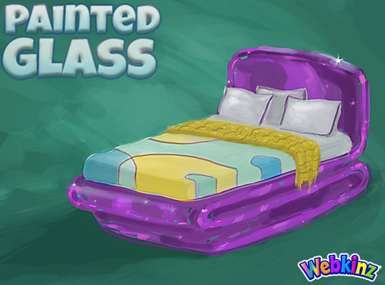
I hope TripleGFarms is happy with the look of the bed that will be included in this theme. I love the dark purple frame. Notice that the sheets match the wall divider we saw in the first group of concepts:
The glass side table will probably look perfect when placed next to the bed. Mike (the artist who created these concept drawings) and I were talking about this item yesterday and we thought the surface might look better if it was circular shaped instead of oval. What you you think?:

I am really excited about the sink that will be included in this theme. The idea here is that you will be able to mount the sink onto your wall giving it a nice, light modern look:

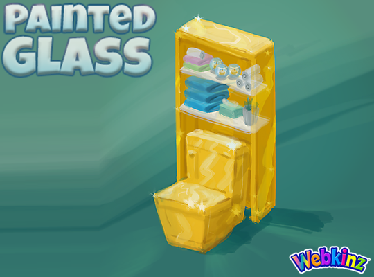
The toilet will have a nice set of glass shelves incorporated into the item. I really like how the items on the shelves match the colors of the other pieces that are included in this room theme:
The modern glass bathtub completes the mini glass bathroom set. Do you think all three pieces should be featured in the same color, or would you like to see some different colors used on some of these pieces?
Finally, here’s a look at the wallpaper. I don’t think we really have anything like it currently available in Webkinz World. I love the wavy top and the fact that it will be slightly taller than our standard wallpaper:
Remember to leave your feedback in the comment section below and stay tuned for your first look at the 3D versions of these items coming soon… I plan on posting the first set on April 20th.
The Painted Glass room theme will be available in the W-Shop, for KinzCash, on May 8th.










This theme is coming along really nicely! I am going to critique each item on how I think they are or can be improved.
Bed: I love how the glass was incorporated around the frame. As for the bed itself, I think that with the purple against the pattern, there’s too much contrast. I think the yellow throw should be replaced with another blue shade. I also agree with the other person who said that the throw looks chewed up – it needs to be replaced with either fringe or just becoming solid.
Table: I think the shape of the top should be more of a geometric oval, sort of like the unique shape of the top of the wallpaper. So that certain parts of the tabletop are curving out more than the others. We have more than enough oval-shaped tables in my opinion.
Sink: I love it, especially how it hangs on the wall. Though maybe the pipe underneath should be covered with the gold painted glass as well? To look more complete.
Toilet: Excellent. Maybe the flush handle should be stainless steel as the pipes on the sink and bathtub are? It’ll coordinate with them better.
Bathtub: Perfect!
Wallpaper: Awesome! Really unique.
Overall, really great drawings! I’m excited to see the finished product.
Love how this theme is looking! And, I also think the side table should be round. But I do love the look of the base of that table. Not so sure about the cover on the bed though. I think the sink is so very cool and unusual. I just love it. But maybe in another color. I keep trying to place it on the wallpaper in my head and with the large swathes of yellow color on each wall, it just isn’t working color wise for me. I also think the toilet and shelf need more curves to it. The bath tub is awesome. For some reason I keep wondering how it would look if there was pretty blue water inside it. I’m really hoping there is a floor to go with that pretty wallpaper. Thanks for the update.
I can not believe that I’m getting so excited about this theme! Every piece that I see I keep making up rooms with! I’m seriously thinking of making a separate bathroom from the kitchen/dining room/living room. Or even making a full section room and then another small bathroom for another part of the house. I have so many pets now an extra bathroom or two will come in handy!
seeing as the kitchen has that one piece that stands out, maybe you can do the same with the bathroom
It would be very cool if they made different versions of each of these items and made each version a different color. Maybe they could give these items with different colors away as prizes.
For example, the bathroom set could be purple and the bedroom set could be yellow.
FUN! It looks amazing and we won’t have to clean fingerprints off this glass.
Maybe instead of the bathtub being solid yellow, you could do some sort of pattern on it, like one similar to the divider. And I think the toilet would stand out more if the shelf was a different color, like green or blue. I’m already loving this theme, and I have so many ideas already. And will they’re be a floor to match the wallpaper?
Ooooo! A pattern on the tub would be nice. I also like the idea of perhaps making the toilet in the blue glass against the yellow. I love blue for a bathroom and that would be a nice touch. I was also wondering about a flooring. What about a towel rack to go with it? We only have the 2 choices in the W-Shop and the one we can make with the Bake Sale items. Personally if they don’t make a towel rack I would go with the blue one from the Atlantis theme.
I agree, I would like a pattern on the tub.
I disagree, I think all the bathroom colours should be kept coordinating with each other. There will be way too much contrast if too many items have a pattern on them. I like how sleek the bathtub looks. Simplistic but elegant.
Oooh, pretty. Now if you’d just swap out the purple and use maybe the green in the background, you’d have a total winner! It’s not horrible or anything, but we can always use accessories for our pop of color. I am actually excited to see the finished theme. I do love that wall though, it’s so cool!! I like the idea of a round table too. And that sink, nice! Bravo!
I’m not sure how I feel about making the purple table round. I rather like the idea of something a little different from the usual round or square side tables. However I was wondering if they could perhaps code it so that as you turn it 2 choices would be oval and 2 choices would be round. That way those who want one or the other could have it their way and those of us who like both ideas could have a variety of ways to decorate with them.
I can’t picture a side table being oval though, wouldn’t it be tiny? Maybe not, we shall see! But i love your idea of it changing when turned. Wonder if that could be done, hmm…
The purple should be kept IMHO, but I think the green should replace the yellow on the bathroom items.
After reading different posts, seems everyone loves the purple! Nothing wrong with that, I’m just not a fan of purple. (I know, I’m in the minority lol) I still love the yellow bathroom, though green would look pretty too. You know, they really need to update our choices in the wshop, and make pieces like a toilet, sink, tub in different colors. Not part of any theme, just stand alone pieces. And some new wall paint too, like a light teal and boring beige!
I agree acoolaunt. The colours in the wallpaper should be the only ones used. Purple is too much of a contrast with the others, it makes the bed especially look very bold! It would be better as the blue or green hues used in the theme. The purple is unnecessary, I think.
I think the side table should be round for sure and I like that the bathroom set is all one color. In fact, the bathroom set is the only part of this theme I think I’ll be using. I love the sink!! The toilet with the shelves is also very nice.
WOW! Ahead of its time designs. So well done. Creative with a very clean look. The wallpaper will be used in so many ways, glass studio, artists loft, any office, and I see a profile of a dog on the left wall. :). Bravo! Another Standing Ovation!
Oh, my goodness! I didn’t notice that until you mentioned it! Oh, gosh, we are going to have SO MUCH FUN with this wonderful theme! It wasn’t even the one that I wanted for either vote that it was in but I’m so happy with how it’s turning out! I stand with appleblossomrose in the Ovation for the Creative Team! Bravo indeed!!!