I am excited to show you the concept drawings for the second half of the Painted Glass room theme. Thanks to everyone who left feedback for the first set of concepts. Please feel free to do the same with this set. We will be reviewing your comments before modeling the final items in 3D.
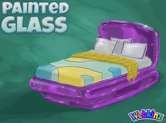
I hope TripleGFarms is happy with the look of the bed that will be included in this theme. I love the dark purple frame. Notice that the sheets match the wall divider we saw in the first group of concepts:
The glass side table will probably look perfect when placed next to the bed. Mike (the artist who created these concept drawings) and I were talking about this item yesterday and we thought the surface might look better if it was circular shaped instead of oval. What you you think?:

I am really excited about the sink that will be included in this theme. The idea here is that you will be able to mount the sink onto your wall giving it a nice, light modern look:

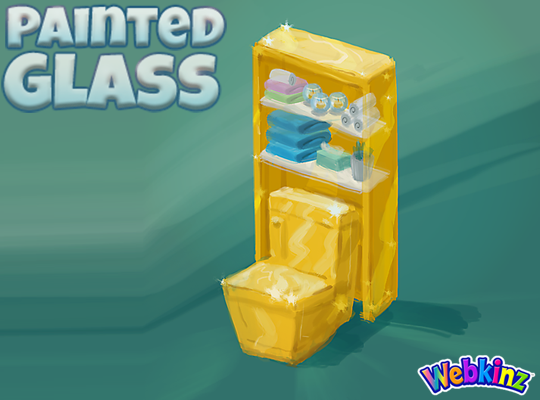
The toilet will have a nice set of glass shelves incorporated into the item. I really like how the items on the shelves match the colors of the other pieces that are included in this room theme:
The modern glass bathtub completes the mini glass bathroom set. Do you think all three pieces should be featured in the same color, or would you like to see some different colors used on some of these pieces?
Finally, here’s a look at the wallpaper. I don’t think we really have anything like it currently available in Webkinz World. I love the wavy top and the fact that it will be slightly taller than our standard wallpaper:
Remember to leave your feedback in the comment section below and stay tuned for your first look at the 3D versions of these items coming soon… I plan on posting the first set on April 20th.
The Painted Glass room theme will be available in the W-Shop, for KinzCash, on May 8th.










I like the yellow color, different than the ever popular purple. I love purple but it seems so many webkinz things are purple. Color variety is good with me.
I’d prefer all three bathroom pieces were the same color. They’ll already look unique because of the glass finish. Keeping the color consistent between them allows for more impact from the colors of additional items used as decorating touches.
I agree 100%
WEBKINZ NEWZ LAG at night is so so S L O W !! PLEASE can you fix this and YES I have cleared everything normal and updated my FLASH as I have always done before playing here. GLASS COULD we get 2 off subject DECOR items ? 1 a large YELLOW SUN for on a wall behind trees and house just plain round . 2D A LARGE WHITE MOON to use behind homes in Spooky rooms on a wall nothing fancy simple round . Middle of room to the TOP of the wall 4 or 5 wide and tall at least but matching GLASS so it may reflect like glass does and not appear flat . THANKS tHEY ALSO WORK SO WELL IN GARDENS AND ABOVE A POND in summer and summer nights .
IMAGINE BEACH and water with blue skies or sunset skies on the far wall a sun or large moon touching the water to the top of the wall . Your pets watching out as lil pets swim from their beach chairs . OR FIREWORKS going off in front of the moon that sounds pretty and Estore has a lil boat that shoots fireworks !
BEACH your pets sit in beach chairs looking out to sea as lil pets swim in the water. Or Watching a sunset far away with a sun or moon setting just at the edge of the water going to the top of the sky. Night place FIREWORKS in the middle or EStore fireworks boat in the water.
Well, I really didn’t think I would like this theme, but I have to say it is growing on me! I love the look of the bed! Love the yellow and purple colors, too! Maybe add a little more blue and green? No pink or orange, please. I love pink (don’t like orange except for Halloween/Thanksgiving), just want other colors for this theme. I think this is going to be a really awesome theme! Look forward to seeing the final results in the WShop! :-)
I’m so excited! However i wish there was more colors. Way too much yellow for my taste. Also would be great to have some more windows since i mean windows are glass anyways lol The wallpaper looks very robot/futuristic to me “, not very painted glass. But maybe it’ll look better when it comes out i’m not sure. i just hope everything is sorta see through and not like a metal look tonit. Please do more colors than just blue and yellow. Maybe a deep ring, or amethyst color, or even so aquamarines would be great!
I LOVE the purple!! The side table should definitely be a circle. As for the bathroom items, I think having them all be one color, especially yellow, is a bit overpowering. Maybe consider making the toilet more orangey, or them all different colors altogether. I wasn’t as excited about this theme when it was announced, but I am SUPER excited now!!
April 20th will be exciting to see the final versions of some of these items. I hope the blue of the kitchen items match the medium blue dining chair and that the dining table is a deeper yellow like the bathroom set. I have to say, though, my favorite color used in this theme is that deep purple.
I really love each of these items in the first and second set of concept drawing just the way that they are designed. My only wish would be that we could have two different color options for each item. It would be wonderful to have a whole other version of this exact theme with different colors for each item. Maybe it could be given away as prizes. Also, I really think this theme should include flooring. Maybe that could be a bake sale prize this year or next year.
Now that I look over all the concept drawings again, I do have a question…what about the windows? You could have come up with something really beautiful in stained glass to match this theme (the stained-glass windows currently in the W-Shop won’t match because they have red in them). Also, I don’t like the olive-green color along the top of the bedsheets. It doesn’t look fresh enough for this theme (not to mention that, as someone else already said, that part of the sheets is really tattered-looking on the ends for some reason I can’t figure out).
I LOVE the wallpaper — don’t change it at all — and the purple items are gorgeous! As for the side table, I agree that the surface would look better as a circle, more like a side table should be (I thought it was a redo of the dining table when I first saw it). Maybe it could even be a rounded rectangle to better match the shape of the bed. What I dislike here is the sink and the bathtub. The color and shape of them make them look like they’re supposed to be made from nutshells or something. Also, I think that yellow makes them a little musty-looking. It’s better-looking on the toilet; however, I still would prefer if the bathroom items were the same teal green you used in the wallpaper and divider. That would be a fresher, cleaner look. Hope this feedback helps!