I am excited to show you the concept drawings for the second half of the Painted Glass room theme. Thanks to everyone who left feedback for the first set of concepts. Please feel free to do the same with this set. We will be reviewing your comments before modeling the final items in 3D.
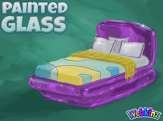
I hope TripleGFarms is happy with the look of the bed that will be included in this theme. I love the dark purple frame. Notice that the sheets match the wall divider we saw in the first group of concepts:
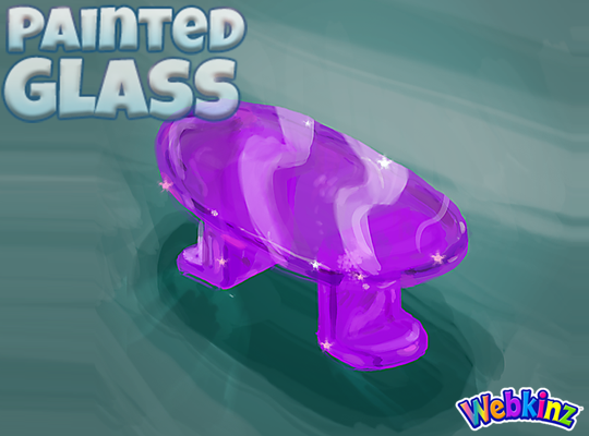
The glass side table will probably look perfect when placed next to the bed. Mike (the artist who created these concept drawings) and I were talking about this item yesterday and we thought the surface might look better if it was circular shaped instead of oval. What you you think?:
I am really excited about the sink that will be included in this theme. The idea here is that you will be able to mount the sink onto your wall giving it a nice, light modern look:

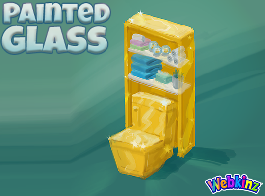
The toilet will have a nice set of glass shelves incorporated into the item. I really like how the items on the shelves match the colors of the other pieces that are included in this room theme:
The modern glass bathtub completes the mini glass bathroom set. Do you think all three pieces should be featured in the same color, or would you like to see some different colors used on some of these pieces?
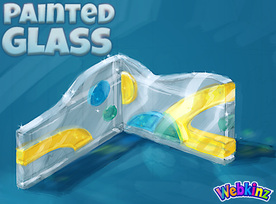
Finally, here’s a look at the wallpaper. I don’t think we really have anything like it currently available in Webkinz World. I love the wavy top and the fact that it will be slightly taller than our standard wallpaper:
Remember to leave your feedback in the comment section below and stay tuned for your first look at the 3D versions of these items coming soon… I plan on posting the first set on April 20th.
The Painted Glass room theme will be available in the W-Shop, for KinzCash, on May 8th.









Happy Dance!!!!! They made a bed for this theme:)
Wow! That on-the-wall sink is off-the-wall awesome! I like that you are trying new things. The purple glass curved bed frame is tres chic! Is there a way that you can incorporate some of that purple into some of the other areas of the line for those of us who like to design an entire apartment in one WW room? I’m not sure about the side table – oval or round. I think that Mike and the design team might be able to make either one work as long as they keep looking for ways to unify the whole theme. I like the bathroom pieces. It may be a little too much yellow, (thinking of the similar daffodil bathroom pieces), but I’m not sure how you can add in more color without making it look too clownish (thinking of the bright primary colors of the ‘Kids’ theme). I like the sleek sophistication and hope that comes across in the final designs. I agree with another post which mentioned that the handle on the toilet should match the chrome fixtures on the sink and tub. Is there a way to make the toilet and shelves more curved, like the bath? I’m not sure yet about the wallpaper, and will have to wait to work with the finished product. Could you please brainstorm a little more about the bed coverings? Thank you for the time and attention to detail with all of the little touches of home on the etagere. I think you really like your job, Mike, and it shows in what you do! Thank you!
My kinzcash will continue to add up as I’m not a fan of these. What in all of Webkinz world can be used as a window on those walls?
The oval table looks like a small coffee table. Maybe it should be round or square. the bathtub could have 2 colors with blue on the inside. Also the shelf behind the toilet should be a different color or the toilet different. Too much yellow! More blue or green in wallpaper. This is not a very exciting theme.
I love that you did a wall mounted sink. I would go either the yellow or blue for the bathroom. Would love to see a window.
I wasn’t impressed with the first group of drawings but I sure am now! I will definitely be buying these.
Really don’t like it-but everyone likes different things.
The wallpaper is pure perfection :D and the table is very nice. Perhaps two versions, round and oval? Round would work better with the bed, but the oval one is lovely in and of itself. I definitely don’t think that they should all be the same colour. Also, I’ve seen a lot of “favourite colour” polls, and the usual winners are blue and red, with yellow nearer the bottom of the list. I could have too narrow a data set, though, so you guys might want to do your own research :) Anyway, I really like the designs overall, and I am very much looking forward to seeing the finished product (and seriously hoping that some pieces will be available to “free players” like me.)
Technically I have 40+ plush pets but since I haven’t signed one up in more than a year I’m a “free player”. Seems odd, but, you gotta pay for site upkeep, and I am off topic anywayXDGetting the 5 pets for the Challenge here in the NEWZ is just PAINFUL !! ALMOST 3 HOURS this loads so very slow
First off I have to say how AWFUL this lag is – SO MUCH WORSE than the jinxed bad gateway error -Please fix!! Now for the feedback: This theme is coming along beautifully. The bed colours are lovely, but please change the throw by making it a solid colour, such as the green you’ve got on the bedspread, but a few shades darker, and please clean up the tattered edge. I agree with you and Mike about the side table – perhaps if you make it an organic or odd-shaped oval instead of symmetrical, and less long? I love how you made the sink a wall-mounted item, but I think the faucet should be toned down to a brushed nickel because it’s too much in competition with the colour of the sink. I really like that you made the toiled square – it’s a perfect foil for all the contouring on everything else. The shape of the tub is divine (I’d LOVE one like it in RL!) but, like the sink, needs the faucet toned down. Also, I like that all three bathroom pieces are the same colour – However, to foil all that yellow, I’d love to see a teal or sea green glass flooring option! As for the wallpaper, the only thing I would change on it is to switch out the yellow with the green (making the green more prominent) because it will balance out the strong yellow colouring of the bathroom items better, imo. Lastly, a great big THANK YOU to Mike (the artist) for your imagination and hard work – you’re amazing!!
Forgot to say: I’d love to see some stained glass wall art and/or windows added to the them, as well. Some free-standing sculpture Presentables a la Chihuly would be a PLUS, too.
*Should read ‘theme’, not ‘them’. Oopsies!
I’m glad that I’m not the only one having issues with the lag/reload problem. I was beginning to worry about my new computer!
Lol i thought i was the only one having problems XD i though it was my computer but everything else is loading fine. Its been hard even trying to get here to see comments to see if anyone else was having the same problem, im not alone! lol
I am having the same thing….
I am having the same thing too.