I am excited to show you the concept drawings for the second half of the Painted Glass room theme. Thanks to everyone who left feedback for the first set of concepts. Please feel free to do the same with this set. We will be reviewing your comments before modeling the final items in 3D.
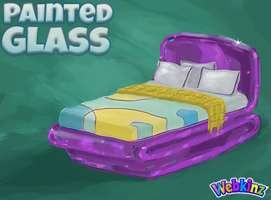
I hope TripleGFarms is happy with the look of the bed that will be included in this theme. I love the dark purple frame. Notice that the sheets match the wall divider we saw in the first group of concepts:
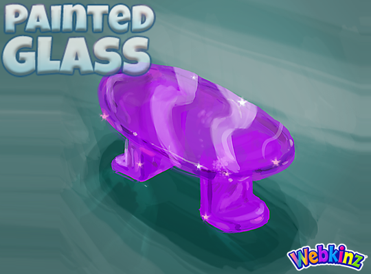
The glass side table will probably look perfect when placed next to the bed. Mike (the artist who created these concept drawings) and I were talking about this item yesterday and we thought the surface might look better if it was circular shaped instead of oval. What you you think?:
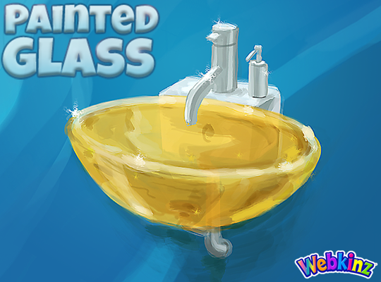
I am really excited about the sink that will be included in this theme. The idea here is that you will be able to mount the sink onto your wall giving it a nice, light modern look:
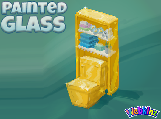
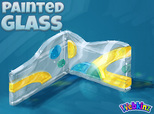
The toilet will have a nice set of glass shelves incorporated into the item. I really like how the items on the shelves match the colors of the other pieces that are included in this room theme:
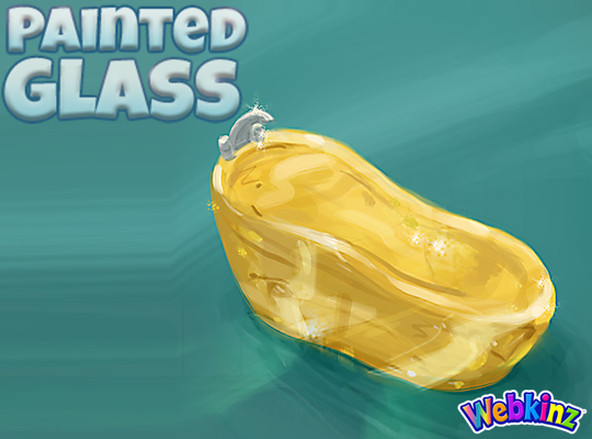
The modern glass bathtub completes the mini glass bathroom set. Do you think all three pieces should be featured in the same color, or would you like to see some different colors used on some of these pieces?
Finally, here’s a look at the wallpaper. I don’t think we really have anything like it currently available in Webkinz World. I love the wavy top and the fact that it will be slightly taller than our standard wallpaper:
Remember to leave your feedback in the comment section below and stay tuned for your first look at the 3D versions of these items coming soon… I plan on posting the first set on April 20th.
The Painted Glass room theme will be available in the W-Shop, for KinzCash, on May 8th.


I voted for this theme but I must say rhat I am a bit dissapointed. Not liking it at all.
Really? That makes me sad. What is it that you are not liking about the theme? What was it that you were looking for?
i’m so excited for this! it looks so pretty :)
I like the look of the oval table, but it does seem more like a coffee table. I would suggest round or square with rounded corners. I feel like these pieces should look “molten” rather than molded, so sharp corners and flat edges wouldn’t look right.
Wow, I’m loving this theme a lot more than I originally thought I would! I really like the bed, the purple color is so pretty and allows the bed to standout in comparison to the other yellow/blue pieces. Upon first glance I originally agreed that the side table should be changed to circular because I can’t see such a long table working next to the bed, but when I thought about it more I felt like it’d be more unique if it was kept as oval. I totally support megamom12′s idea of making the side table change from circular to oval based on how you turn it. That’d be amazing! The bathroom set looks great! The mounted sink is such a great idea, it’s super modern and unlike any other sinks we have. The toilet with the shelves is also really nice. I do think there could be some more color in the bathroom set, maybe in a sleek pattern on either the bathtub or the toilet. The wallpaper is really cool, the abstract/geometric shapes give off a really different vibe than any current theme we have in the W-shop. I was really hoping to see a matching flooring and window though, since I don’t think this wallpaper would work seamlessly with any of the current floorings available and while we do have some stained glass windows, the color scheme/complexity of the current ones wouldn’t match with this. Maybe a matching flooring/window could still be added? :) I’m super excited to see the final 3D look of this theme!
Say, I was just thinking. As far as decorations for this or any other theme, I don’t think that I’ve ever seen a toilet paper dispenser. We could use both the wall mounted and the stand style so that we can find one that works for any direction that we situate our bathrooms. We could also use some more towel racks.
Yes, that’s true! I totally agree, it’d be great to have more bathroom items and a wider variety. For a small and simple bathroom a few extra items like the toilet paper dispenser would really do the trick in making the room look more complete.
I do agree the table should be circular, but I hope the three bathroom pieces stay the same color. They match better that way. If one of the items were a different color, I would suggest changing the color of the sink to blue or green. We don’t currently have a yellow tub in the W Shop and the yellow seems to look good for the toilet.
love the wallpaper and sink! soooo pretty ^-^
This theme to be really painted/stained glass needs all the colors of the spectrum. Please add red and orange and more brightness. The all one color bathroom and kitchen are boring. The kitchen is too much like the ice block theme. The chair a repeat of the ultra modern theme. The toilet is not rounded like a glass item would be. I voted for this theme but I was hoping for way more color and not a bunch of items all the same color! Please keep designing . (-:
Loving these designs so far! Especially the shelf and toilet combo! I think the bathroom would look even better with a different shade (maybe blue or green?) for the tub or sink, but I love the yellow regardless. :D
I don’t like the bed. The base is fine. But the colors of the bedspread DO NOT match and it almost looks tattered and worn out like some old fashioned spread your great grandma would have. Everything else is good, except the tub needs to be purple. Too much yellow.
The bed covers are the coordinating colours and designs. I like the folded throw and I’m sure that in the final design they will clean up the edges to show that it is fringed. There’s nothing wrong with having one of great grandma’s pieces that she made with her own hands displayed on your bed.
There is quite a bit of yellow in this. At the very least the commode should be a different colour from the shelving unit…or perhaps make the shelving unit a contrasting colour.
I agree that the oval table looks like a coffee table & not a good side table. I love Powerann’s suggestions for stained glass – that would be great to have stained glass windows for the theme. And to have decorative glass pieces “a la Chihuly” would be fantastic!
I do like the oval table for a coffee table. I do agree that there should be a smaller side table. Perhaps a table lamp as well with a Tiffany style stained glass table lamp.