I am excited to show you the concept drawings for the second half of the Painted Glass room theme. Thanks to everyone who left feedback for the first set of concepts. Please feel free to do the same with this set. We will be reviewing your comments before modeling the final items in 3D.
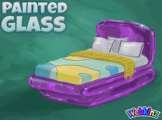
I hope TripleGFarms is happy with the look of the bed that will be included in this theme. I love the dark purple frame. Notice that the sheets match the wall divider we saw in the first group of concepts:
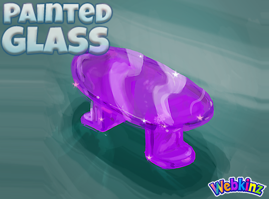
The glass side table will probably look perfect when placed next to the bed. Mike (the artist who created these concept drawings) and I were talking about this item yesterday and we thought the surface might look better if it was circular shaped instead of oval. What you you think?:
I am really excited about the sink that will be included in this theme. The idea here is that you will be able to mount the sink onto your wall giving it a nice, light modern look:

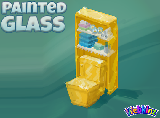
The toilet will have a nice set of glass shelves incorporated into the item. I really like how the items on the shelves match the colors of the other pieces that are included in this room theme:
The modern glass bathtub completes the mini glass bathroom set. Do you think all three pieces should be featured in the same color, or would you like to see some different colors used on some of these pieces?
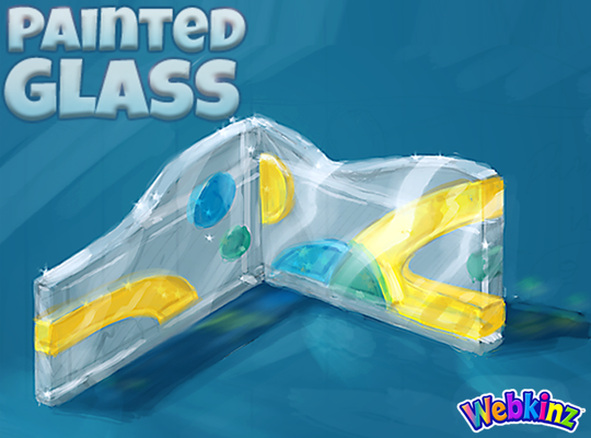
Finally, here’s a look at the wallpaper. I don’t think we really have anything like it currently available in Webkinz World. I love the wavy top and the fact that it will be slightly taller than our standard wallpaper:
Remember to leave your feedback in the comment section below and stay tuned for your first look at the 3D versions of these items coming soon… I plan on posting the first set on April 20th.
The Painted Glass room theme will be available in the W-Shop, for KinzCash, on May 8th.






I have an idea for the flooring. Create a large quarter of the floor tile and offer four rotations. Perhaps one could be multi colored glass bits, another multi colored glass bricks/ovals and maybe different colored solid glass 1/4 tiles. That way we could customize the flooring in the different areas of our room.
i love the fact that WW has a complete bathroom for a change – All 3 pieces and not just 1-2 -
I think the bathroom pieces should be available in multiple colors. I like mine to match each other but it sounds like others want the items to be different colors. The teal, aqua and purple are gorgeous colors, and the gold yellow matches well with them all. I can’t wait!
I would like to see more variation of color the glass is so beautiful I want to see the bathroom pieces all different colors…bling bling
The bed is perfect. The side table should be round. Nice idea with the wall sink. I feel the bathroom should be all one colour to avoid looking busy but ‘maybe’ the shelf over the toilet could be another colour. What about the facet colour? Something else? Or maybe the back wall of the toilet shelf just needs another colour. The wallpaper pattern reminds me of the retired soccer theme but I like the transparency look. Why is there no purple in it even if it was outlining the shapes like in the bed. I would consider the legs of the table to look similar to the swirl look of the bottom of the bed. Maybe the bathtub the shape of the sink. I’m looking forward to the 3D version but it has been fun watching the process and reading the suggestions.
I have voted for this theme twice and I am so excited it’s finally going to be a W-shop theme. I absolutely love the concept of this theme. Can’t wait!
I’m another one who likes the idea of the bathroom pieces having a different color from one another. I like the wallpaper too. Now, what type of flooring would look good with it? I can see many kinds of flooring that may go with it. The bed is super cool, and the side table (either -round , or oval ) is a nice complimentary touch.
I think different colours for the bathroom pieces/furniture would be beautiful
These are so cool!!!! I love everyone of these items!!!
I love the look of this new theme! As for the side table, I like a round shape, or even a square shape, better than an oval. I agree with other players that the oval looks more like a coffee table.