As promised, I have your first look at the Painted Glass room theme! Mike, one of our talented artists here at Webkinz headquarters, has done a great job creating concepts for 6 items that will be included in the theme. Please feel free to leave your feedback in the comment section below. Let us know what you like or don’t like about each item because we will be reviewing your feedback before modeling the final items in 3D.
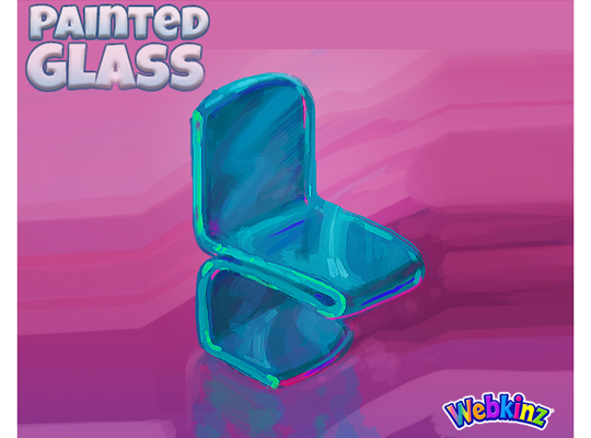
Here’s another look at the original concept drawing of the dining chair that was released when you first had the chance to vote for this theme. This design was used as inspiration for the other items that will be included in the theme:
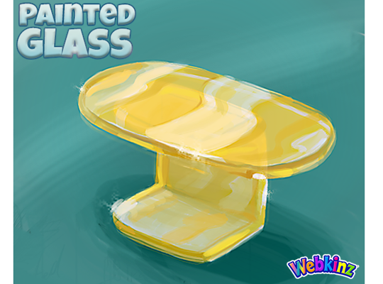
The dining table has a beautiful yellow sheen. It will be a nice contrast to the teal colored dining chair. The thing that I love most about this theme is that each item will work great together or mixed with items from other room themes:
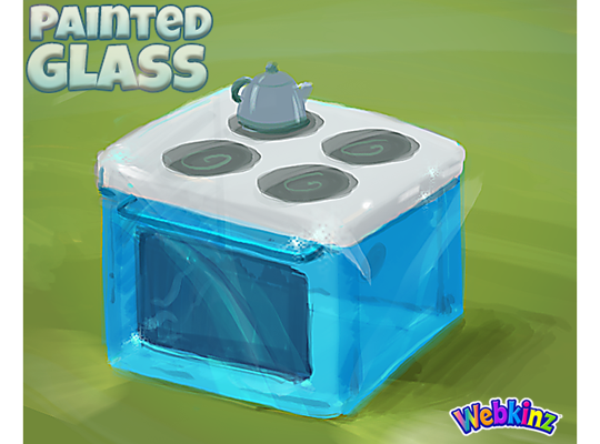
I love the look of the stove that will be included in this theme. The sleek white surface of the stove is a nice contrast to the beautiful blue glass used for the rest of the item. The tea kettle is also a nice touch. I really like when we add extra details to our items:
This may be a first for Webkinz… We actually decided to combine a sink and a fridge into one item so players can create a complete kitchen set. Clicking on this item in room will allow you to store food inside the fridge. I really like the see-through door and the fact that the colors will match the stove so they can be placed side by side seamlessly:
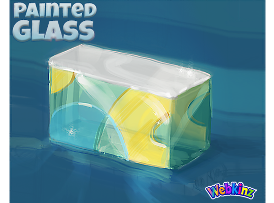
This next item is also pretty unique. It’s a wall divider but will actually have two different heights. Two rotations will be 1 tile high, and the remaining two rotations will be 2 tiles high so, technically you’ll be able to use it as a divider or a counter. The neat thing about this is that you’ll be able to place items on the surface of this item in all 4 rotations:
Finally, here’s a look at the lamp that will be included in the Painted Glass room theme. I really like Mike’s design. The sleek look has a futuristic feel and will work with all sorts of room designs:
I hope you like the way this theme is turning out. Remember to leave your feedback in the comment section below and stay tuned for more concept drawings coming soon… I plan on posting the second set on April 6th.
The Painted Glass room theme will be available in the W-Shop, for KinzCash, on May 8th.







I was not too keen when I first saw this in the voting stages, but after seeing the drawings, I really think it is going to be a great room, thanks to the art team!!
I like the color scheme so far. Thank you for not using pink this time. I don’t know why but I expected to see deep jewel tone colors. These colors make me think of the ocean, please add a sea green & a deep green to the palette, I think that’s look amazing. Wouldn’t it all be fun to use in an underwater or aquarium room! I’m looking forward to the next set of concept drawings.
I also think sea green and deep green would be good. I don’t like the bright yellow table, it needs to be more gold. I can’t see me wanting to put the chairs round that table. I do like the divider that has a lot of uses, we need more of those types of items. Maybe add a magenta type colour, but not pink, as we have lots of that already.
I like the yellow but a more muted good would look really nice too. Undersea colors. As for the magenta – maybe not. (look at the background color behind the blue chair.)
A more muted GOLD.
I kinda like the look of the pink background behind that blue, IMHO.
I love the transparency of these designs! If it can be replicated through layers, it would be really cool! I love different ways of combining fridges and taking fantasy to something that is unconventional, yet still “functional”. Pushing the boundaries is really great! I mean, who wouldn’t love to have a fridge and a sink? Great job! I hope this goes more toward the green side and not all are the “webkinz blue”. The teal is great with the yellow and I can’t wait to see more!
The gloss is very interesting.
I also like the yellow. Go yellow go!
I absolutely love the combo sink/fridge. So cool!
Since this is first sketch, here are my ideas.
The table and lamp top should have the same shaped edges as the sink and fridge and stove. So more square.
The chair, table and lamp base should have the same legs. I would prefer half the length of the chair and table legs so less drawn out.
The kettle and counter top items can use colour.
I can’t wait for these new items.
And if the little white sparkles you show to emphasize the shine on a lot of these new concept designs could actually make it onto the real items, maybe twinkling every now and then…that would be awesome!
Oh, yeah — I also wanted to mention that the blue color you used on a lot of these items is just gorgeous! Please keep it in the final versions, and please keep everything as beautifully shiny as it is in these concepts, too! :)
You should make the chair in another color as well, so there are two colors for chairs!
I absolutely love the lamp! I think it looks great the size it is, myself… But the item I’m not sure about is the table. First thing I see when I look at it is a letter J, so if the shape was changed a bit, that would be better. The wall divider/counter is cool — if it changed colors/patterns when rotated, that would be amazing!
Are they going to be see through? Not sure I like them. Not sure of the colors either-I’m sorry.
I like the design, however, I agree with others regarding the lamp. But, my biggest question is: with the table base like it is are we going to be able to put chairs all the way around it? I think the table base should be centered and not so big.