As promised, I have your first look at the Painted Glass room theme! Mike, one of our talented artists here at Webkinz headquarters, has done a great job creating concepts for 6 items that will be included in the theme. Please feel free to leave your feedback in the comment section below. Let us know what you like or don’t like about each item because we will be reviewing your feedback before modeling the final items in 3D.
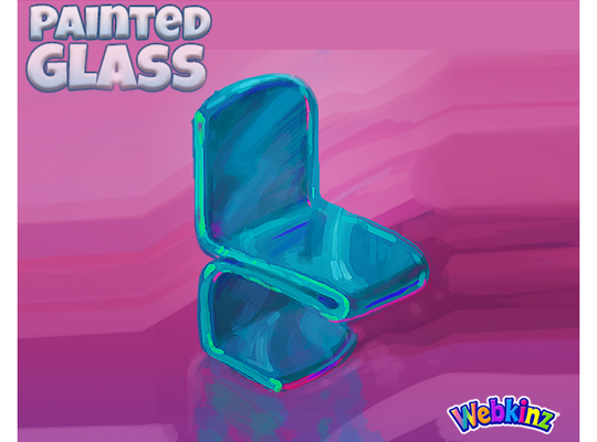
Here’s another look at the original concept drawing of the dining chair that was released when you first had the chance to vote for this theme. This design was used as inspiration for the other items that will be included in the theme:
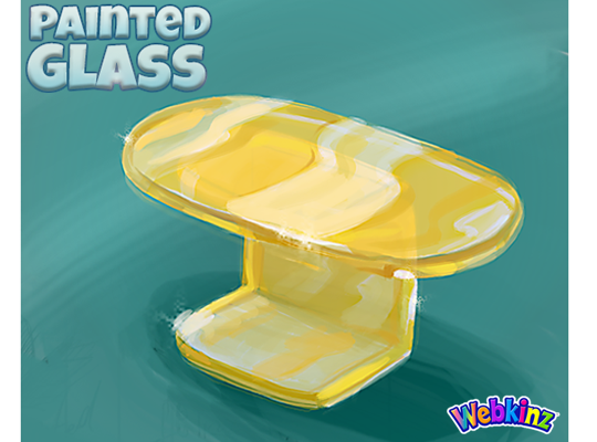
The dining table has a beautiful yellow sheen. It will be a nice contrast to the teal colored dining chair. The thing that I love most about this theme is that each item will work great together or mixed with items from other room themes:
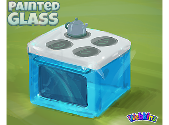
I love the look of the stove that will be included in this theme. The sleek white surface of the stove is a nice contrast to the beautiful blue glass used for the rest of the item. The tea kettle is also a nice touch. I really like when we add extra details to our items:
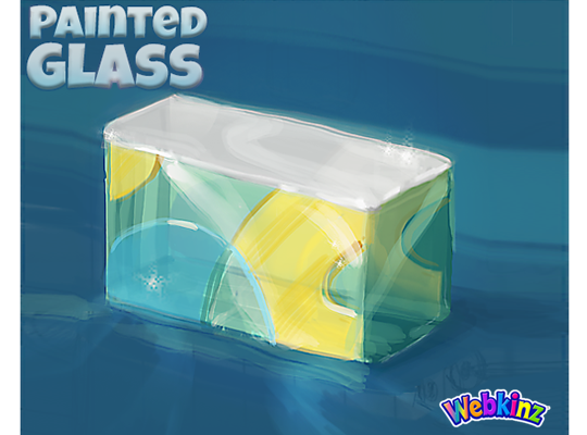
This may be a first for Webkinz… We actually decided to combine a sink and a fridge into one item so players can create a complete kitchen set. Clicking on this item in room will allow you to store food inside the fridge. I really like the see-through door and the fact that the colors will match the stove so they can be placed side by side seamlessly:
This next item is also pretty unique. It’s a wall divider but will actually have two different heights. Two rotations will be 1 tile high, and the remaining two rotations will be 2 tiles high so, technically you’ll be able to use it as a divider or a counter. The neat thing about this is that you’ll be able to place items on the surface of this item in all 4 rotations:
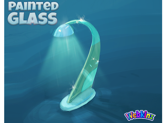
Finally, here’s a look at the lamp that will be included in the Painted Glass room theme. I really like Mike’s design. The sleek look has a futuristic feel and will work with all sorts of room designs:
I hope you like the way this theme is turning out. Remember to leave your feedback in the comment section below and stay tuned for more concept drawings coming soon… I plan on posting the second set on April 6th.
The Painted Glass room theme will be available in the W-Shop, for KinzCash, on May 8th.






CAN you make it so we can turn these and CHANGE COLOR ?? GREEN would blend better with outside rooms .
When I read the title, ‘Painted Glass,’ I imagined more colors, not just blue and yellow, as it seems to be very popular in webkinz. I imagined more reds, greens, purples, blues, yellows, and combos thereof; almost like the color scheme of stained glass. I am also disappointed in the lack of other furniture like bathroom sinks, toilets, showers, tubs, beds, couches, side tables, coffee tables, armoires, dressers, vanities, floor lamps, and so on. I hope there will be more to this room theme along with color and not just another blue and yellow room like the Atlantis, galactic, trading card series, fantasy theme, and several others. I really am expecting big things from this room theme and very excited to see it. While we are on the subject of kitchens, perhaps more blenders, sandwich makers, microwaves, and perhaps dishwashers could be available as well. I do see that wonderful gleam I was hoping for in the concept art though. Thank you so much, and best of luck to the designing of the new room theme!
Michael Webkinz plans on posting the second set of concept drawings on April 6th. Maybe some of those will include some of the items that you are hoping for like the bed, and the bathroom pieces. We all need to be patient. Good things come to those who wait!
These look great! It qould be super cool if more items were rotatable to get more colors to mix and match!
I love the concept and am glad it will be in the w-shop for Kinz cash. I can’t wait to see the rest of the theme assuming you’re making more. At least a refrigerator to complete the kitchen. The counter top is my favorite because of the mixture of colors and the fact that it can be different heights to really have fun with it.
The refrigerator is shown in the above group of concept drawings that you posted this comment under.
You could place two dining tables together and create one BIG dining table. So far so good….. one thing though, if you have a yellow piece, Your gonna have to make more yellow items. I did not vote for this because afraid it would look weird. I was wrong though.
With UNEVEN sides putting 2 side to side will look strange. BETTER end to end .
Your right…. hmm tricky.
I like the concepit but the yellow table clashes withe the cool blue. you should never mix warm colors with cool ones. The mixed color counter doesn’t look good either you shpould stick with one color and I suggest the blues.
I respectfully disagree. Cool colors and warm colors mix beautifully all throughout nature. Consider a long-stemmed red rose, or a scarlet macaw in the lush jungle, or the kaleidoscope of colors in the forest in Autumn by a clear blue waterfall with moss covered rocks. It all blends magnificently in my eyes!
If you look at the colour wheel, the colours across from each other are complementary colours – one warm and one cold. Warm and cool colours are meant to be used together.
I think the bend on the chair should be thinner and I really don’t like the look of the leg of the table. It would be better to have the one leg come down into a flatter base. Finally the wall divider and lamp look good but would be better if their colour was closer to the blue of the stove. Perhaps you could give us a choice of colour for the chairs in both the light and dark blue as well a blue or yellow table.
I see this looking great in an underwater room
I totally agree- great in an underwater room, not too sure about elsewhere. Like being able to see through the cabinet doors into contents. Kinda like the blue and yellow item.
Too sparkly. XP
MyLittlePone2010EG13: LOLz, I did say Chihuly inspired pieces in a suggestions but um okay…I go wit the flow, I really wanted the painted glass theme though, so XD can’t wait, it will be awesome I’m sure.
Sorry your username is long…sub out the e for a y on Pony. :)
I love the concept art! I can’t wait for it to be released in the w-shop!