Steve Webkinz here, reporting on some important updates to your Dock!

We recently changed the sorting of all items to an alphabetical format rather than grouping certain item types together under the same tab.
Now to help make things even more organized, we’ve begun adding sub-tabs to specific sections. Players who use the Webkinz mobile app will already be familiar with these sub-tabs, which they’ve seen when dressing their pets.
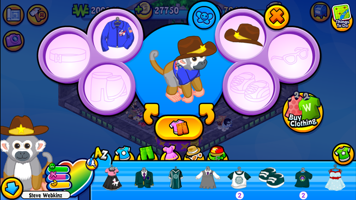
Players in Webkinz World will now also find these sub-tabs when they select the clothing tabs. We’ve also added sub-tabs to the Decorations tab of the Dock. In each of these sections, we’ve included an A-Z alphabetical option for players who want to continue seeing themed items together.


We’re planning on creating even more sub-tab sections for the Dock in the near future, so keep watching Webkinz Newz for announcements! We would also one day like to add a search feature to the Dock, however this project currently isn’t in the production pipeline, so it will still be some time before it will happen.
This has been Steve Webkinz reporting for Webkinz Newz! What would you like me to report on next? Let me know in the comments below.






Thanks, this is a FANTASTIC improvement to our docks and makes finding things so much easier. All I ask now is please please please make it so we can hide the doors in our rooms. I don’t even want to use any of my amazing wall papers to decorate until those awful doors are gone!! The doors just look strange in the middle of the beautiful outdoor wall papers.
biscotti, I Soooooo agree with you!!!! Even the indoor wallpaper designs are sometimes ruined by the doors. My “house” is all wacky, trying to arrange it so there aren’t any doors along the wallpaper side!
I was wondering could you PLEASE make the the WEBKINZ NEWZ bed sendable ???
Thanks for the tabs – pure alpha was a nightmare.
Can you make a junk tab where we can place things we don’t like or can’t trade or sell?
YES! Wow that would be awesome. JUNK TAB! I have so much junk that I can’t get rid of and at least I wouldn’t have to go through it all to see what I want.
YES!!
This makes things much easier.
I LOVE the clothing tabs- it’s so much easier than just click, click, click, click, click, click, click, clicking to the other side for shoes or something!
i’d like the estore items to have their own tab instead of being mixed in with the kinzcash items
Awesome idea, YES!!
Go back to the original. This is such a mess.
Really? I guess because I’ve been using the dock system from the Mobile end, I’ve actually come to appreciate how it compresses your stock. I really like that all of the wallpapers are in one place and not scattered end to end. I like being able to find things by the alternate alphabetical listing, as well. I know some people don’t appreciate change and find it frustrating when things aren’t where you’re used to finding them, but give this new format a real chance before you toss it. If you could add a search by name function, like with the pets on the Web site, I think it would improve the efficiency even further. But then, you’re talking to someone who has 1000+ items in their dock.
The tabs are super helpful! Just going alphabetical was tough with a lot of wallpaper in my dock, but now everything works :) Thank you!
Cool! I can’t wait till more sub-tabs are added… they make it so much easier to find things. (Ooh, and it would be pretty cool if they added in a search feature one day… I’ve been wanting that for years)