Hey guys, I’m back with a look at the final 3 concept drawings for furniture that will be included in the Garden Oasis room theme. This brand new theme will be released in the W-Shop on July 4th and will be available for KinzCash!
Miss my last post? CLICK HERE to take a look…
This beautiful blue arch matches the look and feel of the table and chair that are included in this theme. I really like the pop of color the flowers add to this item:

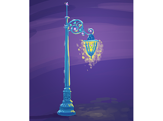
I find this lamp post very enchanting. What a beautiful way to light up the garden at night:
Finally, here’s a look at a couple of designs for a garden patio floor tile. Which version do you like best?:
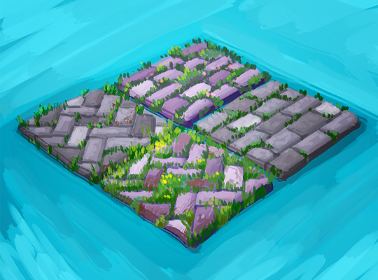
The 3D artist will use these concept drawings as inspiration when designing the final items that will be included in this theme. So, please feel free to leave your feedback in the comments section below….







I really like these final three items, especially the blue arch! ^-^ I think it’d be cool if we could have all four floor tiles, (it changes when you rotate it), but if I had to choose one, it’d probably be the very bottom one (the one with the most grass). I can’t wait until this theme is available to purchase! :D
I like the zigzag tiles best, and I also prefer the natural grey, as I feel it will be more versatile. But it is difficult to know if the other tiles would actually look better with this new theme once it is all put together. The arch and lamp are lovely, and have nice peaceful, happy colors. Great job Mike, and the rest of the design team!!
I would also like all 4 tiles!(via rotate) They would look great in several of my rooms!
Since the designers have already made 4 versions of the path tiles, why not use them all in a rotating piece? If I had to choose, my preferred ones are the diagonal bricks. I’d like the bricks to be grey like the StoneBird column is going to be, and I like both the grassy version and the tiny yellow flowers one. I think I’d go with the flowers AND grass, and downplay the purple on the bricks. It will make them more useful for more room types beyond this theme. Thanks for considering my input!
Actually, the rotating path tiles would be just 2 choices, not 4, so that both patterns could be turned in both directions when creating a path. (this is important!) I’d go with one diagonal & one straight brick tile, both grey to match the column & waterfall. I like the 2 that show the tiny flowers in the grass between the bricks best.
I’m asleep this morning! I just looked at the description again & see that they’re supposed to be patio tiles, not path. Pity, they would’ve made an awesome path…
I like the top right tile with the touch of pink to bring out that color in the archway and lamp post. This concept grows on me more & more! The finished pieces are beautiful! Looking forward to it’s release!
Either of the diagonal is my favorite but do like the flowers added the best. I can’t think of any diagonal you had before but could be wrong. Maybe you can have them rotate all 4 like someone else said.
all four make them so they rotate please
I’m all for the idea of having them rotate so that we can have a variety of choices. If that is not possible that either one of the herringbone (diagonal) patterns will work for me.
The picture shows each tile in it’s rotated view. It isn’t four tiles on one block, it’s four separate views of one tile. They have been making a lot of the single panel rotated views.
I agree with puppies4me, it would be really great if you could choose the 4 different styles by rotating the tiles. All four styles are really nice.
I love the arch and the lamp !!!
Love the arch and the lamp. My favorite version of the tile is the one at the very bottom the lighter stones diagonally placed and grass visible, but I agree with Dipstick2013 and would very much like a grassy flooring for the garden or grass as an alternative to the cobblestones if the tile can be rotated for different patterns.