Hey guys, I’m back with a look at the final 3 concept drawings for furniture that will be included in the Garden Oasis room theme. This brand new theme will be released in the W-Shop on July 4th and will be available for KinzCash!
Miss my last post? CLICK HERE to take a look…
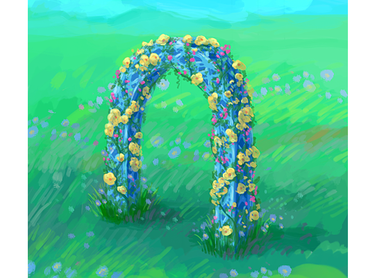
This beautiful blue arch matches the look and feel of the table and chair that are included in this theme. I really like the pop of color the flowers add to this item:
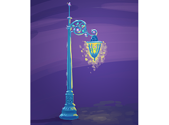
I find this lamp post very enchanting. What a beautiful way to light up the garden at night:
Finally, here’s a look at a couple of designs for a garden patio floor tile. Which version do you like best?:
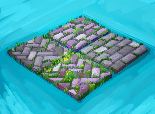
The 3D artist will use these concept drawings as inspiration when designing the final items that will be included in this theme. So, please feel free to leave your feedback in the comments section below….







i like the zig zag with the grass and flowers
I would love to have the tiles rotate into the four different designs. I wasn’t too happy about Garden Oasis winning the poll but that arch looks absolutely gorgeous! I’m really looking forward to July 4.
these are my favorite designs of this series–yay! don’t change… ;) k.
Love all of these! All the tiles are wonderful – can’t choose! How about all four AND they rotate? =) Thanks for the beautiful designs!
Is this going to be just for deluxe members? Hope not!!!
No, it won’t be just for Deluxe, however they will probably have some Deluxe only items anyway. =/
This is exactly my thoughts – rotating looks
I like the zig zag pattern the best. I think you should design so that when we place it, there are just a few flowers, like the design on the left but when you rotate it, the amount of flowers increases and are more in bloom, like the zig zag picture on the right.
I agree! Zigzag pattern is a unique tile we could add to our rooms! :)
Yes, I definitely like the left tile pattern and color, too. Good idea about the rotation to add in flowers!
very nice designs. I also hope we can rotate the tile for each design. The tiles will look very pretty in my victorian garden
Kudos to all the artists there! From concept to actual virtual items, wow! Y’all are so amazingly talented!!!
I like the herring bone patterns…both of them, more plain and the one with some color but yeah, that pattern is very nice.
The diagonal without the flowers or all 4 different that can be rotated.
I like the garden patio floor tile with more grass and flowers the best.
I want to dig the weeds out of those tiles LOL. It should be interesting to see this in the winter rooms, too.