Hey guys, I’m back with a look at the final 3 concept drawings for furniture that will be included in the Garden Oasis room theme. This brand new theme will be released in the W-Shop on July 4th and will be available for KinzCash!
Miss my last post? CLICK HERE to take a look…
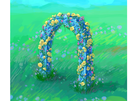
This beautiful blue arch matches the look and feel of the table and chair that are included in this theme. I really like the pop of color the flowers add to this item:
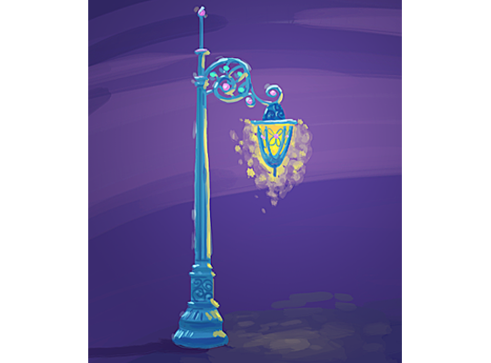
I find this lamp post very enchanting. What a beautiful way to light up the garden at night:
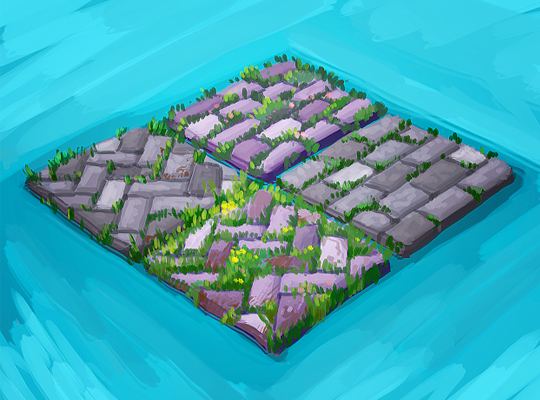
Finally, here’s a look at a couple of designs for a garden patio floor tile. Which version do you like best?:
The 3D artist will use these concept drawings as inspiration when designing the final items that will be included in this theme. So, please feel free to leave your feedback in the comments section below….







I love all of these!!! The blue arch is my everything! I love how delicate the flowers look. I also really love the hanging lamp it is perfect just the way it is. For the tiles, I like the ones that zig zag better than the straight one.
I like the one with the flowers the best. The other one on the right is my second. I love the archway and the light. Those are great!
Very beautiful drawings.
I like the straight tiles with less grass tbh
I think it would be awesome if the floor tile rotated to at least two different designs. I like the herringbone one, but I like the subway too. I also like the idea of us having the option of whether or not there is grass peeking up? I love the grass peeking up, but a plain one would be nice too. :)
Herringbone pavers, please!!!
Wow! I love this theme more and more each time I see it. As for the patio tiles, I like the herringbone pattern, with or without the flowers.
I love this whole theme!
I like the herringbone pattern stone pavers with the flowers best. Can’t wait to see the final designs!
Please tell me that our kinz can actually walk through the archway (I know that’s a lot to ask)
@Dixiecup micheal webkinz said on podkinz 101 “When you click on the archway your pet will actually sit in the middle of the archway”.
If the archway was 3 blocks wide, and the posts took up one block on each side, then the pets could walk through it. Or, if the arch was broken in half players could put it together with a block in the middle and pets could walk through. Could be kinda like candy cane balloon columns that look almost connected when put together with an empty block in the middle. It seems a little weird to sit in the archway.
My thoughts EXACTLY!! Why make it a seated object where you have to stop to go through. And who knows, with it being a half and half object that way, you can actually do some other nifty things with walls … I like the half-arch idea. that’s kind of a unique concept.