Hey guys, I’m back with a look at the final 3 concept drawings for furniture that will be included in the Garden Oasis room theme. This brand new theme will be released in the W-Shop on July 4th and will be available for KinzCash!
Miss my last post? CLICK HERE to take a look…
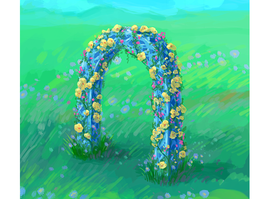
This beautiful blue arch matches the look and feel of the table and chair that are included in this theme. I really like the pop of color the flowers add to this item:
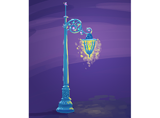
I find this lamp post very enchanting. What a beautiful way to light up the garden at night:
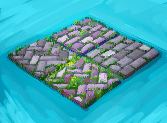
Finally, here’s a look at a couple of designs for a garden patio floor tile. Which version do you like best?:
The 3D artist will use these concept drawings as inspiration when designing the final items that will be included in this theme. So, please feel free to leave your feedback in the comments section below….







I too prefer the herringbone pattern. The one to the far left looks a little neater, while the lower one looks brighter but a bit overgrown. I agree with several other players’ suggestion that the tiles rotate to show all 4 versions. That would be simply ideal!
herringbone pattern please!!!!!!!!!!!!!!!!!!!!!!!!
I love the stone tiles.
top right bricks are the best ! (x,x)
I love the one with the little flowers but the best would be a click on tile that rotates the design.
Great garden tiles! Ideally, having them rotate would be awesome! My favorite is the diagonal with just some grass peeking through. My favorite item is the beautiful arch! I need something like this for my daughter’s wedding in October…design team, any ideas?
I love these items! At first I really wasn’t sold on the theme since I didn’t really like the butterflies and colorful fabric much, but there are actually so many different types of items in this theme it’s amazing! We could have all the bricks by using with rotations, but if I were to choose, I like the closest brick option with the zigzags and extra green grass :) It’s fresh and lively
I love all of the garden patio tiles! The one on the left is my favorite though. Would second the suggestion to do the rotation option for the tile
I love both styles of bricks. Use both styles in the rotation option like the hotel theme rug!
herringbone pattern for sure either one but without flowers is nicer