The Webkinz Newz community recently chose the Treat or Treat Street theme as this year’s Halloween room theme and today, I am excited to show you the first set of concept drawings!
I really like how this theme is turning out, but there is still some time before the artists start modeling each item in 3D. This is your chance to leave feedback in the comments section below. Tell us what you like or don’t like about each item or how you would make them better. We will be reading each comment carefully and take all your suggestions into consideration before making the final items.
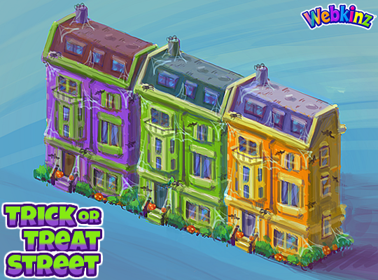
Here is a look at the homes that will be included in this theme. You will be able to add the homes to the border of an outdoor room to create the feel of a neighborhood that is decorated for Halloween. There will be three different homes, each featured in a unique color. You’ll be able to mix and match colors or set up a neighborhood using only one. Do you like the colors we used?:
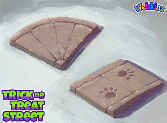
We added the road tiles that you could collect playing SPREE to the W-Shop and now you’ll have sidewalk pieces to match them. I think they will be perfect to use as pathways leading to each house as well. The paw prints are a nice touch but you don’t need to use them if you don’t like. The sidewalk tiles will change slightly when you rotate them in your room:
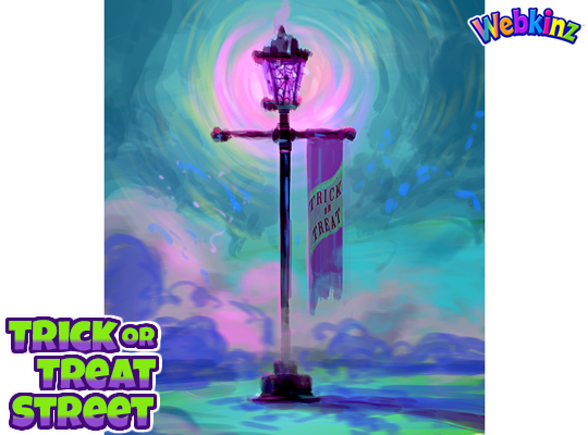
This lamp post is beautiful and I love that it will glow purple when it’s turned on. The Trick or Treat banner is also the perfect touch. What do you think?:
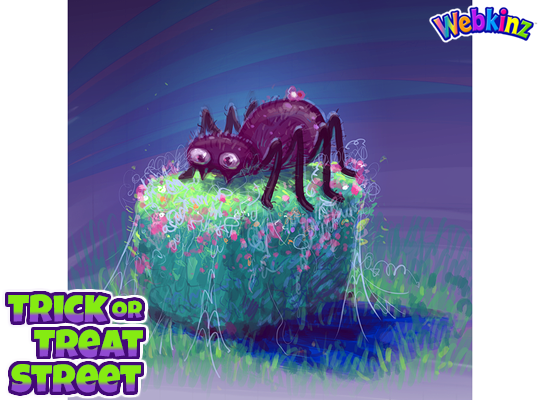
The last concept drawing I have to show today is a hedge that is decorated for Halloween. The concept drawing features a giant spider decoration resting on top of the hedge, but it will change with each rotation, giving you lots of design options:
Don’t forget to leave a comment letting us know what you like or don’t like about each item. You could have a hand in how the final pieces will look! We will be taking every comment into consideration.
Stay tuned for some more concept drawings coming soon. I plan on posting them on Saturday, Aug 17th.





Some ideas would be a jack-o-lantern that changes face when rotated, a pumpkin pile that changes when rotated, a low fence that is decorated or can be decorated using other items of the theme, an interactive scarecrow, maybe a one square floor tile that can go on top of other floor tiles of candy wrappers that changes when rotated, a fog machine that stays on, skeletons, ghosts & zombies that change to a different webkinz when rotated, a black cat that changes pose when rotated, decorative/fridge trick or treat bags & decorative/dispenser candy bowls that change when rotated & a tree that changes decorations when rotated. The tree decorations could be crows, then a witch crashing into the tree, then bats, then spiders. Pittiesrule
I love the tree idea and the decorative candy bowl! I think a low fence would be nice (one that can be place in-room) even if it isn’t super decorated (to give some contrast). Maybe it could have little pumpkins, but if you rotate it the other way it’s plain?
love the houses and the lamp!!! Im hoping to see some new costumes too :D
I’m really not happy with how this turned out :( I voted for this theme thinking it would have cute fall-related halloween items, not ugly glaring bright orange, purple and green. I love the sidewalk tiles, but I absolutely despise the color scheme of the other items. I would like the houses to have normal color schemes, so that the spider webs and pumpkins are the decorations that pop out, not the house colors. The lamp would be cuter with a soft orange and cream colored banner with a nice orangey glow. I LOVE that the hedge changes when you turn it, but again, I would like more orange or neutral toned decorations with a dark foresty green color. Essentially, I would really like the color scheme to better match the concept art we voted on! I love the designs, just not the colors.
I kind of agree. This wasn’t exactly what I was picturing either. I wasn’t expecting so many cobwebs and spooky stuff for this theme. :P
I think it’s perfect myself. It’s pretty much exactly what I imagined for a town decorated for Halloween! Classic spooky colors, classic spooky decorations!
I’m probably the only person in this world who likes spider so I kind of like the cobwebs as decorations :P But they shouldn’t be the ONLY decorations. I do agree with you that there are too many and there should be some variety.
I agree, I’ve never seen purple, green, or orange houses like that in real life, I think it would be better if they were normal house colours with vibrant decorations.
I pictured and was hoping for a cozy small town feeling with white-washed houses decorated for excited little trick-or-treaters and quaint store fronts with costumes for sale. The local brick schoolhouse could be represented with hand-painted pumpkins lined up outside. The houses that are shown remind me of the ones from which the parents never let their kids keep the candy. LOL!
I agree!!!
The house pictured looks nice but I think that if you are designing 3 different ones there should be some differences in each of them other than a color change. The ones pictured are exactly the same other than the colors. Change them up a bit like put the Bay window on the opposite side of one, the steps on another, the chimney should be a little different on each. Maybe put a peak on the roof line of one.
Hi I have a suggestion for the theme I think a tree with a crow or raven that would flap its wings and call to another crow or raven when clicked on would be cool. I love the new concept art, and theme. I love the house colours and the spider on the bush. This will be a great addition to webkinz. Have a good day/ night everyone :)
The tree is a super good idea!
Thank you :)
I would love to click on each house and get a treat! Awesome work can’t wait to build my rooms…
I LOVE what I see so far. I do wish that the houses could go in indoor rooms, too. I have always wanted sidewalks to put in rooms so I’m excited for that. Hoping that they’re NOT Deluxe. Pittiesrule
I would change the yellow house to a dark blue with purple trim & change the trim for the green house blue.
If they don’t change the colors as I previously suggested, I think this would be a great fix. Right now I think they’re a little too glaring.
I also hope that the houses are 1×2 as they fit better. It would be nice if the houses would look different & have different decorations, one house be crazy decorated like they’re having a Halloween party & the other ones more normal decorated.
Love all of the concept art, but maybe you could change the shapes of the houses so they don’t look exactly the same. Love the colours of everything. Great job! Have a great day. :)
so far so good Looking forward to seeing more
Yes, yes, yes, yes!!!! =D These are awesome! I love the spider bush, the ghostly purple light, and the ghastly buildings! Please make a HAUNTED HOUSE to go with it!!!! OOOH– WALLPAPER AND FLOORING THAT LOOKS LIKE YOUR INSIDE OF THE HAUNTED HOUSE BUILDING!! Okay, so you could have this big haunted house building for outdoors and indoors(Not a wall decoration, like the cottages and real buildings) and your could make a wallpaper that shows what it looks like inside AND we could you stuff from older Halloween themes/items and maybe have this zombie buddy? Do NOT put it in the mystery bags though. I’m so excited for the Annabelle outfit and the cupcake ones and the starry ones that are going to be in them along with the Lil’ Midnight, Mischievous, and Magical Munchkins, and the Creepy Cave ?? Theme along with the Noble Elk ?? Theme!! AND THE GINGERKINZ THEME, AHHH. AND THE OWL PLUSHY AND THE NEW SEEDS AND SO MUCH MORE!! (I do look at spoilers)
The spider bush is my favourite! :)
Yeah!! =D
Hey Radish, I do think its going to be an outdoor only theme, at least I’m hoping so, I think it would be better that way, because after all, a neighborhood is outdoor haha!
Oh, oof. XD