The Webkinz Newz community recently chose the Treat or Treat Street theme as this year’s Halloween room theme and today, I am excited to show you the first set of concept drawings!
I really like how this theme is turning out, but there is still some time before the artists start modeling each item in 3D. This is your chance to leave feedback in the comments section below. Tell us what you like or don’t like about each item or how you would make them better. We will be reading each comment carefully and take all your suggestions into consideration before making the final items.
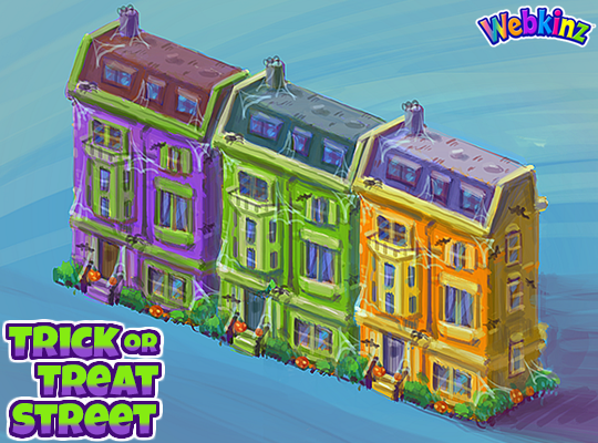
Here is a look at the homes that will be included in this theme. You will be able to add the homes to the border of an outdoor room to create the feel of a neighborhood that is decorated for Halloween. There will be three different homes, each featured in a unique color. You’ll be able to mix and match colors or set up a neighborhood using only one. Do you like the colors we used?:
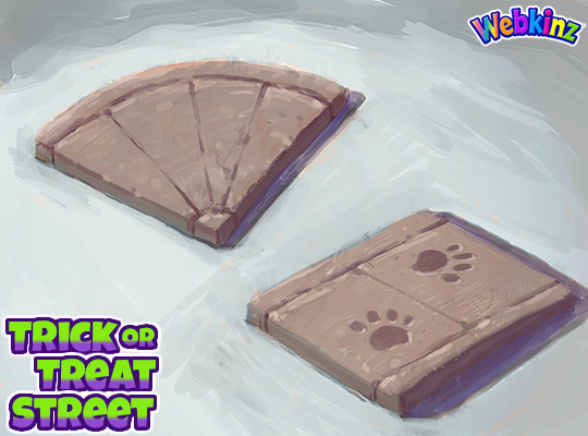
We added the road tiles that you could collect playing SPREE to the W-Shop and now you’ll have sidewalk pieces to match them. I think they will be perfect to use as pathways leading to each house as well. The paw prints are a nice touch but you don’t need to use them if you don’t like. The sidewalk tiles will change slightly when you rotate them in your room:
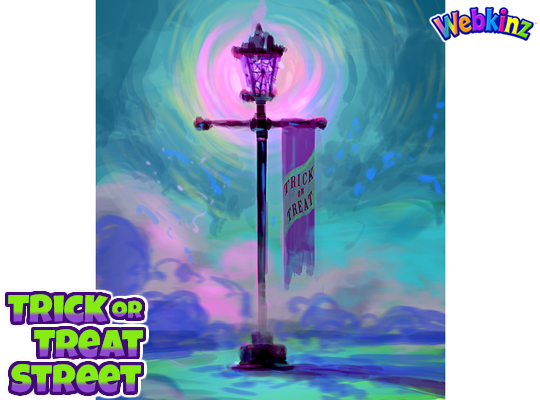
This lamp post is beautiful and I love that it will glow purple when it’s turned on. The Trick or Treat banner is also the perfect touch. What do you think?:
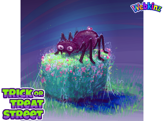
The last concept drawing I have to show today is a hedge that is decorated for Halloween. The concept drawing features a giant spider decoration resting on top of the hedge, but it will change with each rotation, giving you lots of design options:
Don’t forget to leave a comment letting us know what you like or don’t like about each item. You could have a hand in how the final pieces will look! We will be taking every comment into consideration.
Stay tuned for some more concept drawings coming soon. I plan on posting them on Saturday, Aug 17th.





Hey Guys!!! The concept is looking great so far. Suggestion on the Hedge. Maybe when rotated the hedge can display the spider, then a Jack O’ Lantern, then rotate to a Ghost, then rotate for some Bats. This will give us more scary creature options to frighten the Trick or Treaters. Just a thought.
Hi trexjt2013! I like your idea for the hedge!
Maybe one of the rotations could just be a plain hedge? That way we can use it to add contrast in our designs
Yes a plain rotation please! If there was a plain version it could also be used in other contexts!
I love them! The only thing I say is to switch around the roofs of the orange and purple houses and make the houses all a little bit darker.
Again, if they don’t use my color recommendation, making the houses darker would make them more palatable
I feel like everything is a bit spookier than expected. Like, the spider on the bush is fine, he doesn’t look too creepy. And the tiles are perfect! But all of the cobwebs and the purple glow of the lantern.. ehh.. I’d prefer if it was a normal color. You could keep the cobwebs and banner, but make the light yellow. Also, the houses hmmm.. Could they be more normal? Like a brown house and an orange house and a yellow house maybe? And make them all look slightly different in shape and decoration, with different Halloween decorations on the front. Two could have just pumpkins, one could have a banner that says “trick or treat.” Or maybe make one look more spooky with the cobwebs and spiders you guys like. I don’t know, I don’t mind a little spooky stuff, but I just kinda preferred the nice friendly little fall neighborhood trick-or-treat idea, which is what I thought this would be.
Me too! I wanted something different from the past themes that are mega spooky/kinda crusty looking (like with cobwebs and broken things). I wanted a cute fall outdoor theme with nice neutral colors and pops of orange! That’s what the concept art we voted on portrays. I feel click-baited :/
Please could they fit the rooms allowing for any doors that appear. The problem with previous houses and shops has been that it is hard to put them together to make them fit when a door is in a room and you end up with silly gaps that you have to fill with trees or similar. This would let us have the doors which we can imagine are other streets connecting to this one.
I agree! Maybe have an additional item that is a one-block house so that we could fill in any gaps
That’s a great idea! When I was making a room with the Christmas version of these houses it was so difficult to fill the gaps without the room still looking incomplete and I kept wishing they had made the houses to fit perfectly or had made a one-block version. Hopefully we won’t have the same problem this time!
I like the sidewalk tiles, but that’s all.
I like the colors on the houses, but they all look identical…is that what they would be? Identical style and decorations but different colors? I think I would prefer that the houses are similar, but have some differences. Love the sidewalk and lamp post, too. The hedge is a cute idea–can’t wait to see what each side looks like. It looks like these might work with some of the Freaky Forest items, which would be awesome! Looking forward to more concept drawings; thanks, Michael!
I agree, my first impression was it would look better if each house were unique in decoration. I’ve never seen a street where everyone decorated the same way. Great job so far. This looks like a fun collection.
I agree that the house facades should be different. Love the hedges & sidewalks. Good job!
That’s very true. In some places, like town homes, the houses are all exactly the same, which is fine, but they wouldn’t decorate the same!
I love the hedge and the sidewalk tiles. With the houses, I would like to see yellow swapped out for the green or purple. Since you’ve included that beautiful purple street lamp, maybe green-yellow-orange for the homes. I would love to see 3 different facades and/or stoop decorations for the homes. Would be great if a there was home, structure that could go into the room, even if it was a build-it type, like the one released for Christmas a few years back. Very promising so far, IMO! Oh, for the sidewalk tiles, will they be flush with the street tiles when placed?
I really hope the sidewalk tiles look nice next to the street tiles! I agree that it would be nice to have some sort of home structure to use this theme in indoor rooms!
Treat or Treat? That’s different.
Lol, I didn’t even see that typo until you mentioned it! ;P
Absolutely LOVE these items so far. They are perfect!! Love the brownstone houses with the creepy touches and I’m completely in love with the sidewalk tiles!! These colors on the street lamp and hedge are nice, too. Spooky and glowing eerily. Can’t wait to see more!!
they’re beautiful. we will make a beautiful room