
Ella McWoof here! With your help, I’ve sniffed out some important information about the X-citing new project, Webkinz X!
Now, in my EXCLUSIVE SCOOP, here’s more information straight from the TOP SECRET documents!
We wanted to make Webkinz World bigger and better, but without taking anything away from the many fan-favorite places! To accomplish this, we’ve added a little something extra to the design to help everything fill out any size screen!
Here’s a look at some of the updated looks you’ll see around Kinzville:
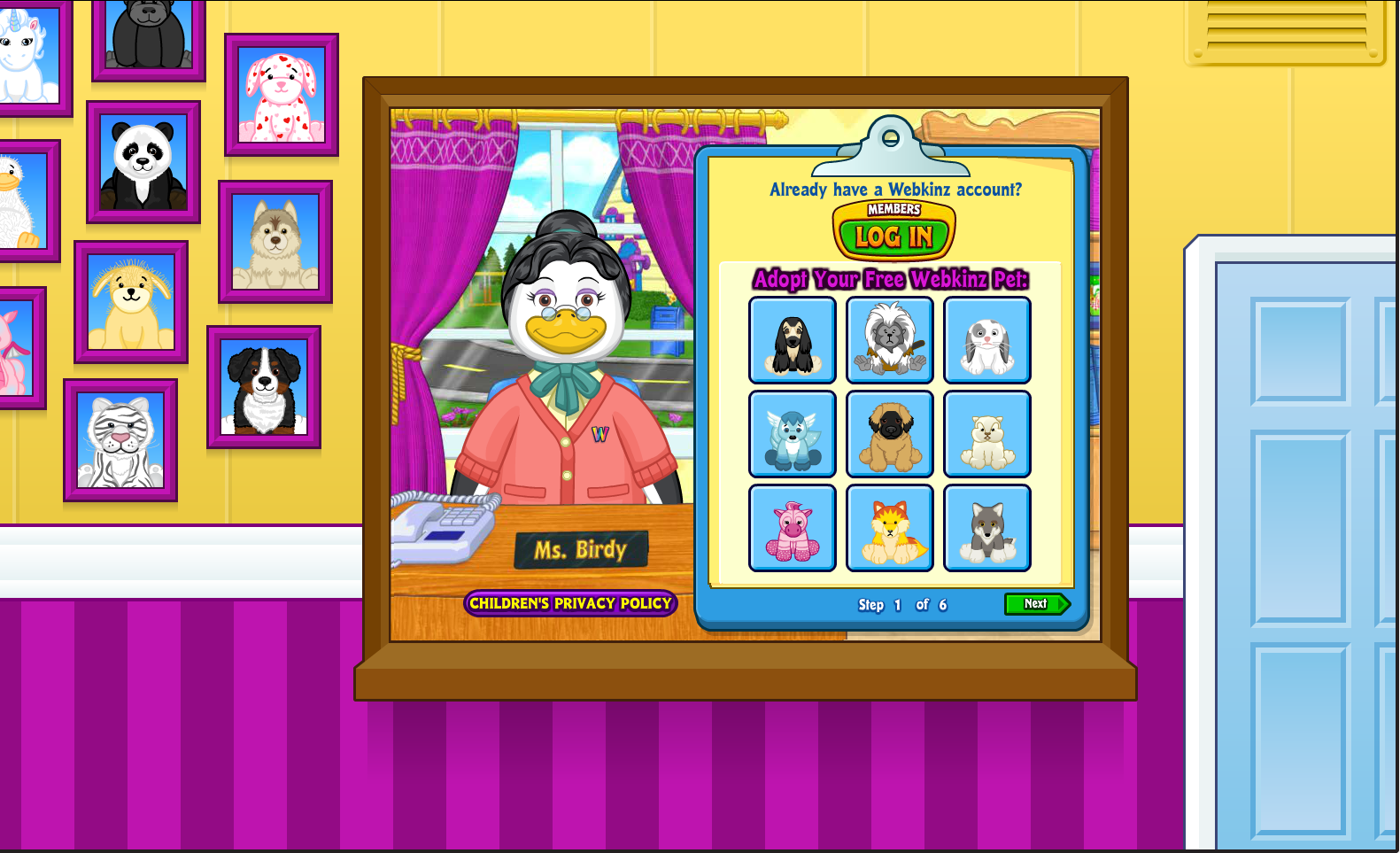
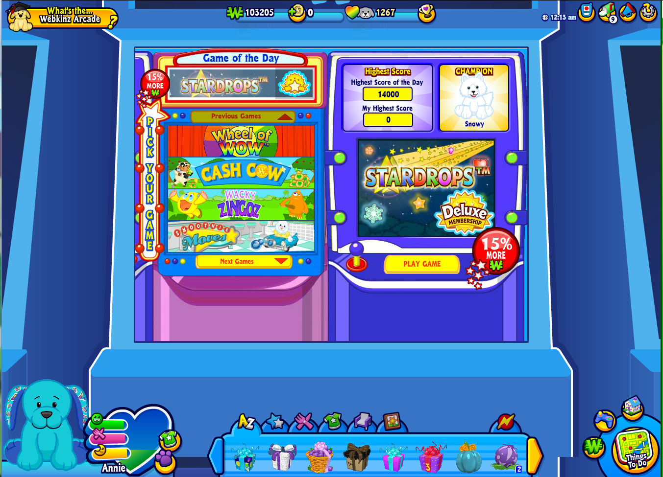









I don’t think anything is really smaller. There are just new designs on the sides instead of the current green. The ads will probably cover a lot of the newly designed space.
Though, does this mean that there will be ads on both sides? That would NOT be a welcome change. Neither is the smaller dock.
The screens look out of place in the backgrounds. They look really nice, but I don’t understand why they would put a new background and then a thick border to completely cut it off. It will take some getting used to.
I think the Adoption Center and the Kinz Post look nice. The Employment Office, the Kinzville Academy, the Magical Forest, and the Curio Shop look okay. The changes to the Arcade, the Clubhouse, Music Starz, and Quizzy’s seem so unnecessary. I mean, Music Starz and Quizzy’s look okay, but the changes just seem unnecessary. And in my opinion, the Kinzstyle Outlet, the Wish Factory, and the Tournament Areana don’t look all that great… and I think the Webkinz Stadium looks plain awful. I have to say, I’m not all that excited for this specific change.
I’m not as excited for this change as the other ones either but to me, the change is kind of nice to fit in with the rest of the modern stuff! :) With changes happening everywhere else, KinzVille seemed to need to change too instead of just remaining the same. Don’t worry! Ganz knows what they’re doing!
Love the idea for Arte’s shop, Tabby’s office, and the wish factory!!!:)
Okay, maybe I’m just not tech-savvy enough, but I don’t really understand what is meant by all these changes to “fit any size screen.” Does it mean that all the new borders around the old screens will just show up as filler for players on computers with larger screens? Or is it something that you will see only if you play with the window on full-screen?
This is exactly what I’ve been saying! The new stuff is FILLER. It’s to replace the old green background. Only large screens will see it. Hope this helps!
It will look more colorful that way! By the way, what happened to Vacation Island? Did I miss it?
I just noticed this.. They said “Here’s a look at some of the updated looks you’ll see around Kinzville”. So they only said some not all. =] But, I’m okay with not seeing all of them, they are just giving examples so we have an idea of what’s coming super soon! #2MoreDays!
Hey, marinawaterd59, Vacation Island is now Deluxe only. If you mean what the filler thing is, they didn’t show it. And now Webkinz X is here! I’m going to either melt or explode!!!
Just adding stuff around the outside does not make the Webkinz Rooms bigger, it just makes them look smaller and crowded. Not a fan yet, but it may be better when we get to use it.
I totally agree!! It looks like the changes will make it look smaller. I play on a laptop with a smaller screen. Seems like there will be a lot of wasted space around the edges make everything even smaller. :(
I think that is because they are making webkinz full-screen now, so instead of the plain green screen there will be a new, more colorful and creative screen instead! (:
Yes! Now there’s a positive comment, CaramelKisses33! I love awesome backgrounds and these backgrounds are AWESOME! Amazing job Ganz! Looking forward to tomorrow’s article! #2MoreDays
Yeah, I’m liking this! It does look a little small, but what I think is that it adjusts to your screen, and zooms in more on a smaller screen. I think that is the farthest out it goes in the pictures above.
And remember, they’re adding a zoom feature so you can zoom in & avoid the background altogether if you want.
I love the idea of making Webkinz World more realistic and full screen! I do have one question though, Genelle: How will this affect the ads? Will they still be on the side or somewhere different?
Good question! Will the wshop also get a makeover? I hope! Cuz at the moment when I go to sell items I can only sell 70% of my items, the rest disappear until I exit the wshop:/
Hmm, yes very good question. I also wonder if the W-shop will have a background. I hope they get rid of those video ads, though! On a fast computer they don’t bother me, but on a slow laptop they slow everything down a lot. Sometimes I can’t even play in the Tournament Arena or play arcade games.
Very true! If you use chrome download free Adblock as an app. It prevents those from ever hitting your screen and the site runs much faster!
I think it would be super if any of the Kinzville Academy students could be labelled with their class ranking so that all their hard work could be recognized! ♥♥♥foxpaws♥♥♥
So cool it’s coming on July 8th happy 4th of July
¤ kinzkash! ¤ kinzcash! I’ve got ¤ kinzkash ¤!
everyone dose unless they spend it all.
everyone spends it all the time for food games and chairs and more
Wait, is the update going to come on July 8th?
Yep! Webkinz X is coming July 8th. (#2MoreDays!) I think all of this is really cool. It always bothered me when the screen didn’t fit, so this will be a nice update for me. =] I still wonder why this article didn’t come July 4th, but oh well! At least it came!
What?!? I AM EXPLODING WITH EXITEMENT RIGHT NOW!!! AHH!!! #2moredaysINCAPITALLETTERS! Oh – I might have gone overboard a little bit!
Everything looks so far away now :(
I was going to say that. Its not my favorite idea ever. Especially with the arcade. Its like you are looking at arcade units within an arcade unit.
Anyone notice that the pets on the left side of Adoption Center are all from the Greatest Webkinz Contest! Cool little detail! Otherwise, these changes are interesting. From what I’ve read in the comments and in the article, these are filler, so it shouldn’t change the size of Webkinz World that we see now, right? ☺§
Wait… if this is fitting every size screen now, does that mean that those pesky ads on the side (the two large boxes and small one in the middle) are gone? ☺§
On My computer my screen is already the size of the new screen without the stuff on the sides so now I don’t think I will even be able to see it. It doesn’t work to enlarge it but Chrome does work. But with my sister her computer only has Chrome and it gives her a small screen. I don’t like this change. Out of all the changes this is my least favorite and there have been a lot that I didn’t like also but I guess I have no say in this so yeah. Bye webkinz world that I know and grew up with……..
Maybe, but if you really don’t want the ads (I don’t mind), there’s an option to have your parent get rid of them… *~Warriors2002~*
O-M-G!!! I’ve been asking and asking for Webkinz to go full screen. NOT because I just want to fill up the screen, but because a lot of the text is very small in the current version and anyone who’s eyesight isn’t perfect is probably having a bad time of it. This doesn’t address the problem, Ganz. Please tell us you’re going to make the important stuff fill the screen. Please? Holy moly. love to all! :D – Avzora ♥
I noticed that!
It doesn’t look like anything has changed…..hmmmmm…ANYWAY! Thx Gennelle, Steve, Mike, Ella, and Matt Webkinz for showing helping and making….webkinz x thing! As I said before I trust that this webkinz x thing will be AWESOME! see ya ~ my9tailkinz
I totally agree you.. all is awesome , I can’t wait to start Webkinz X. This will be FANTASTIC. Thx a lot Ganz for all the hard work done!!! :))
Actually, I am not concerned. This is to fit all screens. Only large screens, like computers, will see the new stuff. I believe the screens will stay the same size. It’s just a background. On my computer, there is a whole BUNCH of green background, which is boring. This will be more entertaining.
I agree on these points. If it fits my computer well, I’m happy. I LOVE the detail around the screen, but have some concerns. If I DO get to see all these details, I am afraid the main screen may look a little TOO small. Also, while I like the detail, I am not so happy with the screen in the center. It’s like I’m looking at a computer screen with a screen in the middle, like Fred Rover is in a little box, while the rest of the Stadium is all around me. Almost like I’m watching him through Skype. Also, when I log into Webkinz, a smaller screen comes up with the rest of the welcome page filling my screen. I’m not sure if that’s for everybody or not, so I’m curious to see this update for real.
I like the idea of Webkinz fitting the whole screen. Will we be able to open new tabs next to Webkinz now, too?
if you have a mac you already could. I can still, but I’ve yet to try with a PC
Please note: We haven’t changed the size of the original play area, we’ve just added a frame around the existing game to fill out larger screens. All of these images were captured on a 27-inch HD widescreen monitor. The screens only look small because they’ve been squeezed into the set column width for our Newz articles.
Thanks, that’s good to know.
It is, but I just can’t handle this. It hurts my eyes. It’s just too much. I might have to quit. Ow.
I need to get to a computer tomorrow!!! I need a least a little bit more time with the normal version or my brain will explode! And, §, please, let us choose if we want this or not, like the new Google Drive. They let you use the old version if you want. Please?
My Google Drive did the same thing, but one day I got on Google Drive on my HP Laptop and it was atomically the new drive! It made me mad! Anyway, I wish we could choose whether we wanted the new or old version, I’m excited for some of the stuff, but this isn’t one of my favorites! :( Face it Arte’s Curio Shop is still cool though…. Why did Ganz decide to change Webkinz World anyway? What was wrong with it?
I mean, it’s a good idea, but two questions Steve Webkinz: Will the annoying video ads be gone now? I can’t even play Webkinz when there are video ads because it slows down my computer so much. Plus it bothers me because I have third party advertisement turned OFF, and I’m pretty sure ganz doesn’t sell lipstick and workout equipment. Second, does this mean that if we don’t have the window full screen, it will cut off our dock??
Steve Webkinz, does that mean no more video ads? Those video ads are making everything run super slowly.
I know, I really hope they don’t have anymore video ads. Or just make all of them pause-able, that would work for me..
emiemiemiemiemi, there sort of is.
I’ve been wondering this myself but i didn’t know where to post the question. I have several pets trying to make through Kinzville Academy and they are having a hard time with the computer slowing down every time these ads switch. I keep going to the parent control area to check and it and it says my 3rd party ads are turned off but why do we keep getting these ads that are most certainly 3rd party ads, and videos to boot. It is very frustrating.
I HATE video ads. Anyone know how to get rid of them? Thanks.
I just never have sound and completely ignore them. Works for me. But I don’t know how to get rid of them.
Ok good cuz I was gonna say it was too small but if the size hasn’t changed then that’s awesome!
I had a feeling that might be it. I really like several of the new borders. I think I like the Curio Shop one the best! Nice work on both the creative end for the designs and the programmers for the execution. It’s A LOT of work. Thank you so much for all of the effort!
I wonder if the new webkinz will take care of some of the old glitches. I got a free picnic table the other day only now it won’t leave the dock and can’t move it any other way either. There are also some blue google berries that show up only when the Wshop is open. Can’t move those either or even sell them.
Wow, thank you so much for clearing that up, Steve Webkinz! That’s really good to know. :{)
Thanks for addressing that concern, Steve.
Is anyone else having problems with the dock getting in the way of arcade games, like Spree and Goober’s Atomic Lab??
my screen is small so i cant even see the much change but i have to scroll up and down just to get the hole thing, and i was playing a game and i lost because of the change. No afence GANZ but i dont really like the hole webkinz X thing. sorry but like it makes me have to do even more thing to take care of my pet. i still love webkinz in all but i just dont really like the hole webinz X thing. p.s thisis just my opinion. still and always will love you GANZ <3 (;
Same here, it’s so sad that Webkinz has to change. :(
i like everything but the arcade looks the best code
I agree. My son just asked if he was going to need a magnify glass to play on WW when they change it. I hope not! I hope everything can be enlarged so we can see all the work they have done.
Guys, you don’t understand. Webkinz is going to be the same size it is now. This background is just that green area you see if you have a large screen and expand it out all the way. Most people won’t ever see these backgrounds. It’s only if your screen is very large.
I usually play on a very large monitor, so this is great for me. Much more thematic & fun than the endless green screen! I like it a lot.
Exactly! It’s just like that, except the main screen will be in the middle of a nicer “outside” than just the green “outside”.
I like it. I just hope it fits on my whole computer screen
ikr, it also looks like everything is in a ……… window. aka farther away. the only farther away one that i like is the kinzville academy, w/ the lockers showing is pretty neat.
it looks like everything is smaller but why cant it get bigger
I know it looks awful!
well if you can see it now, then when webkinz X is in place you will see it in full screen.Also, bullseyejingles444, the free pets have been like that for a while, but that might just have been in the wbkinz mobile app.
I really hope Webkinz X will be okay… and I hope GANZ doesn’t get too carried away with making Webkinz too different… I LOVE it the way it is already… :O
WHOA. umm… already my screen is small… this will make it even smaller? :/
ummmm I think it is just the photo shot!
It’s just the photo shot. Don’t worry, the size your screen already is will stay that way for Webkinz X. However, if your regular gameplay on Webkinz DOESN’T fill out your entire screen, this extra detail will be there to fill it out, rather than enlarging the old screen. Don’t worry, they are not shrinking it either. ;)
Yes, I do not like that either. :/
I think it’s just a filler for screens with good resolution. If Webkinz already fills up your screen, you shouldn’t see a change…hopefully.
Read my mind!
HI GUYS! I’M BACK☺☻☺ and YAY more webkinz X info!!! I’m so Xcited for Webkinz X, and also Xtremely terrified but I should’ave guessed § would do this someday . . . anyway, no offense for ultimite “WEBKINZ X IS THE BEST THING THAT HAS EVERY HAPPENED!” fans, but I’m still not sure I really like these borders for Webkinz places, actually most of them are fine but I’m just not a fan of the arcade one :( Blue is my fave color but for the arcade I always thought of bright red and yellow colors for it . . But did I hear Webkinz X is happening on the 8th of July? EEEEKKKK THIS IS THE LAST DAY WEBKINZ WILL BE THE OLD WEBKINZ! OHMYGOSH I’M FEELING REEEALLLLY FAINT RIGHT NOW! CATCH ME! *faints*
Yeah, the red and yellow always felt characteristic of the Arcade. However, depending on how large your computer screen is, you may not have to see much of the blue at all!
Off-topic, but congrats on your picture getting featured, ShardLovesPotatoes! Your Googles is adorable! :D
Yes my first thought too, it all looks so much smaller now! The icons on the tabs are really small.
I agree ND i DO NOT LIKE IT , I feel it is just going to mess more things up onsite and make it harder to play anything , gonna have massive glitches too probably for a few months. Not looking forward to this at all. I do not know how this is supposed to make it Easier for kids?? Looks more complicated .
Also, this is kind of off-topic, but does anyone else remember the Characters section of Kinzapedia? It was rather fun looking at all the different entries for every Webkinz character; I just found out today that it’s gone! Welp, guess I’m pretty out of the loop. :P
What the…… Well, this is weird. At least there’s one thing I like about this… Why do I always seem to dislike changes on Webkinz?? Well, the KinzChat Plus thing was pretty hard not to dislike. And getting rid of Dr. Quack, getting rid of the Travel Agency (not to mention Debby Dragon), all this Deluxe stuff– the list is long. I remember when I used to spend a decent amount of time on here. Oh well, more time for drawing. :\
Yeah, most of the changes that Webkinz has made lately have been for the worse, in my opinion…however, that makes the site all the more ready for a fresh start (even if it is just a new coat of paint).
I dunno, I think the color of this paint is pretty ugly. Webkinz is so slow now. And Shadow is asking me to take him to the arcade….. Uh…..