Ella McWoof here! With your help, I’ve sniffed out some important information about the X-citing new project, Webkinz X!
Now, in my EXCLUSIVE SCOOP, here’s more information straight from the TOP SECRET documents!
We wanted to make Webkinz World bigger and better, but without taking anything away from the many fan-favorite places! To accomplish this, we’ve added a little something extra to the design to help everything fill out any size screen!
Here’s a look at some of the updated looks you’ll see around Kinzville:
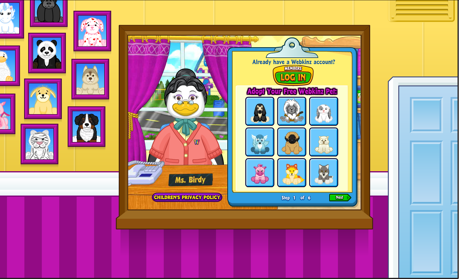
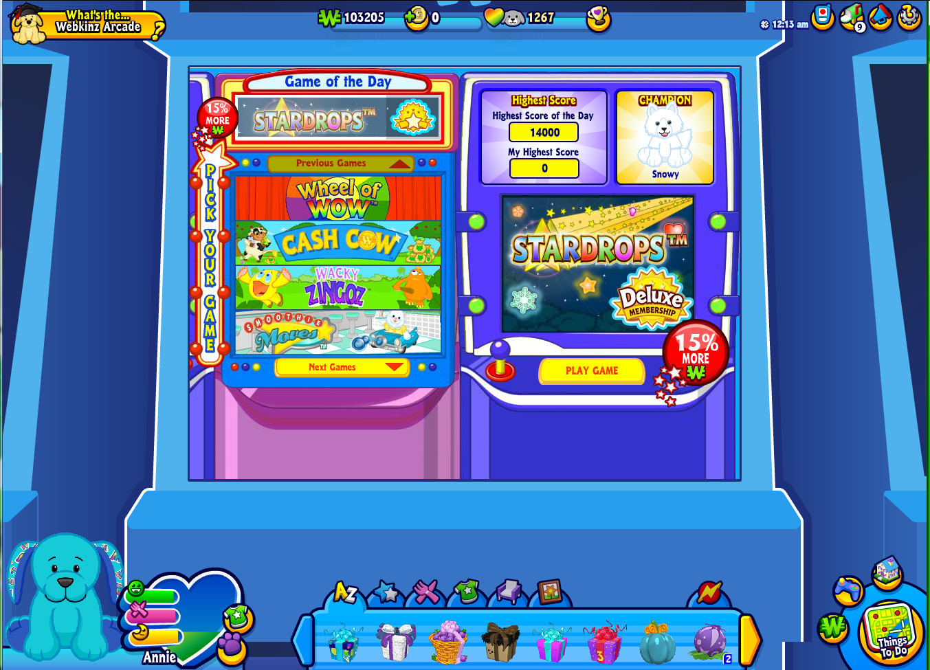









Maybe it just looks small because of the size of the pictures. It’ll look better, right?
Huh. This’ll be interesting. I just hope they change the W-Shop or add filters. I hate seeing all the Deluxe and eShop stuff mixed with the items I can buy- too confusing. I like when the eShop had its own store.
I agree, Dawn2Night (BTW I love your username!) I loved it when the eStore & the WShop were two separate places. It’s so difficult to shop now that I rarely go to the WShop any more.
Ganz has been working really hard on this!! And you do realize that complaining won’t make the changes not come. So really, it’s better just to accept it. Even if you think you’re going to hate it, please just try it out! You may like it!! So thank you Ganz, I personally can’t wait to try Webkinz X.
I hope this means we will no longer get all those ads. I don’t see anything to make me think this is any better than the way it was – just different.
It really doesn’t look like anything was made bigger to fit any size screens like i read on facebook somewhere… it looks like tiny squares of playing screen in middle and then some borders and backgrounds to cover what used to be all green screen….
I’d rather that WW would ALL be bigger not just adding backgrounds – very pointless. I’m not all that impressed again. I hate this – you give me hope then let me down. Just fix what was broken (WShop), control over our rooms. This is all cosmetic cover up to make it seem like Ganz is improving when it’s not.
That’s pretty quick to judge as pointless. The game is being updated, starting with some areas, to work with all resolutions and not be locked at the standard 800×600 that Webkinz has been for the past years. For the parts of the game that aren’t like that yet, the game area has been centered and bordered.
It’s not the best idea they just took what you would normally see and just add another background and it makes the stuff harder to see.Plus added some other buttons to click and press. :[ ;{
So, we get to adopt free pets? Cool!
Only if you’re making a new account; that screen is the same one as the screen you get when you’re making a free account, so I don’t think existing accounts would get a free Webkinz. That would be cool, though!
A lot of people are getting really concerned, saying the new stuff is going to make the screen seem smaller. Honestly, stop freaking out! I believe it’s just going to replace the current green background. As for ads, no idea. And, Racoon6000, the smaller dock is not bad. It will make it easier to find things! Hope this helps!
Unless this will fill the entire computer screen, these elaborate borders are unnecessary… many of them are just distracting, and as others have mentioned, make the actual playscreen appear so minuscule. I have a hard enough time seeing details as Webkinz is now, on a 32″ monitor! :(
In webkinz x i can’t feed my pet! or go to other rooms