Ella McWoof here! With your help, I’ve sniffed out some important information about the X-citing new project, Webkinz X!
Now, in my EXCLUSIVE SCOOP, here’s more information straight from the TOP SECRET documents!
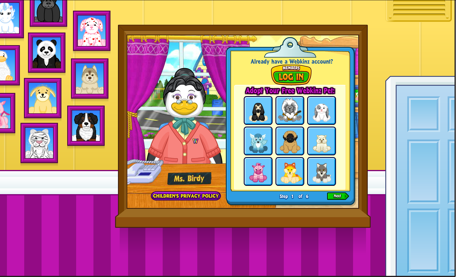
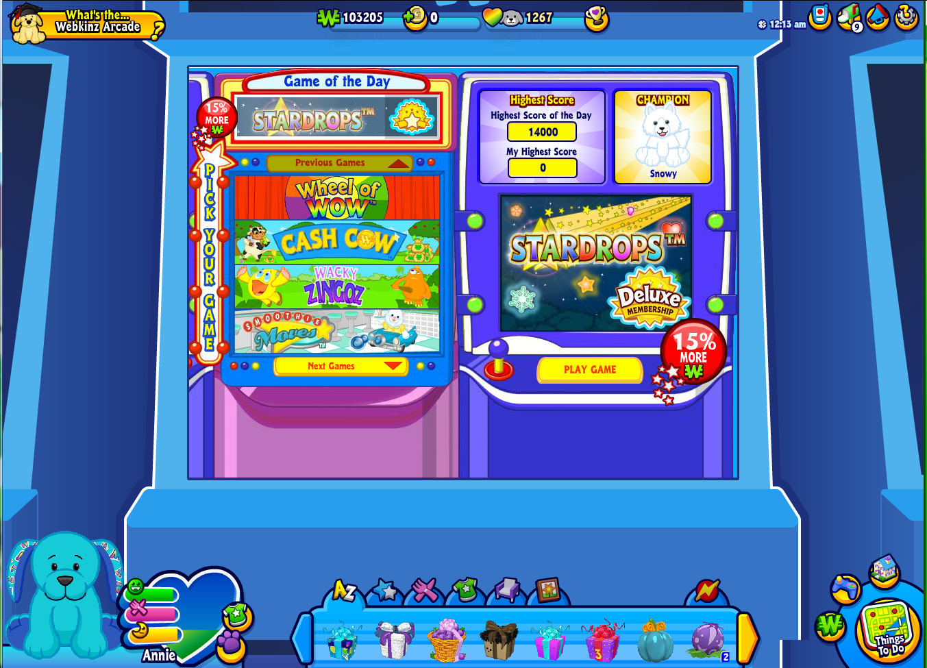
We wanted to make Webkinz World bigger and better, but without taking anything away from the many fan-favorite places! To accomplish this, we’ve added a little something extra to the design to help everything fill out any size screen!
Here’s a look at some of the updated looks you’ll see around Kinzville:


Ganz, I’ve been with Webkinz a long time and I like the change, although I wasn’t unhappy with the old version
i dont really like how its all so far away and some dont make sense other do i dont know about Webkinz x anymore i liked the other changes but this one not as much
I don’t know how I feel about it right now. It would have been better if the actual playing screens had fit all computer screens instead of just adding borders to everything. I don’t see that as an improvement really because the playing screen is the same size. The rest seems distracting and like too much to look at. But I’m sure with time we will be able to tune that out and focus on the game. I will be very excited about it if we are able to remove doors, that is a much needed feature. My WW map looks like swiss cheese because I couldn’t add a room here or there because I didn’t want a door to appear in a room next to it that would mess everything up. That will be the best feature of Webkinz X to me. It’s hard to find a safe place to put a new room when I know I’ll ruin another room’s design with a door right in the middle of everything.
Oh i’m not sure about this, Ganz.
As long as the screen size for the main Webkinz world is the same size, I really like this background thing. These look pretty cool and it seems better than staring at green. plus I think it will help center it better instead of the main screen being off to the side more.
WEBKINZ!!! DON’T DO THIS!! IT HAS BEEN LIKE THIS FOR 10 YEARS NOW!!!! dont change the backround!!1 just do webkinz x
I really despise the new dock. It looks terrible.
I…. I hate it…. It really looks like it’s for babies now rather than for every one. What was wrong with the original lay out? I don’t think it was broken. I hate this so much.
Actually, This is pretty cool! Though everything is smaller now, I love that things will start fitting every screen! the top of a lot of my wallpapers are cut off so i’m hoping that will be fixed and I have to enter full screen to even get to my dock. (I use a MacBook Pro) I think it’s great things will fit screens better, I also like the backgrounds for all the places! Nice job Ganz.
cool it looks good