Ella McWoof here! With your help, I’ve sniffed out some important information about the X-citing new project, Webkinz X!
Now, in my EXCLUSIVE SCOOP, here’s more information straight from the TOP SECRET documents!
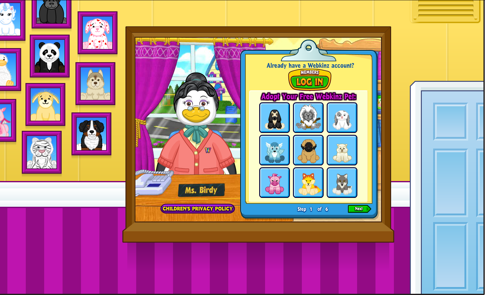
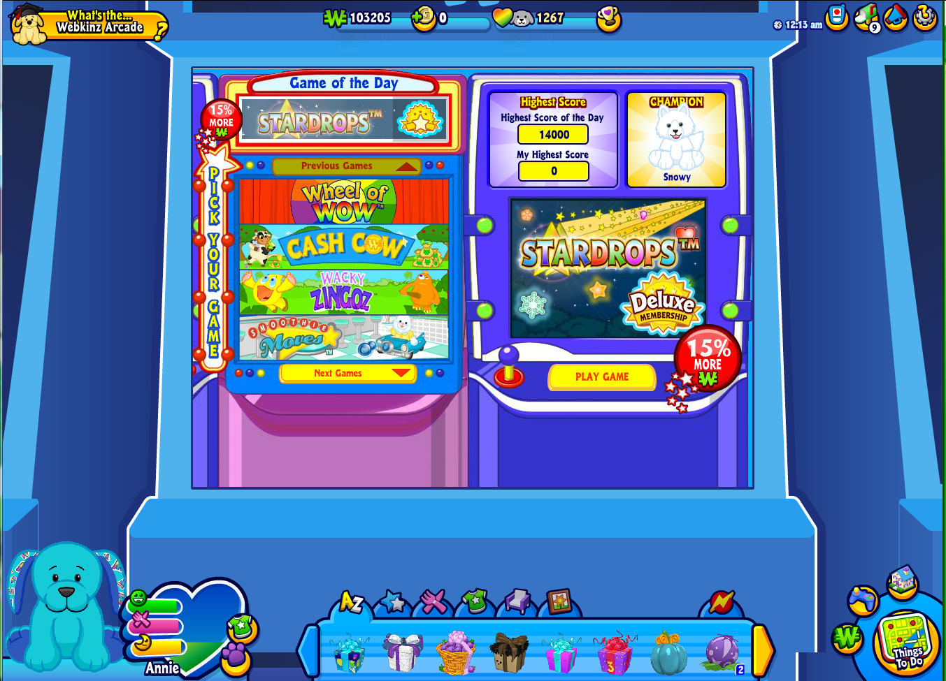
We wanted to make Webkinz World bigger and better, but without taking anything away from the many fan-favorite places! To accomplish this, we’ve added a little something extra to the design to help everything fill out any size screen!
Here’s a look at some of the updated looks you’ll see around Kinzville:







Honestly, most of this stuff just looks useless and annoying! I don’t like any of the changes, especially not the boarders-not for the size the just look ugly-I also have liked any of the previous changes. Maybe it’s just me but I that the changes usually end up making things more annoying and harder. They rarely ever seem to benefit. Like the map for instance, they took a perfectly acceptable and cute map and made it into a bother. The WShop was turned into something super hard to use where I can never find what I am looking for. I am not against improvements and change but Ganz just seems to be changing things for no good reason, making me wish it was like it used to be a few years ago.
I agree with you! Completely.
It’s going to take some getting used to. I really like the Kinzville Academy design though! :) ~*JaneOfAllTrades*~
Did you ever hear the saying, “If it ain’t broke, don’t fix it”? That’s how I feel about these changes. Webkinz was great the way it was, except for the glitches, which I’m sure we’ll have even more of when Webkinz X starts. Another saying comes to mind, “Leave well enough alone”. I dread these changes. We’ll have to learn how to use Webkinz all over again. I am not a happy camper. =(
OK…… WHAT are those weird symbols around Amanda panda’s wish factory screen…………….:o(-(
I have been playing on webkinz since 2007, and I am not sure about this…….I have lasted through ALL of the big changes and updates since, but this BIG UPDATE is kind of scaring me. I do hope this removes the ads though.
This looks awesome!
Hmm… it is fine… I had hoped for the mainscreen (the screen where you play) to fit the device that is used. I had hoped to play in fullscreen mode, having the Webkinz playscreen I’m used to, just loads BIGGER. My eyes would like that too… ;) But hey, these backgrounds are well done, that’s for sure.
So now the game screen will take up the whole computer screen, right? Or is it just bigger for really large computers? I think a lot of the new borders are nice but I dislike the new arcade one because I think it’s too dark, a little scary. I’m ok with most of the new screens. I like the adoption center screen and the Tournament Arena screen. I don’t think this’ll make too much of a difference when you think of all the other major changes. All in all, it goes with the new modern look of Webkinz which I think is very important and eXciting!!!!!! I can’t wait to actually use the new Webkinz X. I think there are lots of eXciting things in store for the new Webkinz!!!!!
I like it! It’s a nice touch, instead of the green all the time!
I don’t like this change, I wish webkinz would stay the same :(