Hey guys… Michael Webkinz here, reporting for Webkinz Newz. I am back with your first look at some of the final items that will be included in this year’s brand new Halloween room theme: The Haunted Castle! This theme will be available in the W-Shop on October 1st.
One interesting aspect about this theme is that it can be mixed and matched with the rare Medieval theme that can be found at the Curio Shop. Imagine a Medieval Dining Table featuring mostly regular Medieval Chairs with one or two Haunted Castle dining chairs mixed in with the rest? Or the same idea with the columns? At first glance it would appear that the room was simply a medieval themed room however, on closer inspection, the castle would appear to be haunted!
I can’t wait to see the Haunted Castle screenshots players will send me when this theme is released on October 1st…
If you missed my last post, You can see it HERE. If you have any feedback or name suggestions for any of these items, please feel free to leave your ideas in the comment section below.
This has been Michael Webkinz reporting for Webkinz Newz…


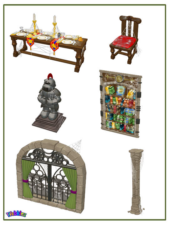





I love the castle doors! This was not the theme I voted on, but loving it anyway!
Loving this, my favorites are the window and bookshelf.
Really what a disappointment. Just another remake only with cobwebs. I voted for the street halloween, at least it would have been new and fresh looking and a little more like Halloween, Ganz you failed in the spooky design this time. Bet the window door will be deluxe, sad for alot of people. desing team needs refreshed, bring the team that is designing the estore,tired of paying for the really good stuff.
don’t worry, pamala, if you need something deluxe I can send to you :)
Thanks neez, the offer is much appreciated! I have 8 deluxe sites and often send to others that would like stuff, I read how others get disappointed in all the deluxe stuff they can’t purchase. You are a thoughtful player:)
That’s what people wanted. A remake of an existing theme. Maybe they will design a Christmas theme…Wreath on the gate, turkey on the table, etc. These same pieces could go on forever.
I have to agree with _emiemiemiemiemi_ on the colors. I am a little disappointed at how all these pieces look like ones from other themes with a dash of cobwebs. The doors are really nice though!
I really like the window – I like it so much that I wish it could be rotated to show a “clean” version because I’d use it in so many other rooms. The bookcase looks so much better than the concept drawing. The books needed to be different colors to add texture and variety, but these colors are more muted hues than the original art we saw a couple weeks ago. Looking forward to seeing more of this theme.
What a fabulous idea! It would be great if ALL the cobwebs could be turned on and off!
QUESTION the table does it light up when touched ? Cant wait to see the wall paper and floor. The Ribbon (Wish Factory) bed could be used here but wish there was a webbing on it to match . Hopeing for falling leaf globe and straw bales for a corner. I got a spinning wheel and piles of gold for this room. FREITENING LIGHTENING windows will match so perfect ! PLEASE OFFER THEM !!
Door is white outside how about let us turn it for day/night .
I really love this theme. Can’t wait! I adore the window and the bookcase. I don’t know if it’s at all possible at this point, but it would be awesome if you could rotate them and have versions without the spiderwebs. They are both so beautiful and I could see them in other rooms that way. Awesome job designers. Still saving kinzcash!
Love the motif at the top of the bookcase and window. Hope it shows up on another piece. What about a motto to hang on the wall? Just imagining that the queen had one. I’m just so intrigued by her.
Not bad. :)
I love the final pictures! Great designing, ganz!
Hmm.. well okay. I was kind of hoping that the gray would be a more purple-ish hue to make it look darker than this, but.. eh, oh well. The items look alright in virtual form.. they always seem to look better as art to me. =P Oh well. I’ll still be buying it and attempting at making a nice room with these items.