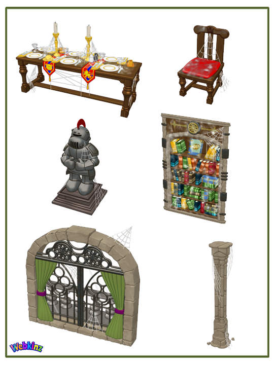
Hey guys… Michael Webkinz here, reporting for Webkinz Newz. I am back with your first look at some of the final items that will be included in this year’s brand new Halloween room theme: The Haunted Castle! This theme will be available in the W-Shop on October 1st.
One interesting aspect about this theme is that it can be mixed and matched with the rare Medieval theme that can be found at the Curio Shop. Imagine a Medieval Dining Table featuring mostly regular Medieval Chairs with one or two Haunted Castle dining chairs mixed in with the rest? Or the same idea with the columns? At first glance it would appear that the room was simply a medieval themed room however, on closer inspection, the castle would appear to be haunted!
I can’t wait to see the Haunted Castle screenshots players will send me when this theme is released on October 1st…
If you missed my last post, You can see it HERE. If you have any feedback or name suggestions for any of these items, please feel free to leave your ideas in the comment section below.
This has been Michael Webkinz reporting for Webkinz Newz…





I really liked the purple from the concept art, what happened to it?
Spooky story bookshelf is awesome! I think it would be rad if the chairs sorta floated….like they were being levitated off the ground. I agree that purple instead of red would add a little more difference between the regular and new haunted version.
Why does the door have a arch and the wallpaper have a point? They won’t match. Can you fix it?
I really like these items but…since the wallpaper has gothic pointed arches and the door has a rounded arch I think it will look very strange. I hope the designers will fix this so the arch on the door meshes with the arch on the wallpaper.
Cool!
Name them all starting with 2017 so they are in our dock together . Then like 2017 Haunted table , 2017 Haunted door , 2017 Haunted Piller , 2017 Freight knight and so on.
ONE LAST THING – THE Knight could you have the EYE SLOT on the armour GLOW when touched . FOR THAT SPECIAL feeling in the room ;).
Yes, yes, YES! Make sure they all start with the same word so they stay together in the dock!
Awesome!! I really like this theme so far! :D I especially like the bookshelf and the window. :)
These are looking great! Although, I thought the red from the medieval theme was supposed to be changed to more of a purple color.
Yeah I know, and I wish there are more than 6 items too. I do like the window…
Exactly what I thought. It was supposed to be purple.
Purple would be better than red. They used rich majestic colors. Great job Ganz!!
I agree. It would look better if the primary color were purple. I’m also hoping there will be a bed. Fingers crossed!!!
I agree. Purple would be better. The red isn’t quite on theme.
Looks totally cool, and 100% awesome! =D Can’t wait for this new theme! =^^=
I agree, Michael, that it will be so fun to see the rooms made from the new items. I especially love the bookcase and window. Thanks for the first look!